
Making Information Make Sense
InfoMatters
Category: Information / Topics: History • Information • Statistics • Trends
COVID-19 Perspectives for May 2021
by Stu Johnson
 Building article list (this could take a few moments)...
Posted: June 155, 2021
As U.S. and other countries prepare to reopen, trouble spots elsewhere show that the COVID-19 global pandemic is far from over…
Putting the COVID-19 pandemic in perspective (Number 11)
This series was spawned by my reaction to reporting early in the COVID-19 pandemic that focused on raw numbers. Big numbers are impressive, even frightening, but hard to comprehend. Rarely have we been given a context that helps lead to better understanding of the numbers or how to make comparisons between the U.S. and the rest of the world. This series turned into a monthly summary setting the U.S. numbers in global perspective. This analysis is based on data from worldometers.info, which monitors 215 countries. From those, I focus on details for 21 countries that have appeared in the top-10 of worldometers metrics since I started more detailed tracking in September 2020.
A note on reliability of data: It should be noted that the statistics reported by worldometers and other sources are only as good as the integrity of the reporting system in each country. China's statistics have increased so little since October that it is doubtful its numbers are accurate, so they are not included in some of the charts. Other countries have also had gaps in reporting, or made adjustments when admissions of underreporting have been made. While precise comparisons between countries may be brought into question, there is still enough information to make trends evident. That is why I may tend to round some numbers and watch for changes over two or three months rather than focusing on a single month, as significant as that may turn out to be.
Just after updating data for this report on May 31, there were new stories on June 1 that Peru was adjusting its numbers significantly upward. Indeed, some of them increased two and three-fold. That will show up in the report of June data.
Even though the U.S. may fully reopen this summer, these reports will continue as long as the pandemic persists around the world.
Report Sections:
• May at-a-glance
• The Continental View • USA Compared to Top-5 Countries
• COVID Deaths Compared to the Leading Causes of Death in the U.S.
• U.S. COVID Cases versus Vaccinations
• Profile of Monitored Continents & Countries • Scope of This Report
May-at-a-glance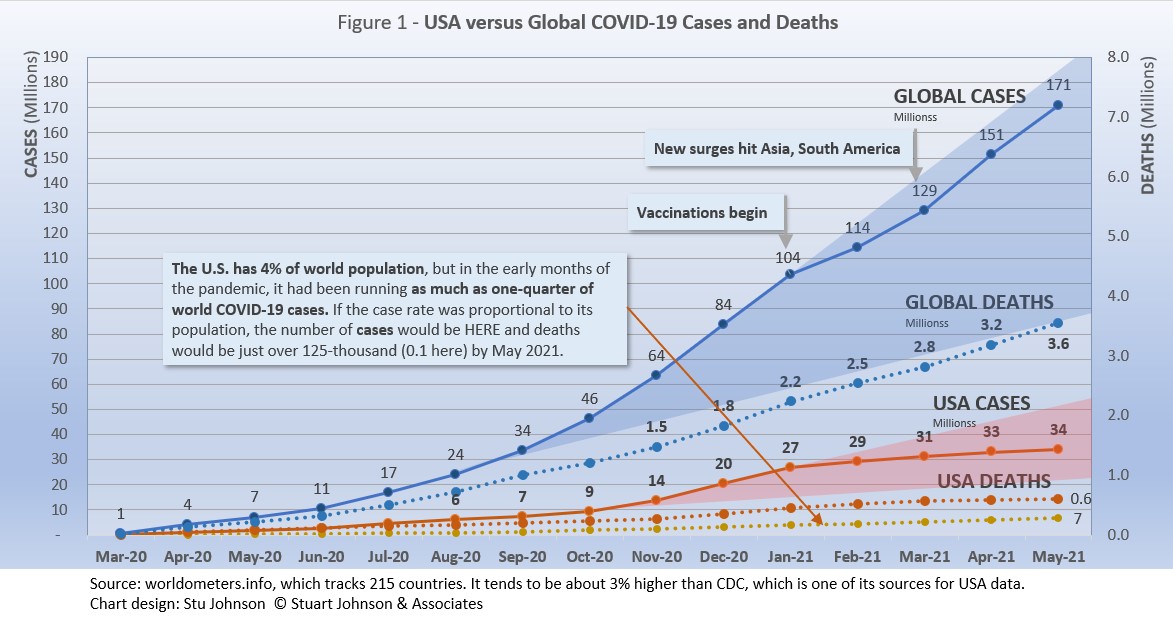
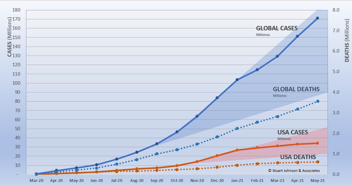
- COVID-19 continued to spread around the world, reaching 171-million cases by the end of May, up 13% from April. After a rapid increase from September through January, February appeared to "bend the curve" downward, with only a slight upward move in March. April brought surges, particularly in Asia and South American, which continued and even worsened in some locations in May.
The blue "cone" in Figure 1 shows the possible high and low projections, with the bottom (roughly 85-million) representing the trajectory of the lower pace in late summer 2020 and the upper (185-million) representing a continuation of the surge from November through January. You can see that the curve for global cases started to bend down in February 2021, but then resumed in March, following the November-January rate of increase. That was not the case with the U.S., which I'll get to below. - The pattern for deaths tends to lag behind cases by several weeks, and the global increase continues to fall below that of cases—dropping from a 23% increase in January to 11% in March, then turning back up slightly with a 13% increase in April that continued into May. In the April report, I suggested that because of the lag in deaths, we would likely see an upswing in May, but the curve continued at roughly the same pace it has been on since January. The good news is that mortality rates are dropping, so an acceleration in cases is not matched with a corresponding increase in deaths.
- The U.S. continues to lead the world in the number of reported cases and deaths, and while cases represent 19.9% of global cases through May (with only 4% of world population), that is down from a high of 25.9% in January. Similarly, deaths have declined from 20.9% of the world total in September to 17.1% in May. As you will see in details to follow, while the U.S. outpaced everyone through the early months of the pandemic, the vast disparity is slowly shrinking. The projection cone surrounding USA Cases in Figure 1 shows a continued flattening of cases to the middle of the cone (roughly 22- to 52-million) since vaccinations started in January. That is a striking contrast to the global cases curve and projection cone.
Figure 1 also shows how much lower cases would be—at about 7-million by now, instead of 34-million—if they were proportional to the global population,. It would also mean just over 120-thousand deaths instead of 609-thousand. One must be careful, however, in stating the situation so simplistically, as reality is a complex set of factors. Yet, it cannot be denied that the U.S. share to date has been extraordinarily high compared to other large countries. - With vaccinations, the U.S. continues to move ahead with remarkable speed, though the pace slowed somewhat in May (see Figure 9). By the end of May, half of the U.S. population had received at least one dose (Moderna and Pfizer require two, Johnson & Johnson only one). 40.7% of the population was fully vaccinated (two weeks following the final shot), including 74.8% of those 65 and above.
In the last day or two, President Biden has encouraged another target for vaccinations, urging that 70% of Americans receive at least one dose by July 4. With states dropping restrictions (Illinois, where I live, is scheduled to officially "reopen" on June 11), the success of those decisions and behavior will be evident if the curves continue to flatten over coming months. There is definitely light at the end of the tunnel, but we're not out of the pandemic tunnel yet, and we cannot forget COVID-19 is a global pandemic and other parts of the world are still facing the worst.
The Continental View
While COVID-19 has been classified as a global pandemic, it is not distributed evenly around the world, though we began to see some shifts in patterns starting in April..
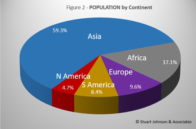
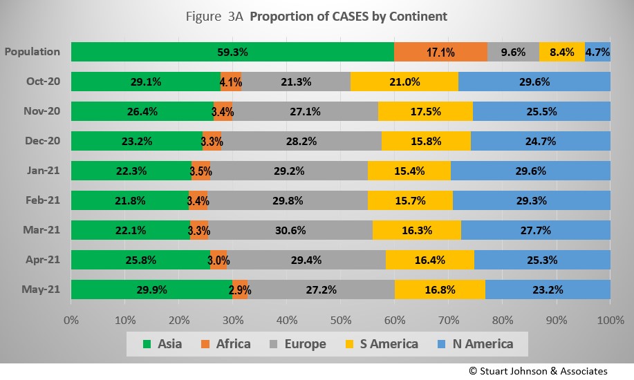
Asia accounts for 59.3% of the world's population (Figure 2), but only 29.9% of COVID cases in May (Figure 3A)—affecting a mere 1.1% of its population. After shrinking in proportion of cases since October, Asia has now reached its highest level since October (and statistics from China are likely badly underreported). Where Asia and Africa combined represent about three-quarters (76.4%) of the world's 7.8-billion people, Europe, South America and North America still account for two-thirds of cases (67.2% - Figure 3A) and three quarters of COVID deaths (77.1% - Figure 4A).
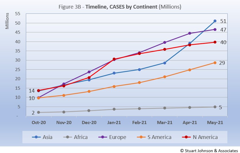
By raw numbers alone, Asia now has the highest number of reported COVID cases, surpassing both Europe and North America as it experienced a dramatic upturn in April and May. South America remains in fourth place, but is slowly accelerating in cases each month. On the other hand, North America began to flatten its curve back in January (when vaccinations began), and Europe (slower to get vaccinations started) showed a slight increase in pace in March and April before decelerating in May. Africa, second by population, remains a loner, with an almost flat curve compared to the other four large continents. (Oceania's population is too small to be statistically significant).
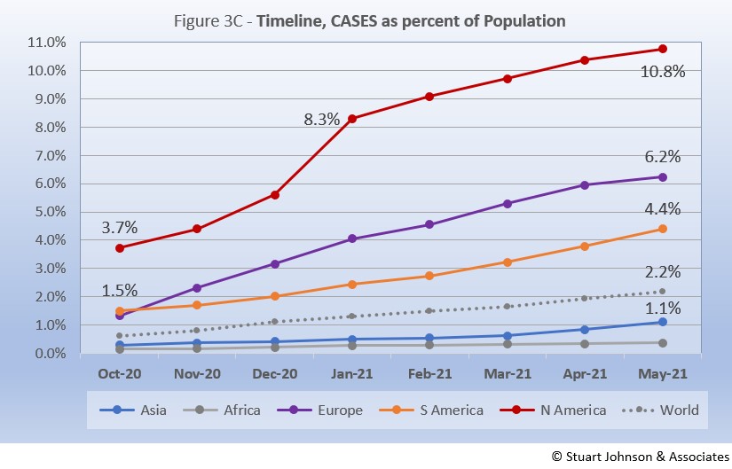
Remembering proportionality, the raw numbers of Figure 3B can be deceptive. Figure 3C gives a more realistic picture of impact by translating raw case numbers to percentage of population. After a sharp increase in January, North America has slowed down in month growth, but remains slightly above the global pace. That still leaves North America far above the other continents, with one in ten (10.8%) reported as having contracted COVID. Europe and South America remain above the global rate, with South America increasing slightly each month and Europe showing a small but noticeable dip in May.
Despite the reports of COVID surges in India and other parts of Asia similar to what Italy experienced at the beginning of the pandemic, the sheer size of the continent means it can absorb a lot of growth in cases before it causes a dramatic bend in the curve (as seen in North America in January).
In the last two weeks of May, cases in Asia increased by 3.7-million—more than half of the global increase of 7.2-million cases—with India alone accounting for 2.7-million cases. Yet, with a population of nearly 1.4-billion, the bend in the curve remains a minor statistical adjustment, masking the human impact. .
Africa, the second largest continent (1.3-billion, nearly the size of India), also remains far below the global pace for COVID cases, ending May with 4.8-million cases, or 0.4% of its own population.
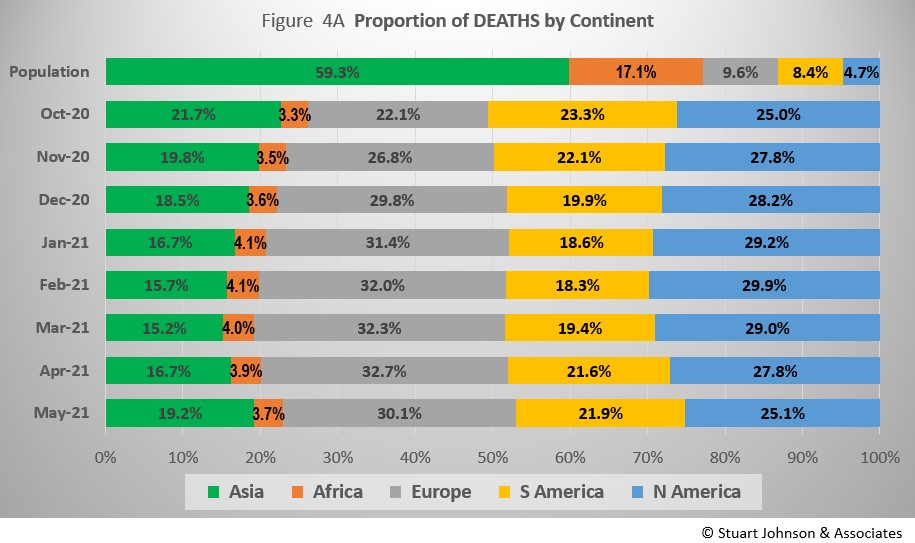
The proportion of deaths between continents is even more distorted than that of cases. Figure 4A shows the steady increase in the proportion of deaths in Europe and the Americas through April. April ended with Asia and Africa (76.4% of world population) accounting for 22.9% of COVID deaths.
The growing crisis in India showed up in May deaths, with Asia hitting 19.2% (still below the high of 21.7% in October). Africa was down slightly in May. Europe's proportion went down for the first time since it started rising in November. South America has been increasing steadily since its low proportion in February. North America went down for the third month since it peaked in February.
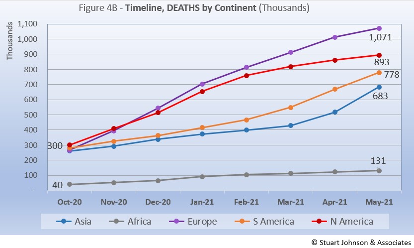
The overall distribution for deaths through May shows how that trajectory lags behind cases and has progressed at a steadier rate.
By numbers alone, we can say that Africa continues at a very slow and steady pace in terms of COVID deaths. North America is slowing down. Europe remains on a steady path that may have entered a time of slower growth. Asia and South America continue as the current continental hot spots.
Back in October, Asia, Europe and the Americas were close together in raw numbers. Europe and North America began a steady upward climb, well above the others, with Europe surpassing North America by December. January saw a slowdown for both, but North America slowed even more beginning in March, so the divide between has continued to grow. Europe did show a slight slowing in May, but became the first continent to surpass 1-million deaths (out of 3.6-million total).
South America started at a slower pace before bending upward more noticeably in March, then ending May poised to cross into second place as North America flattens. Asia followed a similar pattern, though it was dropping further below South America until April when it started to rise, accelerating even more in May. Africa has remained the lowest and slowest in growth, ending May with 131-thousand deaths.
Comparison of U.S. to Top-5 Countries
Cases
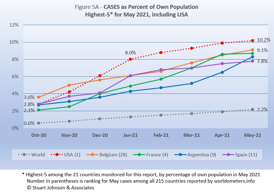
USA stays at #1. Belgium moves up one to #2, France down one to #3. Argentina appears at #4, pushing Spain to #5 and Brazil out of the top-5.
Early on, the small European country of Belgium was leading the world in COVID cases as a proportion of its population (Figure 5A). The U.S. and Spain were nearly a full percentage point lower in October. Belgium began to level off in December, while the U.S. continued climbing, with a slight acceleration in December that continued into January, then began to slow. Even so, the U.S. ended May with 10.2% of its population with reported COVID cases, far above the 2.2% global level and clearly separated from the next four countries, though that gap is closing.
As the U.S. climbed to 8% in January, Belgium showed a very slight decline before bending upward slightly. France started October in fourth place, rose noticeably in December, virtually tied with Belgium in April, then slowed to end May at #3, allowing Belgium to keep its pace to reclaim #2.
Argentina has seen cases rise steadily, higher than but at about the pace of global increases until April when it started to accelerate, surpassing Spain to end May at #4. Spain was more erratic, with an increase in January that paralleled that of the U.S., then slowing.
Another way to look at population proportion is the measure "1 in." The global figure of 2.2% means that 1 in 46 people in the world have had COVID (and that only by official record keeping, not including any unreported and likely asymptomatic cases). For the U.S. it is 1 in
10. For Spain 1 in 13.
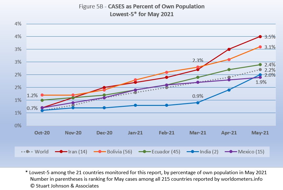
The same five countries appear in the lowest-5 (of the 21 I track) in May, with India moving up one place and Mexico down one.
At the low end (Fig. 5B), the five lowest countries for cases by proportion of population are much closer to the global figure of 2.2% of population with confirmed cases of COVID-19 at the end of May.
Iran and India both bent upward noticeably in April and May—enough to put Iran at the top of the lowest-5 last month. Ironically, although India is experiencing crisis-level surges in some areas, it is such a large country (in population) that the upward movement in April and May only moved it up to second-from the bottom in cases as proportion of population among the 21 countries I monitor.
Those countries represent a considerable spread in size, from India, the second largest country, to Bolivia, ranked number 50 of the 215 countries tracked by worldometers. For Iran, its 3.5% level represents 1 in 29 people, for India it is 1 in 49 and for Mexico it is 1 in 54.
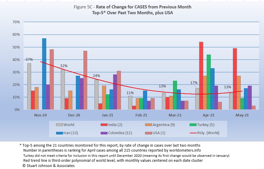
Because the size of countries makes the use of raw case numbers illusory, another measure I find helpful is the rate of change from month to month (Figure 5C).
For this chart, countries are selected based on the change over two-months (end of March to end of May for this report). Except for the U.S. (which will appear every month), the mix has changed since the last report, with Argentina and Columbia replacing France and Chile. India moves up one place to #1, Argentina appears at #2, Turkey moves down two to #3, Iran moves down one to #4 and Columbia appears at #5.
The overall trend (red line) was moving down through February, then started moving up again, with the largest increase in April, at 17%. As noted last month, as global change goes down, the variance between countries in the top-5 tends to flatten out (look at February). March saw Turkey and Iran with changes greater than the global level. April found all of the top-5 above the global level by a wide margin. In May Turkey dropped below the global level, while India and Argentina were well above it, and Iran and Colombia above but closer.
India had the highest change over the previous month, 54% in April, followed by a 48% increase in May.
The U.S. was above global levels of monthly change through January, then dropped below it from February through May, which showed only a 3% change over April.
Deaths
Because deaths as a percentage of population is such a small number, the "deaths per million" metric provides a comparable measure.
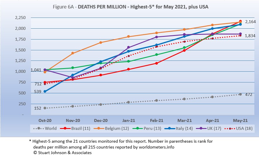
The same countries appear in the May top-5 chart as in April, but the mix changes. Brazil moves up two places to #1, Belgium drops one to #2, Peru is up two to #3, Italy drops two to #4 and UK moves down one to #5. USA is very close behind at #6.
As Figure 6A shows, Brazil has bent upward in deaths per million starting in March, pushing it just beyond Belgium to finish May at the top of the 21 countries I monitor. It is practically a four-way tie, however, with Brazil, Belgium, Peru and Italy all within 75 points. The UK, with its aggressive testing and vaccination efforts, remains in the top but shows the most pronounced flattening of its curve starting in March.
As observed last month, the overall trend shown in Figure 6A is that the UK and USA, with aggressive testing and vaccination, are beginning to slow the death rate, while Europe (represented by Belgium and Italy) continue to climb, showing the frustration over slow vaccination roll-outs, including delays because of suspension of the AstraZeneca vaccine over concerns about extremely rare but serious blood clotting.
At the same time, the upward movement of Brazil and Peru (each up two places) follows the movement of COVID hot spots to South America.
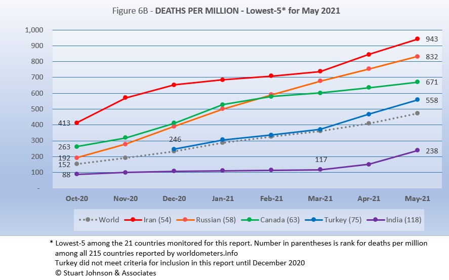
The same five countries, in the same order, continue in the lowest-5 in Deaths per Million (of the 21 countries tracked for this report).
India remained well below the global rate of 467 deaths per million at the end of May, the other four are all above that rate. Except for Canada, which shows some slowing since February (similar to USA), the others all show increases in April and May at a pace slightly higher than the global rate.
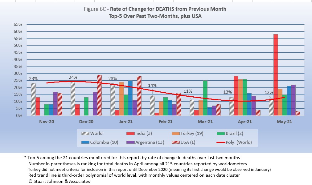
As with the comparable chart for Rate of Change for Cases (Figure 5C), countries are selected based on the change over two-months (end of March to end of May for this report). Except for the U.S. (which will appear every month), the mix has changed since the last report, with Columbia and Argentina replacing Peru and Russia. India moves up two places to #1, Turkey remains at #2, Brazil drops two places to #3, Columbia and Argentina appear at #4 and #5.
The trend
in the rate of change in deaths (red line in Figure 6C) shows the delayed connection with cases. Monthly changes for cases were trending down from October through February, then started moving up again in March. For deaths the trend peaked in December, hit a low in March, then rose again in April and May (though global changes were much closer to the previous month than some of the countries in the top-5.
India was below the global rate of change through March, then more than doubled the global rate with 28% in April and doubled that with 58% in May. All five countries were at or above the global level in April and May. USA started out above global levels through February, than dropped below it, ending May with a 3% change from April.
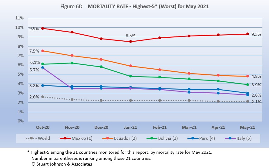
Mortality Rates (percentage of deaths against reported cases) have been slowly declining. This is not surprising as several factors came into play: the ratio of community spread versus outbreaks (nursing homes, similar confined settings) increased, lessons being applied to treatment, increased testing (which would expand the spread between reported cases and deaths), and increasing vaccinations since January (though that should impact both cases and deaths).
The top-5 in mortality rate (among the 21 countries observed) stand out because for the most part they had not been showing up in other charts until the past month or two. All five countries carried over from April, in the same order. Except for Mexico, which has been increasing slightly each month since January, the other four show a downward tilt in their curves, but all remain above the global level, which stood at 2.1% at the end of May.
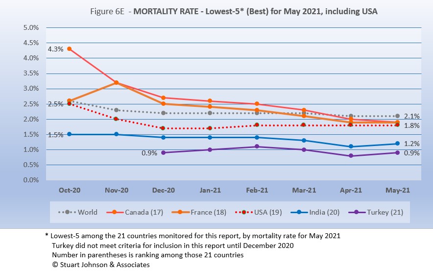
All five countries reappear this month, in the same order.
In last month's report, the chart looked very positive, with all five countries on a steady downward slope, and all below the global level. This month, they are still below the global level, but there is some slowing of the rate for France, and an upward turn for India and Turkey.
How real is the threat of death from COVID? That's where successful mitigation comes in. Worldwide, by May, 1 in 2,198 people have died from COVID. In the U.S., while the mortality rate is low, because the number of cases is so high, 1 in 547 have died through May. With low mortality, the U.S. should have been able to keep deaths much lower, but the extraordinarily high number of cases means more deaths. Without a better-than-global mortality rate, the U.S. death rate would be far higher. And compared to the 1918 pandemic, it could be ten times worse. The response of the health care system is part of keeping mortality down, but it's far too early to detail the cause for that positive piece of the COVID picture in the U.S. Even at the global level of 2.1%, the U.S. would have had 715-thousand deaths by the end of May, instead of 609-thousand.
Tests
The same five countries remain on top in COVID testings, in the same order as April.
The U.S. is far ahead of other countries in reported COVID tests administered, at 479-million, 39% percent ahead of India (but narrowing, with 56% last month.). UK has continued to accelerate testing, moving from #4 through February into a stronger #3 position for April and May. Russia has shown a very modest increase, which brings into question the reliability of its reporting.
These are raw numbers, so it is important to recognize the size of the country. It is also the case that COVID tests can be administered multiple times to the same person, so it cannot be assumed that the U.S. has tested almost all of its population of some 330-million. Some schools and organizations with in-person gatherings are testing as frequently as once a week for those who are not yet fully vaccinated. That's a lot of testing!
The same five countries carry over from April, with changes in position: Argentina moved up one place to #1, moving Peru to #2, Mexico stays at #3, and Bolivia and Ecuador exchange #4 and #5 positions.
There is tremendous disparity between countries in terms of testing. The five countries (among the 21 monitored) with the lowest reported number of tests are all in South America. Peru and Argentina are good examples, both having achieved more than 12-million tests through May. Argentina (13.9-million tests for its 45-million population) is well below Spain (49.7-million tests and a population of 47-million). Similarly, Peru (12.8-million tests and 33-million people) is also well below Canada (34.7-million tests and 38-million people). At the bottom, Ecuador has reported 1.4-milion tests for its nearly 18-million people and Bolivia has tested 1.5-million for its 12-million population.
Tests per million adds another perspective. Fig. 7C shows the five countries with the highest tests per million. Italy replaces Spain at #5, the others all remain in the same order as April.
The UK, already the most aggressive in testing, increased its numeric lead even more in May, with a reported 2.66-million tests per million population, is approaching the equivalent of 3 tests per person. The U.S. continues on a straight line trajectory, reaching 1.44-million tests per million, more than one per person. France, Belgium and Italy track close to each other, all ending with more than 1-million tests per million in May. France, with some variance in its curve has wiggled its way from #5 to #3 since October, but the bottom four (of the top five) have tracked fairly close to each other in that time.
Anything over 1,000 represents more tests than people (1,000 on the chart actually means 1,000,000), but as mentioned above, that does not mean that everyone had been tested. Some people have been tested more than once, and some are being test regularly or with increased frequency.
The same five countries appear as the lowest five in tests per million in May, with Iran and Brazil trading rankings once again (Brazil's reporting has been sporadic, so it has zigzagged its way to a virtual tie with Iran for tests per million).
While still at the bottom of the 21 countries monitored for this report, Iran has made the most substantial progress, increasing three-fold since October. Though Brazil is now even with Iran, it started much higher, so its progress is good but less impressive. Bolivia is also showing more progress in the last two months, while Ecuador and Mexico continue at a slow and steady pace.
While improvement is evident in all five, the equivalent proportion of tests to population remains very low, from roughly 5% to 25%. This illustrates the arguments over inequity in resources among countries.
Causes of Death in U.S.
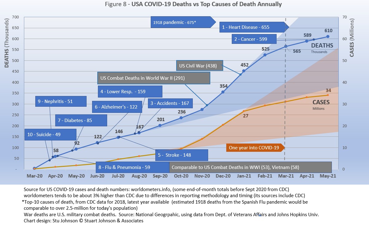
Early in the reporting on COVID, as the death rate climbed in the U.S., a great deal of attention was given to benchmarks, most notably as it approached 58,000, matching the number of American military deaths in the Vietnam War. At that time, I wrote the first article in this series, "About Those Numbers," in which I looked at ways of viewing the data, which at the time of that writing in May 2020 was still focused on worst-case models and familiar benchmarks, like Vietnam. Part of my approach in that article was to put the U.S. COVID deaths on a timeline against not only mileposts like war deaths or significant numbers (i.e., every 50,000 or 100,000), but against the reality of the top-10 causes of death each year, numbers available from the CDC.
Figure 8 shows the number of U.S. COVID cases and deaths against the top-10 causes of death reported by CDC for 2018 (the latest data available), along with several other mileposts from wars and the 1918 pandemic. Notice that for nearly nine months, the curve for deaths was increasing at a faster rate than cases. Then, starting in November the curve for cases took a decided turn upward, while deaths increased at a more moderate pace.
Most media sources reported that the U.S. would pass 500,000 deaths on February 22, 2021. The CDC reported 497,415 deaths on February 21, while worldometer.info was already reporting 512,068. As mentioned elsewhere in this report, worldometer tends to be about 3% ahead of CDC and Johns Hopkins, a matter of a few days difference in data collection. At any rate, it is clear that February 2020 saw the U.S. death toll from COVID pass the 500,000 mark, headed toward 600,000.
The February slowdown in cases was met by a barely perceptible slowdown in deaths, because as pointed out earlier, deaths trail changes in cases. That trend continued in March and bent downward even more in April. In fact, if the trajectory from November to February had continued (the upper edge of the blue cone), we would have seen close to 825-thousand deaths by the end of May. The total of 609-thousand at the end of May did pass 599-thousand, the number who died from Cancer in 2018. The next benchmark is the #1 cause of death, heart disease, at 655-thousand. How close are we to that?
The latest "Ensemble Forecast" from CDC suggests this for the immediate future:
...tthe number of newly reported COVID-19 deaths will likely decrease over the next 4 weeks, with 800 to 4,800 new deaths likely reported in the week ending June 26, 2021. The national ensemble predicts that a total of 601,000 to 614,000 COVID-19 deaths will be reported by this date.
Note: As I've referenced in the notes for several charts, the data from worldometers.info tends to be ahead of CDC and Johns Hopkins by about 3%, because of reporting methodology and timing. I use it as a primary source because its main table is very easy to sort and provides the relevant data for these reports.
Perspective
The 1918-19 Spanish Flu pandemic is estimated to have struck 500 million people, 26.3% of the world population of 1.9-billion at that time. By contrast, we're now at 2.2% of the global population. Deaths a century ago have been widely estimated at between 50- and 100-million worldwide, putting the global mortality rate somewhere between 10 and 20-percent. It has been estimated that 675,000 died in the U.S.
IF COVID-19 hit at the same rate as 1918, we would see about 2-billion cases worldwide by the time COVID-19 is over, with the global population now at 7.8-billion—four times what it was in 1918. There would be 200- to 400-million deaths. The U.S. is estimated to have had 27-million cases (one-quarter of the population of 108-million) and 675,000 deaths. Today, with a population of 330-millions (a three-fold increase from 1918) this would mean more than 80-million cases, and 2- to 4-million deaths.
However, at the present rate of confirmed cases and mortality while the total number of global cases could approach 500 million or more—comparable to 1918 in number, that would be one-quarter of 1918 when taking population growth into account . .. and assuming the pandemic persists as long as the Spanish Flu, which went on in three waves over a two year period. At the present rate of increase (20-million cases per month) it would take another 16 months to reach 500-million, somewhere around September 2024.
If the total number of cases globally did approach 500-million, using the global mortality rate of 2.2% in May, there would be roughly 11-million deaths worldwide, tragic but far below the number reported for 1918 (50-million) with an even wider gap (200 million) when taking population growth into account.
With vaccination in progress and expected to be completed in the U.S. by the end of summer, the end of COVID-19 could come sooner. Like 1918, however, there could be complicating factors such as the growing number of mutations that are more highly transmissible (but not necessarily more deadly). It seems unlikely that the number of cases worldwide will reach 500-mllion, unless current and potential hot spots in Asia and South America continue to grow. Another wild card is Africa, which could remain an outlier during this pandemic, or explode into a major hot spot. While we in the U.S. think the end of the pandemic is in sight, it is still too early to make predictions on the duration and severity of the COVID-19 pandemic.
The contrast demonstrates the vast difference in scale between the Spanish Flu pandemic a century ago and COVID-19 at the present time. Key differences are the mitigation efforts, available treatment today (though still leaving the health care system overwhelmed in some areas), and the beginning of vaccine distribution. In addition, in 1918 much of the world was focused on a brutal war among nations (World War I) rather than waging a war against the pandemic, which ran its course and was undoubtedly made much worse by the war, with trans-national troop movements, the close quarters of trench warfare, and large public gatherings supporting or protesting the war.
Vaccinations in the U.S.
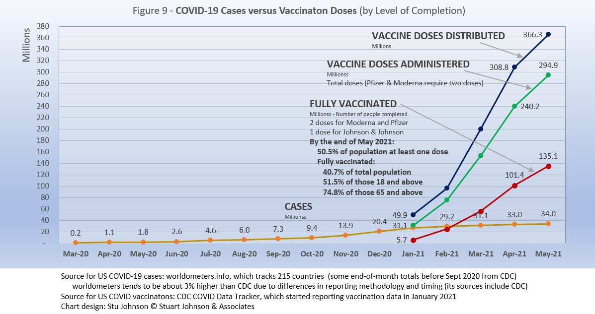
With remarkable speed (it usually takes years to develop vaccines), two COVID vaccines were granted emergency approval for use in the U.S. starting in January—the one by Pfizer requires super-cold storage, which limits its deployment. The other, by Moderna, requires cold storage similar to other vaccines. Both of these require two doses, which means that vaccine dosages available must be divided in two to determine the number of people covered. By my March report, Johnson & Johnson had been granted approval for a single-dose vaccine. The numbers in Figure 9 represent the status of all three vaccines as of May 31.
A person is considered "fully vaccinated" two weeks after the final (or only) vaccine dose; roughly six weeks for Pfizer and Moderna and four weeks for Johnson & Johnson.
Early on (still somewhat evident in March) there was much anxiety about vaccine availability and scheduling appointments. That is behind us and vaccinations are readily available to most of the population (there will always be some disparities and trouble spots, but in general most people who want the vaccine can get it). Now, the biggest concern is convincing the dubious, the deniers, and the resisters to get vaccinated and help the country reach herd immunity (about 70% of the population fully vaccinated). Some of the latest strategies to encourage vaccination is the provision of incentives, from free beer to lotteries for the fully vaccinated
Vaccinating over 300 million people in the United States (much less a majority of the billions around the world) is a daunting task. It is a huge logistical challenge, from manufacture to distribution to administration. Yet, it remains amazing that any of this is possible this soon after the identification of the virus just over a year ago.
There is a delicate balance between maintaining hope with the reality that this is a huge and complicated logistical operation that will take time, though that time is now measured in months instead of years. As the richer countries with access to more resources make progress, the global situation is raising issues of equity and fairness within and between countries. Even as the U.S. and other countries launch large scale vaccine distribution to a needy world community, the immensity of the need is so great that a common refrain heard now is whether this aid is too little, too late. As COVID fades into a bad memory in countries able to provide help, will the will to so remain high enough to produce the results needed to end this global pandemic?
We can grasp the hope that the end is in sight, but let's not throw it away by being foolhardy!
My wife and I have been fully vaccinated since mid-April. DuPage County, Illinois, where we live, has the highest vaccination rate in the Chicago area. With the latest changes in CDC and state guidelines, restrictions that seemed so permanent are being relaxed. I was out the other day, realized I did not have a mask with me, but the store where I was headed had a sign indicating that masks were needed only for the unvaccinated. I went inside, but felt somewhat guilty because so many still wore their masks (I saw several who read the sign, took off their masks, but then put them back on when they entered the store and saw so many people wearing theirs).
On Memorial Day, my wife and I went to walk at a local forest preserve. There were a lot of people, only a few wearing masks, yet there was a sense that distancing still mattered, even at a picnic or while walking on a trail. People around here are beginning to feel more free, but with a sense that there is still danger that requires common sense.
Maintaining Perspective
In the tendency to turn everything into a binary right-wrong or agree-disagree with the science perspective, we ignore the need to recognize the nature of science and the fact that we are dealing with very complicated issues. So, in addition to recommending excellent sources like the Centers for Disease Control and Prevention (CDC), it is also wise to consider multiple qualified sources.
While there has been much focus placed in trusting "the science," it is important to recognize that science itself changes over time based on research and available data. In the highly volatile political atmosphere we find ourselves in (not just in the U.S., but around the world), there is a danger of trying to silence voices of experts whose views are out of sync with "the science" as reported by the majority of media outlets. In an earlier report, I mentioned the
Greater Barrington Declaration, currently signed by nearly 57-thousand medical & public health scientists and medical practitioners, which states "As infectious disease epidemiologists and public health scientists we have grave concerns about the damaging physical and mental health impacts of the prevailing COVID-19 policies, and recommend an approach we call Focused Protection."
For a personal perspective from a scholar and practitioner who espouses an approach similar to the Focused Protection of the Greater Harrington Declaration, see comments by Scott W. Atlas, Robert Wesson Senior Fellow at the Hoover Institution at Stanford University, in an article "Science, Politics, and COVID: Will Truth Prevail?"
Recently on SeniorLifestyle I posted an article by Mallory Pickett of The New Yorker, "Sweden's Pandemic Experiment," which provides a fair evaluation of the very loose protocols adopted by Sweden, essentially a variation of the "Focused Protection" approach. The "jury is still out" on this one, so judge for yourself whether Sweden hit the mark any better than the area in which you live.
How we evaluate the many approaches used to deal with COVID will determine how we prepare for and approach the next global event.
My purpose in mentioning these sources is not to take a political position, but to recognize that there are dissenting voices that should be part of the conversation. The purpose of these monthly reports remains first and foremost to present the numbers about COVID-19 in a manner that helps you understand how the pandemic is progressing and how the U.S. compares to the world—and how to gain more perspective than might be gathered from the news alone.
Profile of Monitored Continents & Countries
(Data from worldometers.info).
| Rank | Country | Population | Share of World Population |
Density People per square km |
Urban Population |
Median Age |
| WORLD | 7.82B | 100% | -- | -- | -- | |
| Top 10 Countries by Population, plus Five Major Continents See lists of countries by continent |
||||||
| - | ASIA | 4.64B | 59.3% | 150 | 51 countries | 32 |
| 1 | China | 1.44B | 18.4% | 153 | 61% | 38 |
| 2 | India | 1.38B | 17.7% | 454 | 35% | 28 |
| - | AFRICA | 1.34BM | 17.1% | 45 | 59 countries | 20 |
| - | EUROPE | 747.7M | 9.6% | 34 | 44 countries | 43 |
| - | S AMERICA | 653.8M | 8.4% | 32 | 50 countries | 31 |
| - | N AMERICA | 368.9M | 4.7% | 29 | 5 countries | 39 |
| 3 | USA | 331.5M | 4.3% | 36 | 83% | 38 |
| 4 | Indonesia* | 274.5M | 3.5% | 151 | 56% | 30 |
| 5 | Pakistan* | 220.9M | 2.8% | 287 | 35% | 23 |
| 6 | Brazil | 212.9M | 2.7% | 25 | 88% | 33 |
| 7 | Nigeria* | 206.1M | 2.6% | 226 | 52% | 18 |
| 8 | Bangladesh* | 165.2M | 2.1% | 1,265 | 39% | 28 |
| 9 | Russia | 145.9M | 1.9% | 9 | 74% | 40 |
| 10 | Mexico | 129.3M | 1.7% | 66 | 84% | 29 |
| *these countries do not appear in the details because they have not yet reached a high enough threshold to be included Other Countries included in Analysis most have been in top 10 of one or more categories covered in this report at least one month since October 2020 |
||||||
| Rank | Country | Population | Share of World Population |
Density People per square km |
Urban Population |
Median Age |
| 17 | Turkey | 84.3M | 1.1% | 110 | 76% | 32 |
| 18 | Iran | 83.9M | 1.1% | 52 | 76% | 32 |
| 19 | Germany | 83.8M | 1.1% | 240 | 76% | 46 |
| 21 | United Kingdom | 67.9M | 0.9% | 281 | 83% | 40 |
| 22 | France | 65.3M | 0.8% | 119 | 82% | 42 |
| 23 | Italy | 60.4M | 0.8% | 206 | 69% | 47 |
| 29 | Colombia | 50.9M | 0.7% | 46 | 80% | 31 |
| 30 | Spain | 46.8M | 0.6% | 94 | 80% | 45 |
| 32 | Argentina | 45.2M | 0.6% | 17 | 93% | 32 |
| 39 | Canada | 37.7M | 0.5% | 4 | 81% | 41 |
| 43 | Peru | 32.9M | 0.4% | 26 | 79% | 31 |
| 63 | Chile | 19.1M | 0.2% | 26 | 85% | 35 |
| 67 | Ecuador | 17.6M | 0.2% | 71 | 63% | 28 |
| 80 | Bolivia | 11.7M | 0.1% | 11 | 69% | 26 |
| 81 | Belgium | 11.6M | 0.1% | 383 | 98% | 42 |
Scope of This Report
What I track
From the worldometers.info website I track the following Categories:
- Total Cases • Cases per Million
- Total Deaths • Deaths per Million
- Total Tests • Tests per Million (not reported at a Continental level)
- From Cases and Deaths, I calculate the Mortality Rate
Instead of reporting Cases per Million directly, I try to put raw numbers in the perspective of several key measures. These are a different way of expressing "per Million" statistics, but it seems easier to grasp.
- Country population as a proportion of global population
- Country cases and deaths as a proportion of global cases and deaths
- Country cases as a proportion of its own population
- Cases and deaths expressed as "1 in X" number of people
Who I monitor
My analysis covers countries that have appeared in the top-10 of the worldometers categories since September 2020. This includes most of the world's largest countries as well as some that are much smaller (see the chart in the previous section).
This article was also posted on SeniorLifestyle, which I edit
Search all articles by Stu Johnson
Building article list (this could take a few moments) ...Stu Johnson is owner of Stuart Johnson & Associates, a communications consultancy in Wheaton, Illinois focused on "making information make sense."
• E-mail the author (moc.setaicossajs@uts*)* For web-based email, you may need to copy and paste the address yourself.
Posted: June 155, 2021 Accessed 2,992 times
![]() Go to the list of most recent InfoMatters Blogs
Go to the list of most recent InfoMatters Blogs
![]() Search InfoMatters (You can expand the search to the entire site)
Search InfoMatters (You can expand the search to the entire site)
Loading requested view (this could take a few moments)...With the enormous and steady increase in the volume of our literature, we must rely more and more upon sympathetic selection, judicious editing, and the indexer who knows where to exercise discretion. Any simpleton can write a book, but it requires high skill to make an index.

InfoMatters
Category: Information / Topics: History • Information • Statistics • Trends
COVID-19 Perspectives for May 2021
by Stu Johnson
Building article list (this could take a few moments)...Posted: June 155, 2021
As U.S. and other countries prepare to reopen, trouble spots elsewhere show that the COVID-19 global pandemic is far from over…
Putting the COVID-19 pandemic in perspective (Number 11)
This series was spawned by my reaction to reporting early in the COVID-19 pandemic that focused on raw numbers. Big numbers are impressive, even frightening, but hard to comprehend. Rarely have we been given a context that helps lead to better understanding of the numbers or how to make comparisons between the U.S. and the rest of the world. This series turned into a monthly summary setting the U.S. numbers in global perspective. This analysis is based on data from worldometers.info, which monitors 215 countries. From those, I focus on details for 21 countries that have appeared in the top-10 of worldometers metrics since I started more detailed tracking in September 2020.
A note on reliability of data: It should be noted that the statistics reported by worldometers and other sources are only as good as the integrity of the reporting system in each country. China's statistics have increased so little since October that it is doubtful its numbers are accurate, so they are not included in some of the charts. Other countries have also had gaps in reporting, or made adjustments when admissions of underreporting have been made. While precise comparisons between countries may be brought into question, there is still enough information to make trends evident. That is why I may tend to round some numbers and watch for changes over two or three months rather than focusing on a single month, as significant as that may turn out to be.
Just after updating data for this report on May 31, there were new stories on June 1 that Peru was adjusting its numbers significantly upward. Indeed, some of them increased two and three-fold. That will show up in the report of June data.
Even though the U.S. may fully reopen this summer, these reports will continue as long as the pandemic persists around the world.
Report Sections:
• May at-a-glance
• The Continental View • USA Compared to Top-5 Countries
• COVID Deaths Compared to the Leading Causes of Death in the U.S.
• U.S. COVID Cases versus Vaccinations
• Profile of Monitored Continents & Countries • Scope of This Report
May-at-a-glance
- COVID-19 continued to spread around the world, reaching 171-million cases by the end of May, up 13% from April. After a rapid increase from September through January, February appeared to "bend the curve" downward, with only a slight upward move in March. April brought surges, particularly in Asia and South American, which continued and even worsened in some locations in May.
The blue "cone" in Figure 1 shows the possible high and low projections, with the bottom (roughly 85-million) representing the trajectory of the lower pace in late summer 2020 and the upper (185-million) representing a continuation of the surge from November through January. You can see that the curve for global cases started to bend down in February 2021, but then resumed in March, following the November-January rate of increase. That was not the case with the U.S., which I'll get to below. - The pattern for deaths tends to lag behind cases by several weeks, and the global increase continues to fall below that of cases—dropping from a 23% increase in January to 11% in March, then turning back up slightly with a 13% increase in April that continued into May. In the April report, I suggested that because of the lag in deaths, we would likely see an upswing in May, but the curve continued at roughly the same pace it has been on since January. The good news is that mortality rates are dropping, so an acceleration in cases is not matched with a corresponding increase in deaths.
- The U.S. continues to lead the world in the number of reported cases and deaths, and while cases represent 19.9% of global cases through May (with only 4% of world population), that is down from a high of 25.9% in January. Similarly, deaths have declined from 20.9% of the world total in September to 17.1% in May. As you will see in details to follow, while the U.S. outpaced everyone through the early months of the pandemic, the vast disparity is slowly shrinking. The projection cone surrounding USA Cases in Figure 1 shows a continued flattening of cases to the middle of the cone (roughly 22- to 52-million) since vaccinations started in January. That is a striking contrast to the global cases curve and projection cone.
Figure 1 also shows how much lower cases would be—at about 7-million by now, instead of 34-million—if they were proportional to the global population,. It would also mean just over 120-thousand deaths instead of 609-thousand. One must be careful, however, in stating the situation so simplistically, as reality is a complex set of factors. Yet, it cannot be denied that the U.S. share to date has been extraordinarily high compared to other large countries. - With vaccinations, the U.S. continues to move ahead with remarkable speed, though the pace slowed somewhat in May (see Figure 9). By the end of May, half of the U.S. population had received at least one dose (Moderna and Pfizer require two, Johnson & Johnson only one). 40.7% of the population was fully vaccinated (two weeks following the final shot), including 74.8% of those 65 and above.
In the last day or two, President Biden has encouraged another target for vaccinations, urging that 70% of Americans receive at least one dose by July 4. With states dropping restrictions (Illinois, where I live, is scheduled to officially "reopen" on June 11), the success of those decisions and behavior will be evident if the curves continue to flatten over coming months. There is definitely light at the end of the tunnel, but we're not out of the pandemic tunnel yet, and we cannot forget COVID-19 is a global pandemic and other parts of the world are still facing the worst.
The Continental View
While COVID-19 has been classified as a global pandemic, it is not distributed evenly around the world, though we began to see some shifts in patterns starting in April..
Asia accounts for 59.3% of the world's population (Figure 2), but only 29.9% of COVID cases in May (Figure 3A)—affecting a mere 1.1% of its population. After shrinking in proportion of cases since October, Asia has now reached its highest level since October (and statistics from China are likely badly underreported). Where Asia and Africa combined represent about three-quarters (76.4%) of the world's 7.8-billion people, Europe, South America and North America still account for two-thirds of cases (67.2% - Figure 3A) and three quarters of COVID deaths (77.1% - Figure 4A).
By raw numbers alone, Asia now has the highest number of reported COVID cases, surpassing both Europe and North America as it experienced a dramatic upturn in April and May. South America remains in fourth place, but is slowly accelerating in cases each month. On the other hand, North America began to flatten its curve back in January (when vaccinations began), and Europe (slower to get vaccinations started) showed a slight increase in pace in March and April before decelerating in May. Africa, second by population, remains a loner, with an almost flat curve compared to the other four large continents. (Oceania's population is too small to be statistically significant).
Remembering proportionality, the raw numbers of Figure 3B can be deceptive. Figure 3C gives a more realistic picture of impact by translating raw case numbers to percentage of population. After a sharp increase in January, North America has slowed down in month growth, but remains slightly above the global pace. That still leaves North America far above the other continents, with one in ten (10.8%) reported as having contracted COVID. Europe and South America remain above the global rate, with South America increasing slightly each month and Europe showing a small but noticeable dip in May.
Despite the reports of COVID surges in India and other parts of Asia similar to what Italy experienced at the beginning of the pandemic, the sheer size of the continent means it can absorb a lot of growth in cases before it causes a dramatic bend in the curve (as seen in North America in January).
In the last two weeks of May, cases in Asia increased by 3.7-million—more than half of the global increase of 7.2-million cases—with India alone accounting for 2.7-million cases. Yet, with a population of nearly 1.4-billion, the bend in the curve remains a minor statistical adjustment, masking the human impact. .
Africa, the second largest continent (1.3-billion, nearly the size of India), also remains far below the global pace for COVID cases, ending May with 4.8-million cases, or 0.4% of its own population.
The proportion of deaths between continents is even more distorted than that of cases. Figure 4A shows the steady increase in the proportion of deaths in Europe and the Americas through April. April ended with Asia and Africa (76.4% of world population) accounting for 22.9% of COVID deaths.
The growing crisis in India showed up in May deaths, with Asia hitting 19.2% (still below the high of 21.7% in October). Africa was down slightly in May. Europe's proportion went down for the first time since it started rising in November. South America has been increasing steadily since its low proportion in February. North America went down for the third month since it peaked in February.
The overall distribution for deaths through May shows how that trajectory lags behind cases and has progressed at a steadier rate.
By numbers alone, we can say that Africa continues at a very slow and steady pace in terms of COVID deaths. North America is slowing down. Europe remains on a steady path that may have entered a time of slower growth. Asia and South America continue as the current continental hot spots.
Back in October, Asia, Europe and the Americas were close together in raw numbers. Europe and North America began a steady upward climb, well above the others, with Europe surpassing North America by December. January saw a slowdown for both, but North America slowed even more beginning in March, so the divide between has continued to grow. Europe did show a slight slowing in May, but became the first continent to surpass 1-million deaths (out of 3.6-million total).
South America started at a slower pace before bending upward more noticeably in March, then ending May poised to cross into second place as North America flattens. Asia followed a similar pattern, though it was dropping further below South America until April when it started to rise, accelerating even more in May. Africa has remained the lowest and slowest in growth, ending May with 131-thousand deaths.
Comparison of U.S. to Top-5 Countries
Cases
USA stays at #1. Belgium moves up one to #2, France down one to #3. Argentina appears at #4, pushing Spain to #5 and Brazil out of the top-5.
Early on, the small European country of Belgium was leading the world in COVID cases as a proportion of its population (Figure 5A). The U.S. and Spain were nearly a full percentage point lower in October. Belgium began to level off in December, while the U.S. continued climbing, with a slight acceleration in December that continued into January, then began to slow. Even so, the U.S. ended May with 10.2% of its population with reported COVID cases, far above the 2.2% global level and clearly separated from the next four countries, though that gap is closing.
As the U.S. climbed to 8% in January, Belgium showed a very slight decline before bending upward slightly. France started October in fourth place, rose noticeably in December, virtually tied with Belgium in April, then slowed to end May at #3, allowing Belgium to keep its pace to reclaim #2.
Argentina has seen cases rise steadily, higher than but at about the pace of global increases until April when it started to accelerate, surpassing Spain to end May at #4. Spain was more erratic, with an increase in January that paralleled that of the U.S., then slowing.
Another way to look at population proportion is the measure "1 in." The global figure of 2.2% means that 1 in 46 people in the world have had COVID (and that only by official record keeping, not including any unreported and likely asymptomatic cases). For the U.S. it is 1 in
10. For Spain 1 in 13.
The same five countries appear in the lowest-5 (of the 21 I track) in May, with India moving up one place and Mexico down one.
At the low end (Fig. 5B), the five lowest countries for cases by proportion of population are much closer to the global figure of 2.2% of population with confirmed cases of COVID-19 at the end of May.
Iran and India both bent upward noticeably in April and May—enough to put Iran at the top of the lowest-5 last month. Ironically, although India is experiencing crisis-level surges in some areas, it is such a large country (in population) that the upward movement in April and May only moved it up to second-from the bottom in cases as proportion of population among the 21 countries I monitor.
Those countries represent a considerable spread in size, from India, the second largest country, to Bolivia, ranked number 50 of the 215 countries tracked by worldometers. For Iran, its 3.5% level represents 1 in 29 people, for India it is 1 in 49 and for Mexico it is 1 in 54.
Because the size of countries makes the use of raw case numbers illusory, another measure I find helpful is the rate of change from month to month (Figure 5C).
For this chart, countries are selected based on the change over two-months (end of March to end of May for this report). Except for the U.S. (which will appear every month), the mix has changed since the last report, with Argentina and Columbia replacing France and Chile. India moves up one place to #1, Argentina appears at #2, Turkey moves down two to #3, Iran moves down one to #4 and Columbia appears at #5.
The overall trend (red line) was moving down through February, then started moving up again, with the largest increase in April, at 17%. As noted last month, as global change goes down, the variance between countries in the top-5 tends to flatten out (look at February). March saw Turkey and Iran with changes greater than the global level. April found all of the top-5 above the global level by a wide margin. In May Turkey dropped below the global level, while India and Argentina were well above it, and Iran and Colombia above but closer.
India had the highest change over the previous month, 54% in April, followed by a 48% increase in May.
The U.S. was above global levels of monthly change through January, then dropped below it from February through May, which showed only a 3% change over April.
Deaths
Because deaths as a percentage of population is such a small number, the "deaths per million" metric provides a comparable measure.
The same countries appear in the May top-5 chart as in April, but the mix changes. Brazil moves up two places to #1, Belgium drops one to #2, Peru is up two to #3, Italy drops two to #4 and UK moves down one to #5. USA is very close behind at #6.
As Figure 6A shows, Brazil has bent upward in deaths per million starting in March, pushing it just beyond Belgium to finish May at the top of the 21 countries I monitor. It is practically a four-way tie, however, with Brazil, Belgium, Peru and Italy all within 75 points. The UK, with its aggressive testing and vaccination efforts, remains in the top but shows the most pronounced flattening of its curve starting in March.
As observed last month, the overall trend shown in Figure 6A is that the UK and USA, with aggressive testing and vaccination, are beginning to slow the death rate, while Europe (represented by Belgium and Italy) continue to climb, showing the frustration over slow vaccination roll-outs, including delays because of suspension of the AstraZeneca vaccine over concerns about extremely rare but serious blood clotting.
At the same time, the upward movement of Brazil and Peru (each up two places) follows the movement of COVID hot spots to South America.
The same five countries, in the same order, continue in the lowest-5 in Deaths per Million (of the 21 countries tracked for this report).
India remained well below the global rate of 467 deaths per million at the end of May, the other four are all above that rate. Except for Canada, which shows some slowing since February (similar to USA), the others all show increases in April and May at a pace slightly higher than the global rate.
As with the comparable chart for Rate of Change for Cases (Figure 5C), countries are selected based on the change over two-months (end of March to end of May for this report). Except for the U.S. (which will appear every month), the mix has changed since the last report, with Columbia and Argentina replacing Peru and Russia. India moves up two places to #1, Turkey remains at #2, Brazil drops two places to #3, Columbia and Argentina appear at #4 and #5.
The trend
in the rate of change in deaths (red line in Figure 6C) shows the delayed connection with cases. Monthly changes for cases were trending down from October through February, then started moving up again in March. For deaths the trend peaked in December, hit a low in March, then rose again in April and May (though global changes were much closer to the previous month than some of the countries in the top-5.
India was below the global rate of change through March, then more than doubled the global rate with 28% in April and doubled that with 58% in May. All five countries were at or above the global level in April and May. USA started out above global levels through February, than dropped below it, ending May with a 3% change from April.
Mortality Rates (percentage of deaths against reported cases) have been slowly declining. This is not surprising as several factors came into play: the ratio of community spread versus outbreaks (nursing homes, similar confined settings) increased, lessons being applied to treatment, increased testing (which would expand the spread between reported cases and deaths), and increasing vaccinations since January (though that should impact both cases and deaths).
The top-5 in mortality rate (among the 21 countries observed) stand out because for the most part they had not been showing up in other charts until the past month or two. All five countries carried over from April, in the same order. Except for Mexico, which has been increasing slightly each month since January, the other four show a downward tilt in their curves, but all remain above the global level, which stood at 2.1% at the end of May.
All five countries reappear this month, in the same order.
In last month's report, the chart looked very positive, with all five countries on a steady downward slope, and all below the global level. This month, they are still below the global level, but there is some slowing of the rate for France, and an upward turn for India and Turkey.
How real is the threat of death from COVID? That's where successful mitigation comes in. Worldwide, by May, 1 in 2,198 people have died from COVID. In the U.S., while the mortality rate is low, because the number of cases is so high, 1 in 547 have died through May. With low mortality, the U.S. should have been able to keep deaths much lower, but the extraordinarily high number of cases means more deaths. Without a better-than-global mortality rate, the U.S. death rate would be far higher. And compared to the 1918 pandemic, it could be ten times worse. The response of the health care system is part of keeping mortality down, but it's far too early to detail the cause for that positive piece of the COVID picture in the U.S. Even at the global level of 2.1%, the U.S. would have had 715-thousand deaths by the end of May, instead of 609-thousand.
Tests
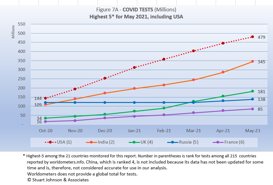
The same five countries remain on top in COVID testings, in the same order as April.
The U.S. is far ahead of other countries in reported COVID tests administered, at 479-million, 39% percent ahead of India (but narrowing, with 56% last month.). UK has continued to accelerate testing, moving from #4 through February into a stronger #3 position for April and May. Russia has shown a very modest increase, which brings into question the reliability of its reporting.
These are raw numbers, so it is important to recognize the size of the country. It is also the case that COVID tests can be administered multiple times to the same person, so it cannot be assumed that the U.S. has tested almost all of its population of some 330-million. Some schools and organizations with in-person gatherings are testing as frequently as once a week for those who are not yet fully vaccinated. That's a lot of testing!
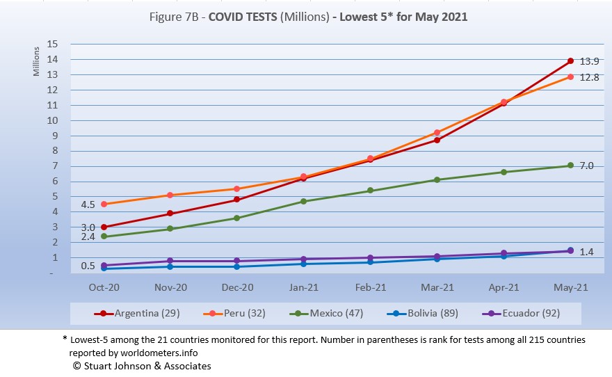
The same five countries carry over from April, with changes in position: Argentina moved up one place to #1, moving Peru to #2, Mexico stays at #3, and Bolivia and Ecuador exchange #4 and #5 positions.
There is tremendous disparity between countries in terms of testing. The five countries (among the 21 monitored) with the lowest reported number of tests are all in South America. Peru and Argentina are good examples, both having achieved more than 12-million tests through May. Argentina (13.9-million tests for its 45-million population) is well below Spain (49.7-million tests and a population of 47-million). Similarly, Peru (12.8-million tests and 33-million people) is also well below Canada (34.7-million tests and 38-million people). At the bottom, Ecuador has reported 1.4-milion tests for its nearly 18-million people and Bolivia has tested 1.5-million for its 12-million population.
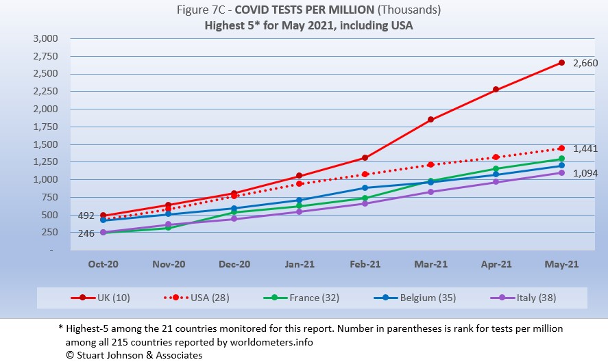
Tests per million adds another perspective. Fig. 7C shows the five countries with the highest tests per million. Italy replaces Spain at #5, the others all remain in the same order as April.
The UK, already the most aggressive in testing, increased its numeric lead even more in May, with a reported 2.66-million tests per million population, is approaching the equivalent of 3 tests per person. The U.S. continues on a straight line trajectory, reaching 1.44-million tests per million, more than one per person. France, Belgium and Italy track close to each other, all ending with more than 1-million tests per million in May. France, with some variance in its curve has wiggled its way from #5 to #3 since October, but the bottom four (of the top five) have tracked fairly close to each other in that time.
Anything over 1,000 represents more tests than people (1,000 on the chart actually means 1,000,000), but as mentioned above, that does not mean that everyone had been tested. Some people have been tested more than once, and some are being test regularly or with increased frequency.
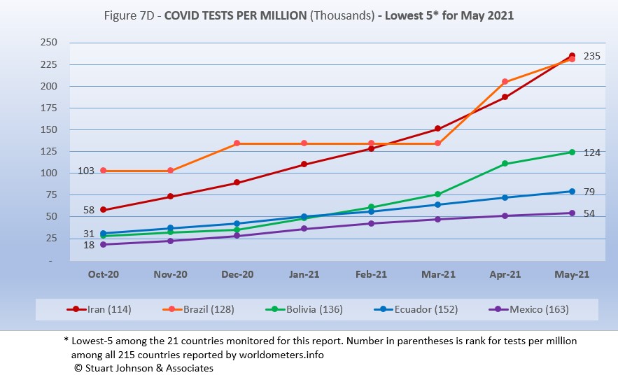
The same five countries appear as the lowest five in tests per million in May, with Iran and Brazil trading rankings once again (Brazil's reporting has been sporadic, so it has zigzagged its way to a virtual tie with Iran for tests per million).
While still at the bottom of the 21 countries monitored for this report, Iran has made the most substantial progress, increasing three-fold since October. Though Brazil is now even with Iran, it started much higher, so its progress is good but less impressive. Bolivia is also showing more progress in the last two months, while Ecuador and Mexico continue at a slow and steady pace.
While improvement is evident in all five, the equivalent proportion of tests to population remains very low, from roughly 5% to 25%. This illustrates the arguments over inequity in resources among countries.
Causes of Death in U.S.
Early in the reporting on COVID, as the death rate climbed in the U.S., a great deal of attention was given to benchmarks, most notably as it approached 58,000, matching the number of American military deaths in the Vietnam War. At that time, I wrote the first article in this series, "About Those Numbers," in which I looked at ways of viewing the data, which at the time of that writing in May 2020 was still focused on worst-case models and familiar benchmarks, like Vietnam. Part of my approach in that article was to put the U.S. COVID deaths on a timeline against not only mileposts like war deaths or significant numbers (i.e., every 50,000 or 100,000), but against the reality of the top-10 causes of death each year, numbers available from the CDC.
Figure 8 shows the number of U.S. COVID cases and deaths against the top-10 causes of death reported by CDC for 2018 (the latest data available), along with several other mileposts from wars and the 1918 pandemic. Notice that for nearly nine months, the curve for deaths was increasing at a faster rate than cases. Then, starting in November the curve for cases took a decided turn upward, while deaths increased at a more moderate pace.
Most media sources reported that the U.S. would pass 500,000 deaths on February 22, 2021. The CDC reported 497,415 deaths on February 21, while worldometer.info was already reporting 512,068. As mentioned elsewhere in this report, worldometer tends to be about 3% ahead of CDC and Johns Hopkins, a matter of a few days difference in data collection. At any rate, it is clear that February 2020 saw the U.S. death toll from COVID pass the 500,000 mark, headed toward 600,000.
The February slowdown in cases was met by a barely perceptible slowdown in deaths, because as pointed out earlier, deaths trail changes in cases. That trend continued in March and bent downward even more in April. In fact, if the trajectory from November to February had continued (the upper edge of the blue cone), we would have seen close to 825-thousand deaths by the end of May. The total of 609-thousand at the end of May did pass 599-thousand, the number who died from Cancer in 2018. The next benchmark is the #1 cause of death, heart disease, at 655-thousand. How close are we to that?
The latest "Ensemble Forecast" from CDC suggests this for the immediate future:
...tthe number of newly reported COVID-19 deaths will likely decrease over the next 4 weeks, with 800 to 4,800 new deaths likely reported in the week ending June 26, 2021. The national ensemble predicts that a total of 601,000 to 614,000 COVID-19 deaths will be reported by this date.
Note: As I've referenced in the notes for several charts, the data from worldometers.info tends to be ahead of CDC and Johns Hopkins by about 3%, because of reporting methodology and timing. I use it as a primary source because its main table is very easy to sort and provides the relevant data for these reports.
Perspective
The 1918-19 Spanish Flu pandemic is estimated to have struck 500 million people, 26.3% of the world population of 1.9-billion at that time. By contrast, we're now at 2.2% of the global population. Deaths a century ago have been widely estimated at between 50- and 100-million worldwide, putting the global mortality rate somewhere between 10 and 20-percent. It has been estimated that 675,000 died in the U.S.
IF COVID-19 hit at the same rate as 1918, we would see about 2-billion cases worldwide by the time COVID-19 is over, with the global population now at 7.8-billion—four times what it was in 1918. There would be 200- to 400-million deaths. The U.S. is estimated to have had 27-million cases (one-quarter of the population of 108-million) and 675,000 deaths. Today, with a population of 330-millions (a three-fold increase from 1918) this would mean more than 80-million cases, and 2- to 4-million deaths.
However, at the present rate of confirmed cases and mortality while the total number of global cases could approach 500 million or more—comparable to 1918 in number, that would be one-quarter of 1918 when taking population growth into account . .. and assuming the pandemic persists as long as the Spanish Flu, which went on in three waves over a two year period. At the present rate of increase (20-million cases per month) it would take another 16 months to reach 500-million, somewhere around September 2024.
If the total number of cases globally did approach 500-million, using the global mortality rate of 2.2% in May, there would be roughly 11-million deaths worldwide, tragic but far below the number reported for 1918 (50-million) with an even wider gap (200 million) when taking population growth into account.
With vaccination in progress and expected to be completed in the U.S. by the end of summer, the end of COVID-19 could come sooner. Like 1918, however, there could be complicating factors such as the growing number of mutations that are more highly transmissible (but not necessarily more deadly). It seems unlikely that the number of cases worldwide will reach 500-mllion, unless current and potential hot spots in Asia and South America continue to grow. Another wild card is Africa, which could remain an outlier during this pandemic, or explode into a major hot spot. While we in the U.S. think the end of the pandemic is in sight, it is still too early to make predictions on the duration and severity of the COVID-19 pandemic.
The contrast demonstrates the vast difference in scale between the Spanish Flu pandemic a century ago and COVID-19 at the present time. Key differences are the mitigation efforts, available treatment today (though still leaving the health care system overwhelmed in some areas), and the beginning of vaccine distribution. In addition, in 1918 much of the world was focused on a brutal war among nations (World War I) rather than waging a war against the pandemic, which ran its course and was undoubtedly made much worse by the war, with trans-national troop movements, the close quarters of trench warfare, and large public gatherings supporting or protesting the war.
Vaccinations in the U.S.
With remarkable speed (it usually takes years to develop vaccines), two COVID vaccines were granted emergency approval for use in the U.S. starting in January—the one by Pfizer requires super-cold storage, which limits its deployment. The other, by Moderna, requires cold storage similar to other vaccines. Both of these require two doses, which means that vaccine dosages available must be divided in two to determine the number of people covered. By my March report, Johnson & Johnson had been granted approval for a single-dose vaccine. The numbers in Figure 9 represent the status of all three vaccines as of May 31.
A person is considered "fully vaccinated" two weeks after the final (or only) vaccine dose; roughly six weeks for Pfizer and Moderna and four weeks for Johnson & Johnson.
Early on (still somewhat evident in March) there was much anxiety about vaccine availability and scheduling appointments. That is behind us and vaccinations are readily available to most of the population (there will always be some disparities and trouble spots, but in general most people who want the vaccine can get it). Now, the biggest concern is convincing the dubious, the deniers, and the resisters to get vaccinated and help the country reach herd immunity (about 70% of the population fully vaccinated). Some of the latest strategies to encourage vaccination is the provision of incentives, from free beer to lotteries for the fully vaccinated
Vaccinating over 300 million people in the United States (much less a majority of the billions around the world) is a daunting task. It is a huge logistical challenge, from manufacture to distribution to administration. Yet, it remains amazing that any of this is possible this soon after the identification of the virus just over a year ago.
There is a delicate balance between maintaining hope with the reality that this is a huge and complicated logistical operation that will take time, though that time is now measured in months instead of years. As the richer countries with access to more resources make progress, the global situation is raising issues of equity and fairness within and between countries. Even as the U.S. and other countries launch large scale vaccine distribution to a needy world community, the immensity of the need is so great that a common refrain heard now is whether this aid is too little, too late. As COVID fades into a bad memory in countries able to provide help, will the will to so remain high enough to produce the results needed to end this global pandemic?
We can grasp the hope that the end is in sight, but let's not throw it away by being foolhardy!
My wife and I have been fully vaccinated since mid-April. DuPage County, Illinois, where we live, has the highest vaccination rate in the Chicago area. With the latest changes in CDC and state guidelines, restrictions that seemed so permanent are being relaxed. I was out the other day, realized I did not have a mask with me, but the store where I was headed had a sign indicating that masks were needed only for the unvaccinated. I went inside, but felt somewhat guilty because so many still wore their masks (I saw several who read the sign, took off their masks, but then put them back on when they entered the store and saw so many people wearing theirs).
On Memorial Day, my wife and I went to walk at a local forest preserve. There were a lot of people, only a few wearing masks, yet there was a sense that distancing still mattered, even at a picnic or while walking on a trail. People around here are beginning to feel more free, but with a sense that there is still danger that requires common sense.
Maintaining Perspective
In the tendency to turn everything into a binary right-wrong or agree-disagree with the science perspective, we ignore the need to recognize the nature of science and the fact that we are dealing with very complicated issues. So, in addition to recommending excellent sources like the Centers for Disease Control and Prevention (CDC), it is also wise to consider multiple qualified sources.
While there has been much focus placed in trusting "the science," it is important to recognize that science itself changes over time based on research and available data. In the highly volatile political atmosphere we find ourselves in (not just in the U.S., but around the world), there is a danger of trying to silence voices of experts whose views are out of sync with "the science" as reported by the majority of media outlets. In an earlier report, I mentioned the
Greater Barrington Declaration, currently signed by nearly 57-thousand medical & public health scientists and medical practitioners, which states "As infectious disease epidemiologists and public health scientists we have grave concerns about the damaging physical and mental health impacts of the prevailing COVID-19 policies, and recommend an approach we call Focused Protection."
For a personal perspective from a scholar and practitioner who espouses an approach similar to the Focused Protection of the Greater Harrington Declaration, see comments by Scott W. Atlas, Robert Wesson Senior Fellow at the Hoover Institution at Stanford University, in an article "Science, Politics, and COVID: Will Truth Prevail?"
Recently on SeniorLifestyle I posted an article by Mallory Pickett of The New Yorker, "Sweden's Pandemic Experiment," which provides a fair evaluation of the very loose protocols adopted by Sweden, essentially a variation of the "Focused Protection" approach. The "jury is still out" on this one, so judge for yourself whether Sweden hit the mark any better than the area in which you live.
How we evaluate the many approaches used to deal with COVID will determine how we prepare for and approach the next global event.
My purpose in mentioning these sources is not to take a political position, but to recognize that there are dissenting voices that should be part of the conversation. The purpose of these monthly reports remains first and foremost to present the numbers about COVID-19 in a manner that helps you understand how the pandemic is progressing and how the U.S. compares to the world—and how to gain more perspective than might be gathered from the news alone.
Profile of Monitored Continents & Countries
(Data from worldometers.info).
| Rank | Country | Population | Share of World Population |
Density People per square km |
Urban Population |
Median Age |
| WORLD | 7.82B | 100% | -- | -- | -- | |
| Top 10 Countries by Population, plus Five Major Continents See lists of countries by continent |
||||||
| - | ASIA | 4.64B | 59.3% | 150 | 51 countries | 32 |
| 1 | China | 1.44B | 18.4% | 153 | 61% | 38 |
| 2 | India | 1.38B | 17.7% | 454 | 35% | 28 |
| - | AFRICA | 1.34BM | 17.1% | 45 | 59 countries | 20 |
| - | EUROPE | 747.7M | 9.6% | 34 | 44 countries | 43 |
| - | S AMERICA | 653.8M | 8.4% | 32 | 50 countries | 31 |
| - | N AMERICA | 368.9M | 4.7% | 29 | 5 countries | 39 |
| 3 | USA | 331.5M | 4.3% | 36 | 83% | 38 |
| 4 | Indonesia* | 274.5M | 3.5% | 151 | 56% | 30 |
| 5 | Pakistan* | 220.9M | 2.8% | 287 | 35% | 23 |
| 6 | Brazil | 212.9M | 2.7% | 25 | 88% | 33 |
| 7 | Nigeria* | 206.1M | 2.6% | 226 | 52% | 18 |
| 8 | Bangladesh* | 165.2M | 2.1% | 1,265 | 39% | 28 |
| 9 | Russia | 145.9M | 1.9% | 9 | 74% | 40 |
| 10 | Mexico | 129.3M | 1.7% | 66 | 84% | 29 |
| *these countries do not appear in the details because they have not yet reached a high enough threshold to be included Other Countries included in Analysis most have been in top 10 of one or more categories covered in this report at least one month since October 2020 |
||||||
| Rank | Country | Population | Share of World Population |
Density People per square km |
Urban Population |
Median Age |
| 17 | Turkey | 84.3M | 1.1% | 110 | 76% | 32 |
| 18 | Iran | 83.9M | 1.1% | 52 | 76% | 32 |
| 19 | Germany | 83.8M | 1.1% | 240 | 76% | 46 |
| 21 | United Kingdom | 67.9M | 0.9% | 281 | 83% | 40 |
| 22 | France | 65.3M | 0.8% | 119 | 82% | 42 |
| 23 | Italy | 60.4M | 0.8% | 206 | 69% | 47 |
| 29 | Colombia | 50.9M | 0.7% | 46 | 80% | 31 |
| 30 | Spain | 46.8M | 0.6% | 94 | 80% | 45 |
| 32 | Argentina | 45.2M | 0.6% | 17 | 93% | 32 |
| 39 | Canada | 37.7M | 0.5% | 4 | 81% | 41 |
| 43 | Peru | 32.9M | 0.4% | 26 | 79% | 31 |
| 63 | Chile | 19.1M | 0.2% | 26 | 85% | 35 |
| 67 | Ecuador | 17.6M | 0.2% | 71 | 63% | 28 |
| 80 | Bolivia | 11.7M | 0.1% | 11 | 69% | 26 |
| 81 | Belgium | 11.6M | 0.1% | 383 | 98% | 42 |
Scope of This Report
What I track
From the worldometers.info website I track the following Categories:
- Total Cases • Cases per Million
- Total Deaths • Deaths per Million
- Total Tests • Tests per Million (not reported at a Continental level)
- From Cases and Deaths, I calculate the Mortality Rate
Instead of reporting Cases per Million directly, I try to put raw numbers in the perspective of several key measures. These are a different way of expressing "per Million" statistics, but it seems easier to grasp.
- Country population as a proportion of global population
- Country cases and deaths as a proportion of global cases and deaths
- Country cases as a proportion of its own population
- Cases and deaths expressed as "1 in X" number of people
Who I monitor
My analysis covers countries that have appeared in the top-10 of the worldometers categories since September 2020. This includes most of the world's largest countries as well as some that are much smaller (see the chart in the previous section).
This article was also posted on SeniorLifestyle, which I edit
Search all articles by Stu Johnson
Building article list (this could take a few moments) ...Stu Johnson is owner of Stuart Johnson & Associates, a communications consultancy in Wheaton, Illinois focused on "making information make sense."
• E-mail the author (moc.setaicossajs@uts*)* For web-based email, you may need to copy and paste the address yourself.
Posted: June 155, 2021 Accessed 2,993 times
![]() Go to the list of most recent InfoMatters Blogs
Go to the list of most recent InfoMatters Blogs
![]() Search InfoMatters (You can expand the search to the entire site)
Search InfoMatters (You can expand the search to the entire site)
Loading requested view (this could take a few moments)...InfoMatters
Category: Information / Topics: History • Information • Statistics • Trends
COVID-19 Perspectives for May 2021
by Stu Johnson
Building article list (this could take a few moments)...Posted: June 155, 2021
As U.S. and other countries prepare to reopen, trouble spots elsewhere show that the COVID-19 global pandemic is far from over…
Putting the COVID-19 pandemic in perspective (Number 11)
This series was spawned by my reaction to reporting early in the COVID-19 pandemic that focused on raw numbers. Big numbers are impressive, even frightening, but hard to comprehend. Rarely have we been given a context that helps lead to better understanding of the numbers or how to make comparisons between the U.S. and the rest of the world. This series turned into a monthly summary setting the U.S. numbers in global perspective. This analysis is based on data from worldometers.info, which monitors 215 countries. From those, I focus on details for 21 countries that have appeared in the top-10 of worldometers metrics since I started more detailed tracking in September 2020.
A note on reliability of data: It should be noted that the statistics reported by worldometers and other sources are only as good as the integrity of the reporting system in each country. China's statistics have increased so little since October that it is doubtful its numbers are accurate, so they are not included in some of the charts. Other countries have also had gaps in reporting, or made adjustments when admissions of underreporting have been made. While precise comparisons between countries may be brought into question, there is still enough information to make trends evident. That is why I may tend to round some numbers and watch for changes over two or three months rather than focusing on a single month, as significant as that may turn out to be.
Just after updating data for this report on May 31, there were new stories on June 1 that Peru was adjusting its numbers significantly upward. Indeed, some of them increased two and three-fold. That will show up in the report of June data.
Even though the U.S. may fully reopen this summer, these reports will continue as long as the pandemic persists around the world.
Report Sections:
• May at-a-glance
• The Continental View • USA Compared to Top-5 Countries
• COVID Deaths Compared to the Leading Causes of Death in the U.S.
• U.S. COVID Cases versus Vaccinations
• Profile of Monitored Continents & Countries • Scope of This Report
May-at-a-glance
- COVID-19 continued to spread around the world, reaching 171-million cases by the end of May, up 13% from April. After a rapid increase from September through January, February appeared to "bend the curve" downward, with only a slight upward move in March. April brought surges, particularly in Asia and South American, which continued and even worsened in some locations in May.
The blue "cone" in Figure 1 shows the possible high and low projections, with the bottom (roughly 85-million) representing the trajectory of the lower pace in late summer 2020 and the upper (185-million) representing a continuation of the surge from November through January. You can see that the curve for global cases started to bend down in February 2021, but then resumed in March, following the November-January rate of increase. That was not the case with the U.S., which I'll get to below. - The pattern for deaths tends to lag behind cases by several weeks, and the global increase continues to fall below that of cases—dropping from a 23% increase in January to 11% in March, then turning back up slightly with a 13% increase in April that continued into May. In the April report, I suggested that because of the lag in deaths, we would likely see an upswing in May, but the curve continued at roughly the same pace it has been on since January. The good news is that mortality rates are dropping, so an acceleration in cases is not matched with a corresponding increase in deaths.
- The U.S. continues to lead the world in the number of reported cases and deaths, and while cases represent 19.9% of global cases through May (with only 4% of world population), that is down from a high of 25.9% in January. Similarly, deaths have declined from 20.9% of the world total in September to 17.1% in May. As you will see in details to follow, while the U.S. outpaced everyone through the early months of the pandemic, the vast disparity is slowly shrinking. The projection cone surrounding USA Cases in Figure 1 shows a continued flattening of cases to the middle of the cone (roughly 22- to 52-million) since vaccinations started in January. That is a striking contrast to the global cases curve and projection cone.
Figure 1 also shows how much lower cases would be—at about 7-million by now, instead of 34-million—if they were proportional to the global population,. It would also mean just over 120-thousand deaths instead of 609-thousand. One must be careful, however, in stating the situation so simplistically, as reality is a complex set of factors. Yet, it cannot be denied that the U.S. share to date has been extraordinarily high compared to other large countries. - With vaccinations, the U.S. continues to move ahead with remarkable speed, though the pace slowed somewhat in May (see Figure 9). By the end of May, half of the U.S. population had received at least one dose (Moderna and Pfizer require two, Johnson & Johnson only one). 40.7% of the population was fully vaccinated (two weeks following the final shot), including 74.8% of those 65 and above.
In the last day or two, President Biden has encouraged another target for vaccinations, urging that 70% of Americans receive at least one dose by July 4. With states dropping restrictions (Illinois, where I live, is scheduled to officially "reopen" on June 11), the success of those decisions and behavior will be evident if the curves continue to flatten over coming months. There is definitely light at the end of the tunnel, but we're not out of the pandemic tunnel yet, and we cannot forget COVID-19 is a global pandemic and other parts of the world are still facing the worst.
The Continental View
While COVID-19 has been classified as a global pandemic, it is not distributed evenly around the world, though we began to see some shifts in patterns starting in April..
Asia accounts for 59.3% of the world's population (Figure 2), but only 29.9% of COVID cases in May (Figure 3A)—affecting a mere 1.1% of its population. After shrinking in proportion of cases since October, Asia has now reached its highest level since October (and statistics from China are likely badly underreported). Where Asia and Africa combined represent about three-quarters (76.4%) of the world's 7.8-billion people, Europe, South America and North America still account for two-thirds of cases (67.2% - Figure 3A) and three quarters of COVID deaths (77.1% - Figure 4A).
By raw numbers alone, Asia now has the highest number of reported COVID cases, surpassing both Europe and North America as it experienced a dramatic upturn in April and May. South America remains in fourth place, but is slowly accelerating in cases each month. On the other hand, North America began to flatten its curve back in January (when vaccinations began), and Europe (slower to get vaccinations started) showed a slight increase in pace in March and April before decelerating in May. Africa, second by population, remains a loner, with an almost flat curve compared to the other four large continents. (Oceania's population is too small to be statistically significant).
Remembering proportionality, the raw numbers of Figure 3B can be deceptive. Figure 3C gives a more realistic picture of impact by translating raw case numbers to percentage of population. After a sharp increase in January, North America has slowed down in month growth, but remains slightly above the global pace. That still leaves North America far above the other continents, with one in ten (10.8%) reported as having contracted COVID. Europe and South America remain above the global rate, with South America increasing slightly each month and Europe showing a small but noticeable dip in May.
Despite the reports of COVID surges in India and other parts of Asia similar to what Italy experienced at the beginning of the pandemic, the sheer size of the continent means it can absorb a lot of growth in cases before it causes a dramatic bend in the curve (as seen in North America in January).
In the last two weeks of May, cases in Asia increased by 3.7-million—more than half of the global increase of 7.2-million cases—with India alone accounting for 2.7-million cases. Yet, with a population of nearly 1.4-billion, the bend in the curve remains a minor statistical adjustment, masking the human impact. .
Africa, the second largest continent (1.3-billion, nearly the size of India), also remains far below the global pace for COVID cases, ending May with 4.8-million cases, or 0.4% of its own population.
The proportion of deaths between continents is even more distorted than that of cases. Figure 4A shows the steady increase in the proportion of deaths in Europe and the Americas through April. April ended with Asia and Africa (76.4% of world population) accounting for 22.9% of COVID deaths.
The growing crisis in India showed up in May deaths, with Asia hitting 19.2% (still below the high of 21.7% in October). Africa was down slightly in May. Europe's proportion went down for the first time since it started rising in November. South America has been increasing steadily since its low proportion in February. North America went down for the third month since it peaked in February.
The overall distribution for deaths through May shows how that trajectory lags behind cases and has progressed at a steadier rate.
By numbers alone, we can say that Africa continues at a very slow and steady pace in terms of COVID deaths. North America is slowing down. Europe remains on a steady path that may have entered a time of slower growth. Asia and South America continue as the current continental hot spots.
Back in October, Asia, Europe and the Americas were close together in raw numbers. Europe and North America began a steady upward climb, well above the others, with Europe surpassing North America by December. January saw a slowdown for both, but North America slowed even more beginning in March, so the divide between has continued to grow. Europe did show a slight slowing in May, but became the first continent to surpass 1-million deaths (out of 3.6-million total).
South America started at a slower pace before bending upward more noticeably in March, then ending May poised to cross into second place as North America flattens. Asia followed a similar pattern, though it was dropping further below South America until April when it started to rise, accelerating even more in May. Africa has remained the lowest and slowest in growth, ending May with 131-thousand deaths.
Comparison of U.S. to Top-5 Countries
Cases
USA stays at #1. Belgium moves up one to #2, France down one to #3. Argentina appears at #4, pushing Spain to #5 and Brazil out of the top-5.
Early on, the small European country of Belgium was leading the world in COVID cases as a proportion of its population (Figure 5A). The U.S. and Spain were nearly a full percentage point lower in October. Belgium began to level off in December, while the U.S. continued climbing, with a slight acceleration in December that continued into January, then began to slow. Even so, the U.S. ended May with 10.2% of its population with reported COVID cases, far above the 2.2% global level and clearly separated from the next four countries, though that gap is closing.
As the U.S. climbed to 8% in January, Belgium showed a very slight decline before bending upward slightly. France started October in fourth place, rose noticeably in December, virtually tied with Belgium in April, then slowed to end May at #3, allowing Belgium to keep its pace to reclaim #2.
Argentina has seen cases rise steadily, higher than but at about the pace of global increases until April when it started to accelerate, surpassing Spain to end May at #4. Spain was more erratic, with an increase in January that paralleled that of the U.S., then slowing.
Another way to look at population proportion is the measure "1 in." The global figure of 2.2% means that 1 in 46 people in the world have had COVID (and that only by official record keeping, not including any unreported and likely asymptomatic cases). For the U.S. it is 1 in
10. For Spain 1 in 13.
The same five countries appear in the lowest-5 (of the 21 I track) in May, with India moving up one place and Mexico down one.
At the low end (Fig. 5B), the five lowest countries for cases by proportion of population are much closer to the global figure of 2.2% of population with confirmed cases of COVID-19 at the end of May.
Iran and India both bent upward noticeably in April and May—enough to put Iran at the top of the lowest-5 last month. Ironically, although India is experiencing crisis-level surges in some areas, it is such a large country (in population) that the upward movement in April and May only moved it up to second-from the bottom in cases as proportion of population among the 21 countries I monitor.
Those countries represent a considerable spread in size, from India, the second largest country, to Bolivia, ranked number 50 of the 215 countries tracked by worldometers. For Iran, its 3.5% level represents 1 in 29 people, for India it is 1 in 49 and for Mexico it is 1 in 54.
Because the size of countries makes the use of raw case numbers illusory, another measure I find helpful is the rate of change from month to month (Figure 5C).
For this chart, countries are selected based on the change over two-months (end of March to end of May for this report). Except for the U.S. (which will appear every month), the mix has changed since the last report, with Argentina and Columbia replacing France and Chile. India moves up one place to #1, Argentina appears at #2, Turkey moves down two to #3, Iran moves down one to #4 and Columbia appears at #5.
The overall trend (red line) was moving down through February, then started moving up again, with the largest increase in April, at 17%. As noted last month, as global change goes down, the variance between countries in the top-5 tends to flatten out (look at February). March saw Turkey and Iran with changes greater than the global level. April found all of the top-5 above the global level by a wide margin. In May Turkey dropped below the global level, while India and Argentina were well above it, and Iran and Colombia above but closer.
India had the highest change over the previous month, 54% in April, followed by a 48% increase in May.
The U.S. was above global levels of monthly change through January, then dropped below it from February through May, which showed only a 3% change over April.
Deaths
Because deaths as a percentage of population is such a small number, the "deaths per million" metric provides a comparable measure.
The same countries appear in the May top-5 chart as in April, but the mix changes. Brazil moves up two places to #1, Belgium drops one to #2, Peru is up two to #3, Italy drops two to #4 and UK moves down one to #5. USA is very close behind at #6.
As Figure 6A shows, Brazil has bent upward in deaths per million starting in March, pushing it just beyond Belgium to finish May at the top of the 21 countries I monitor. It is practically a four-way tie, however, with Brazil, Belgium, Peru and Italy all within 75 points. The UK, with its aggressive testing and vaccination efforts, remains in the top but shows the most pronounced flattening of its curve starting in March.
As observed last month, the overall trend shown in Figure 6A is that the UK and USA, with aggressive testing and vaccination, are beginning to slow the death rate, while Europe (represented by Belgium and Italy) continue to climb, showing the frustration over slow vaccination roll-outs, including delays because of suspension of the AstraZeneca vaccine over concerns about extremely rare but serious blood clotting.
At the same time, the upward movement of Brazil and Peru (each up two places) follows the movement of COVID hot spots to South America.
The same five countries, in the same order, continue in the lowest-5 in Deaths per Million (of the 21 countries tracked for this report).
India remained well below the global rate of 467 deaths per million at the end of May, the other four are all above that rate. Except for Canada, which shows some slowing since February (similar to USA), the others all show increases in April and May at a pace slightly higher than the global rate.
As with the comparable chart for Rate of Change for Cases (Figure 5C), countries are selected based on the change over two-months (end of March to end of May for this report). Except for the U.S. (which will appear every month), the mix has changed since the last report, with Columbia and Argentina replacing Peru and Russia. India moves up two places to #1, Turkey remains at #2, Brazil drops two places to #3, Columbia and Argentina appear at #4 and #5.
The trend
in the rate of change in deaths (red line in Figure 6C) shows the delayed connection with cases. Monthly changes for cases were trending down from October through February, then started moving up again in March. For deaths the trend peaked in December, hit a low in March, then rose again in April and May (though global changes were much closer to the previous month than some of the countries in the top-5.
India was below the global rate of change through March, then more than doubled the global rate with 28% in April and doubled that with 58% in May. All five countries were at or above the global level in April and May. USA started out above global levels through February, than dropped below it, ending May with a 3% change from April.
Mortality Rates (percentage of deaths against reported cases) have been slowly declining. This is not surprising as several factors came into play: the ratio of community spread versus outbreaks (nursing homes, similar confined settings) increased, lessons being applied to treatment, increased testing (which would expand the spread between reported cases and deaths), and increasing vaccinations since January (though that should impact both cases and deaths).
The top-5 in mortality rate (among the 21 countries observed) stand out because for the most part they had not been showing up in other charts until the past month or two. All five countries carried over from April, in the same order. Except for Mexico, which has been increasing slightly each month since January, the other four show a downward tilt in their curves, but all remain above the global level, which stood at 2.1% at the end of May.
All five countries reappear this month, in the same order.
In last month's report, the chart looked very positive, with all five countries on a steady downward slope, and all below the global level. This month, they are still below the global level, but there is some slowing of the rate for France, and an upward turn for India and Turkey.
How real is the threat of death from COVID? That's where successful mitigation comes in. Worldwide, by May, 1 in 2,198 people have died from COVID. In the U.S., while the mortality rate is low, because the number of cases is so high, 1 in 547 have died through May. With low mortality, the U.S. should have been able to keep deaths much lower, but the extraordinarily high number of cases means more deaths. Without a better-than-global mortality rate, the U.S. death rate would be far higher. And compared to the 1918 pandemic, it could be ten times worse. The response of the health care system is part of keeping mortality down, but it's far too early to detail the cause for that positive piece of the COVID picture in the U.S. Even at the global level of 2.1%, the U.S. would have had 715-thousand deaths by the end of May, instead of 609-thousand.
Tests
The same five countries remain on top in COVID testings, in the same order as April.
The U.S. is far ahead of other countries in reported COVID tests administered, at 479-million, 39% percent ahead of India (but narrowing, with 56% last month.). UK has continued to accelerate testing, moving from #4 through February into a stronger #3 position for April and May. Russia has shown a very modest increase, which brings into question the reliability of its reporting.
These are raw numbers, so it is important to recognize the size of the country. It is also the case that COVID tests can be administered multiple times to the same person, so it cannot be assumed that the U.S. has tested almost all of its population of some 330-million. Some schools and organizations with in-person gatherings are testing as frequently as once a week for those who are not yet fully vaccinated. That's a lot of testing!
The same five countries carry over from April, with changes in position: Argentina moved up one place to #1, moving Peru to #2, Mexico stays at #3, and Bolivia and Ecuador exchange #4 and #5 positions.
There is tremendous disparity between countries in terms of testing. The five countries (among the 21 monitored) with the lowest reported number of tests are all in South America. Peru and Argentina are good examples, both having achieved more than 12-million tests through May. Argentina (13.9-million tests for its 45-million population) is well below Spain (49.7-million tests and a population of 47-million). Similarly, Peru (12.8-million tests and 33-million people) is also well below Canada (34.7-million tests and 38-million people). At the bottom, Ecuador has reported 1.4-milion tests for its nearly 18-million people and Bolivia has tested 1.5-million for its 12-million population.
Tests per million adds another perspective. Fig. 7C shows the five countries with the highest tests per million. Italy replaces Spain at #5, the others all remain in the same order as April.
The UK, already the most aggressive in testing, increased its numeric lead even more in May, with a reported 2.66-million tests per million population, is approaching the equivalent of 3 tests per person. The U.S. continues on a straight line trajectory, reaching 1.44-million tests per million, more than one per person. France, Belgium and Italy track close to each other, all ending with more than 1-million tests per million in May. France, with some variance in its curve has wiggled its way from #5 to #3 since October, but the bottom four (of the top five) have tracked fairly close to each other in that time.
Anything over 1,000 represents more tests than people (1,000 on the chart actually means 1,000,000), but as mentioned above, that does not mean that everyone had been tested. Some people have been tested more than once, and some are being test regularly or with increased frequency.
The same five countries appear as the lowest five in tests per million in May, with Iran and Brazil trading rankings once again (Brazil's reporting has been sporadic, so it has zigzagged its way to a virtual tie with Iran for tests per million).
While still at the bottom of the 21 countries monitored for this report, Iran has made the most substantial progress, increasing three-fold since October. Though Brazil is now even with Iran, it started much higher, so its progress is good but less impressive. Bolivia is also showing more progress in the last two months, while Ecuador and Mexico continue at a slow and steady pace.
While improvement is evident in all five, the equivalent proportion of tests to population remains very low, from roughly 5% to 25%. This illustrates the arguments over inequity in resources among countries.
Causes of Death in U.S.
Early in the reporting on COVID, as the death rate climbed in the U.S., a great deal of attention was given to benchmarks, most notably as it approached 58,000, matching the number of American military deaths in the Vietnam War. At that time, I wrote the first article in this series, "About Those Numbers," in which I looked at ways of viewing the data, which at the time of that writing in May 2020 was still focused on worst-case models and familiar benchmarks, like Vietnam. Part of my approach in that article was to put the U.S. COVID deaths on a timeline against not only mileposts like war deaths or significant numbers (i.e., every 50,000 or 100,000), but against the reality of the top-10 causes of death each year, numbers available from the CDC.
Figure 8 shows the number of U.S. COVID cases and deaths against the top-10 causes of death reported by CDC for 2018 (the latest data available), along with several other mileposts from wars and the 1918 pandemic. Notice that for nearly nine months, the curve for deaths was increasing at a faster rate than cases. Then, starting in November the curve for cases took a decided turn upward, while deaths increased at a more moderate pace.
Most media sources reported that the U.S. would pass 500,000 deaths on February 22, 2021. The CDC reported 497,415 deaths on February 21, while worldometer.info was already reporting 512,068. As mentioned elsewhere in this report, worldometer tends to be about 3% ahead of CDC and Johns Hopkins, a matter of a few days difference in data collection. At any rate, it is clear that February 2020 saw the U.S. death toll from COVID pass the 500,000 mark, headed toward 600,000.
The February slowdown in cases was met by a barely perceptible slowdown in deaths, because as pointed out earlier, deaths trail changes in cases. That trend continued in March and bent downward even more in April. In fact, if the trajectory from November to February had continued (the upper edge of the blue cone), we would have seen close to 825-thousand deaths by the end of May. The total of 609-thousand at the end of May did pass 599-thousand, the number who died from Cancer in 2018. The next benchmark is the #1 cause of death, heart disease, at 655-thousand. How close are we to that?
The latest "Ensemble Forecast" from CDC suggests this for the immediate future:
...tthe number of newly reported COVID-19 deaths will likely decrease over the next 4 weeks, with 800 to 4,800 new deaths likely reported in the week ending June 26, 2021. The national ensemble predicts that a total of 601,000 to 614,000 COVID-19 deaths will be reported by this date.
Note: As I've referenced in the notes for several charts, the data from worldometers.info tends to be ahead of CDC and Johns Hopkins by about 3%, because of reporting methodology and timing. I use it as a primary source because its main table is very easy to sort and provides the relevant data for these reports.
Perspective
The 1918-19 Spanish Flu pandemic is estimated to have struck 500 million people, 26.3% of the world population of 1.9-billion at that time. By contrast, we're now at 2.2% of the global population. Deaths a century ago have been widely estimated at between 50- and 100-million worldwide, putting the global mortality rate somewhere between 10 and 20-percent. It has been estimated that 675,000 died in the U.S.
IF COVID-19 hit at the same rate as 1918, we would see about 2-billion cases worldwide by the time COVID-19 is over, with the global population now at 7.8-billion—four times what it was in 1918. There would be 200- to 400-million deaths. The U.S. is estimated to have had 27-million cases (one-quarter of the population of 108-million) and 675,000 deaths. Today, with a population of 330-millions (a three-fold increase from 1918) this would mean more than 80-million cases, and 2- to 4-million deaths.
However, at the present rate of confirmed cases and mortality while the total number of global cases could approach 500 million or more—comparable to 1918 in number, that would be one-quarter of 1918 when taking population growth into account . .. and assuming the pandemic persists as long as the Spanish Flu, which went on in three waves over a two year period. At the present rate of increase (20-million cases per month) it would take another 16 months to reach 500-million, somewhere around September 2024.
If the total number of cases globally did approach 500-million, using the global mortality rate of 2.2% in May, there would be roughly 11-million deaths worldwide, tragic but far below the number reported for 1918 (50-million) with an even wider gap (200 million) when taking population growth into account.
With vaccination in progress and expected to be completed in the U.S. by the end of summer, the end of COVID-19 could come sooner. Like 1918, however, there could be complicating factors such as the growing number of mutations that are more highly transmissible (but not necessarily more deadly). It seems unlikely that the number of cases worldwide will reach 500-mllion, unless current and potential hot spots in Asia and South America continue to grow. Another wild card is Africa, which could remain an outlier during this pandemic, or explode into a major hot spot. While we in the U.S. think the end of the pandemic is in sight, it is still too early to make predictions on the duration and severity of the COVID-19 pandemic.
The contrast demonstrates the vast difference in scale between the Spanish Flu pandemic a century ago and COVID-19 at the present time. Key differences are the mitigation efforts, available treatment today (though still leaving the health care system overwhelmed in some areas), and the beginning of vaccine distribution. In addition, in 1918 much of the world was focused on a brutal war among nations (World War I) rather than waging a war against the pandemic, which ran its course and was undoubtedly made much worse by the war, with trans-national troop movements, the close quarters of trench warfare, and large public gatherings supporting or protesting the war.
Vaccinations in the U.S.
With remarkable speed (it usually takes years to develop vaccines), two COVID vaccines were granted emergency approval for use in the U.S. starting in January—the one by Pfizer requires super-cold storage, which limits its deployment. The other, by Moderna, requires cold storage similar to other vaccines. Both of these require two doses, which means that vaccine dosages available must be divided in two to determine the number of people covered. By my March report, Johnson & Johnson had been granted approval for a single-dose vaccine. The numbers in Figure 9 represent the status of all three vaccines as of May 31.
A person is considered "fully vaccinated" two weeks after the final (or only) vaccine dose; roughly six weeks for Pfizer and Moderna and four weeks for Johnson & Johnson.
Early on (still somewhat evident in March) there was much anxiety about vaccine availability and scheduling appointments. That is behind us and vaccinations are readily available to most of the population (there will always be some disparities and trouble spots, but in general most people who want the vaccine can get it). Now, the biggest concern is convincing the dubious, the deniers, and the resisters to get vaccinated and help the country reach herd immunity (about 70% of the population fully vaccinated). Some of the latest strategies to encourage vaccination is the provision of incentives, from free beer to lotteries for the fully vaccinated
Vaccinating over 300 million people in the United States (much less a majority of the billions around the world) is a daunting task. It is a huge logistical challenge, from manufacture to distribution to administration. Yet, it remains amazing that any of this is possible this soon after the identification of the virus just over a year ago.
There is a delicate balance between maintaining hope with the reality that this is a huge and complicated logistical operation that will take time, though that time is now measured in months instead of years. As the richer countries with access to more resources make progress, the global situation is raising issues of equity and fairness within and between countries. Even as the U.S. and other countries launch large scale vaccine distribution to a needy world community, the immensity of the need is so great that a common refrain heard now is whether this aid is too little, too late. As COVID fades into a bad memory in countries able to provide help, will the will to so remain high enough to produce the results needed to end this global pandemic?
We can grasp the hope that the end is in sight, but let's not throw it away by being foolhardy!
My wife and I have been fully vaccinated since mid-April. DuPage County, Illinois, where we live, has the highest vaccination rate in the Chicago area. With the latest changes in CDC and state guidelines, restrictions that seemed so permanent are being relaxed. I was out the other day, realized I did not have a mask with me, but the store where I was headed had a sign indicating that masks were needed only for the unvaccinated. I went inside, but felt somewhat guilty because so many still wore their masks (I saw several who read the sign, took off their masks, but then put them back on when they entered the store and saw so many people wearing theirs).
On Memorial Day, my wife and I went to walk at a local forest preserve. There were a lot of people, only a few wearing masks, yet there was a sense that distancing still mattered, even at a picnic or while walking on a trail. People around here are beginning to feel more free, but with a sense that there is still danger that requires common sense.
Maintaining Perspective
In the tendency to turn everything into a binary right-wrong or agree-disagree with the science perspective, we ignore the need to recognize the nature of science and the fact that we are dealing with very complicated issues. So, in addition to recommending excellent sources like the Centers for Disease Control and Prevention (CDC), it is also wise to consider multiple qualified sources.
While there has been much focus placed in trusting "the science," it is important to recognize that science itself changes over time based on research and available data. In the highly volatile political atmosphere we find ourselves in (not just in the U.S., but around the world), there is a danger of trying to silence voices of experts whose views are out of sync with "the science" as reported by the majority of media outlets. In an earlier report, I mentioned the
Greater Barrington Declaration, currently signed by nearly 57-thousand medical & public health scientists and medical practitioners, which states "As infectious disease epidemiologists and public health scientists we have grave concerns about the damaging physical and mental health impacts of the prevailing COVID-19 policies, and recommend an approach we call Focused Protection."
For a personal perspective from a scholar and practitioner who espouses an approach similar to the Focused Protection of the Greater Harrington Declaration, see comments by Scott W. Atlas, Robert Wesson Senior Fellow at the Hoover Institution at Stanford University, in an article "Science, Politics, and COVID: Will Truth Prevail?"
Recently on SeniorLifestyle I posted an article by Mallory Pickett of The New Yorker, "Sweden's Pandemic Experiment," which provides a fair evaluation of the very loose protocols adopted by Sweden, essentially a variation of the "Focused Protection" approach. The "jury is still out" on this one, so judge for yourself whether Sweden hit the mark any better than the area in which you live.
How we evaluate the many approaches used to deal with COVID will determine how we prepare for and approach the next global event.
My purpose in mentioning these sources is not to take a political position, but to recognize that there are dissenting voices that should be part of the conversation. The purpose of these monthly reports remains first and foremost to present the numbers about COVID-19 in a manner that helps you understand how the pandemic is progressing and how the U.S. compares to the world—and how to gain more perspective than might be gathered from the news alone.
Profile of Monitored Continents & Countries
(Data from worldometers.info).
| Rank | Country | Population | Share of World Population |
Density People per square km |
Urban Population |
Median Age |
| WORLD | 7.82B | 100% | -- | -- | -- | |
| Top 10 Countries by Population, plus Five Major Continents See lists of countries by continent |
||||||
| - | ASIA | 4.64B | 59.3% | 150 | 51 countries | 32 |
| 1 | China | 1.44B | 18.4% | 153 | 61% | 38 |
| 2 | India | 1.38B | 17.7% | 454 | 35% | 28 |
| - | AFRICA | 1.34BM | 17.1% | 45 | 59 countries | 20 |
| - | EUROPE | 747.7M | 9.6% | 34 | 44 countries | 43 |
| - | S AMERICA | 653.8M | 8.4% | 32 | 50 countries | 31 |
| - | N AMERICA | 368.9M | 4.7% | 29 | 5 countries | 39 |
| 3 | USA | 331.5M | 4.3% | 36 | 83% | 38 |
| 4 | Indonesia* | 274.5M | 3.5% | 151 | 56% | 30 |
| 5 | Pakistan* | 220.9M | 2.8% | 287 | 35% | 23 |
| 6 | Brazil | 212.9M | 2.7% | 25 | 88% | 33 |
| 7 | Nigeria* | 206.1M | 2.6% | 226 | 52% | 18 |
| 8 | Bangladesh* | 165.2M | 2.1% | 1,265 | 39% | 28 |
| 9 | Russia | 145.9M | 1.9% | 9 | 74% | 40 |
| 10 | Mexico | 129.3M | 1.7% | 66 | 84% | 29 |
| *these countries do not appear in the details because they have not yet reached a high enough threshold to be included Other Countries included in Analysis most have been in top 10 of one or more categories covered in this report at least one month since October 2020 |
||||||
| Rank | Country | Population | Share of World Population |
Density People per square km |
Urban Population |
Median Age |
| 17 | Turkey | 84.3M | 1.1% | 110 | 76% | 32 |
| 18 | Iran | 83.9M | 1.1% | 52 | 76% | 32 |
| 19 | Germany | 83.8M | 1.1% | 240 | 76% | 46 |
| 21 | United Kingdom | 67.9M | 0.9% | 281 | 83% | 40 |
| 22 | France | 65.3M | 0.8% | 119 | 82% | 42 |
| 23 | Italy | 60.4M | 0.8% | 206 | 69% | 47 |
| 29 | Colombia | 50.9M | 0.7% | 46 | 80% | 31 |
| 30 | Spain | 46.8M | 0.6% | 94 | 80% | 45 |
| 32 | Argentina | 45.2M | 0.6% | 17 | 93% | 32 |
| 39 | Canada | 37.7M | 0.5% | 4 | 81% | 41 |
| 43 | Peru | 32.9M | 0.4% | 26 | 79% | 31 |
| 63 | Chile | 19.1M | 0.2% | 26 | 85% | 35 |
| 67 | Ecuador | 17.6M | 0.2% | 71 | 63% | 28 |
| 80 | Bolivia | 11.7M | 0.1% | 11 | 69% | 26 |
| 81 | Belgium | 11.6M | 0.1% | 383 | 98% | 42 |
Scope of This Report
What I track
From the worldometers.info website I track the following Categories:
- Total Cases • Cases per Million
- Total Deaths • Deaths per Million
- Total Tests • Tests per Million (not reported at a Continental level)
- From Cases and Deaths, I calculate the Mortality Rate
Instead of reporting Cases per Million directly, I try to put raw numbers in the perspective of several key measures. These are a different way of expressing "per Million" statistics, but it seems easier to grasp.
- Country population as a proportion of global population
- Country cases and deaths as a proportion of global cases and deaths
- Country cases as a proportion of its own population
- Cases and deaths expressed as "1 in X" number of people
Who I monitor
My analysis covers countries that have appeared in the top-10 of the worldometers categories since September 2020. This includes most of the world's largest countries as well as some that are much smaller (see the chart in the previous section).
This article was also posted on SeniorLifestyle, which I edit
Search all articles by Stu Johnson
Building article list (this could take a few moments) ...Stu Johnson is owner of Stuart Johnson & Associates, a communications consultancy in Wheaton, Illinois focused on "making information make sense."
• E-mail the author (moc.setaicossajs@uts*)* For web-based email, you may need to copy and paste the address yourself.
Posted: June 155, 2021 Accessed 2,994 times
![]() Go to the list of most recent InfoMatters Blogs
Go to the list of most recent InfoMatters Blogs
![]() Search InfoMatters (You can expand the search to the entire site)
Search InfoMatters (You can expand the search to the entire site)
Loading requested view (this could take a few moments)...