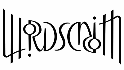
Making Information Make Sense
InfoMatters
Category: Design & Typography / Topics: Graphics • Perception
The Edge of Abpa
Ambigrams and the wonder of reading
by Stu Johnson
 Building article list (this could take a few moments)...
Posted: May 124, 2015
How a glance at the discarded shaving gel can led to an exploration of typography and reading.
The other day while shaving, I was struck by the sight of a shaving gel can in the waste basket. It landed in such a way that the edge name became” abpa”. Because of the bold lowercase font, it clearly reads as another word.

In the famous “Rubin’s face” or “figure-ground vase” image, one example of which is shown below, what you see can oscillate back and forth as you stare at it—a vase or two faces.
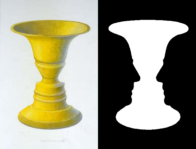
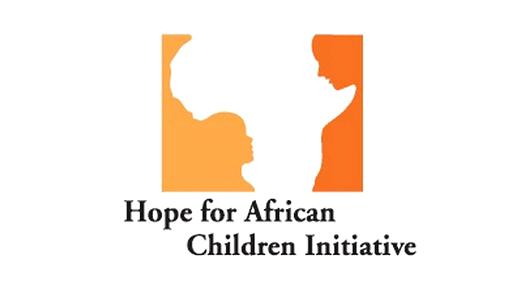
Another example, is this logo for the Hope for African Children Initiative. [1]
In the case of the shaving gel can the upside down version always appears to be “abpa.” It took me a very long time to begin seeing it as “edge” upside down. I believe that is due not just to the bold lowercase font, but the shape of the “e” that forms a very reasonable “a” when turned over.
In others cases, the recognition would be strong enough that you would read the word upside down, as is the case with most text. Try it. Take any piece of advertising, a magazine or newspaper page; lay it upside down and see how well you can read it. (For those totally removed from the print world, just turn your tablet upside down). Your brain will try to make sense of what it sees. It’s incredible how much most people can read when the text is turned through 360-degrees.
The shaving gel cans might not be the most striking example, but it’s a reminder of how incredible it is that our eyes and brains conspire to make sense out of the words we see. I’m not sure how far it goes in other alphabets, but it is absolutely amazing the countless typefaces that can be used to express the Latin (also called Roman) alphabet used for English and many other languages.
With each typeface available in multiple fonts (bold, italic, condensed, etc.) and sizes, there are literally thousands of ways to convey the same textual message. Except for the most highly stylized, the text remains quite readable to most people through all these variations.
Sometimes our brains may be strained to interpret a message, but even then it’s surprising how often we can make sense of scrambled or incomplete text (the subject of a future blog).
To see how many letter characters can be interpreted as readable letters when seen upside down, I did a quick test in PhotoShop.
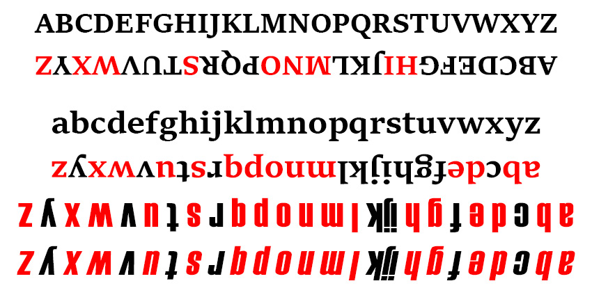
Regardless of the typeface, capital letters are not as flexible in interpretation when seen upside down as are lowercase letters.
Here are some combinations of capital letters that read the same upside down:
NOON, SWIMS, SIS (or the numbers 1881, 1961, 91016) [2]
Here are some combinations that create different words upside down:
MOM = WOW, ON = NO, NOW = MON (abbreviation). Can you spot others?
Readability can also be affected by the specific typeface, whether it is serif (the top four lines, which show the characteristic strokes and change of thickness, are in Sika Text Bold) or sans-serif (a more plain style, as in the Haettenschweiler Regular in the last two lines), Beyond the typeface are other factors such as font weight, italics and other manipulation easily available today, such as character spacing, and character height and width.
Most of the upside down letters, especially in sans-serif, could pass quite well for another, if not the same, letter. The upside down sans-serif “g” could pass for a “b” with a bent ascender (the portion of the line going up).
Of the numerous typefaces on my computer, none produced the precise turning of “e” to “a” in the Edge can example. On the can the “e” is shaped in a particular way that allows it to appear as a very legible “a” when upside down. The lowercase italic (last line above) comes close.
There is an art form for producing words that appear the same when inverted. It is called an “ambigram,” from the Latin ambi (both) + gram (letter). This is different from anagrams, a word game where you try to make as many words as possible from a collection of letters. Following are some examples of ambigrams. You will notice that some are highly stylized, wrapping the word in mystery, while others are instantly readable, with little or no ambiguity or embellishment.
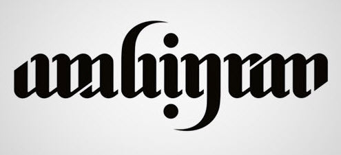 |
40 Cool and Creative Ambigram Designs |
|
|
John Langgdon – Ambigrams, Logos, & Word Art (johnlangdon.net) |
|
|
A Clever Collection of 40+ Inspiring Ambigrams by Sonali Vora (design.tutsplus.com) |
You can find a lot more, including connections with typography, mathematics, and philosophy by searching on the term “ambigram.”
Just before wrapping up this blog, I was looking for images to use in the PowerPoint presentation for our church worship service this week and ran into this interesting example of reflected text. [3]

This is not a true ambigram, though some would include it in that classification. The main text, instead of being rotated 180-degrees, is flipped top-to-bottom...a literal twist on traditional ambigrams. Unlike a typical use of reflection, which simply adds dimension, here it is the reflection itself that draws your eye, because it is the intended text (as well as sitting right on top of the phrase “student ministries”).
My point in this blog has been to talk about the relation between characters and how we perceive them. I hope it inspires in you a sense of wonder about the marvelous way in which we have been created and the myriad ways in which we can visually convey messages. In a future blog I’ll look at how perception and this eye-brain link impacts design for everyday life and how our brains try to make sense of things that are not really there (mixed up letters, wrong words, fragments, etc.).
If you like language games, you’ll also want to take a look at Judith Herman’s article linked in the notes below.
NOTES:
- See Karissa Giuliano's article "13 famous logos with hidden messages" on CNBC for other examples.
- “Palindromes, anagrams, and 9 other names for alphabetical antics” by Judith B. Herman on The Week
- I was actually looking for images to go with the account in the book of Acts in the Bible about the authorities being stirred up because of the rapid growth of the new Christian church in Jerusalem following Jesus’ resurrection—very much as depicted in the current TV series, “A.D., the Bible Continues.” People who look to the early church for inspiration talk about how the Good News would turn the world upside down...the idea behind the logo.
Search all articles by Stu Johnson
 Building article list (this could take a few moments) ...
Stu Johnson is owner of Stuart Johnson & Associates, a communications consultancy in Wheaton, Illinois focused on "making information make sense."
• E-mail the author (moc.setaicossajs@uts*)* For web-based email, you may need to copy and paste the address yourself.
Posted: May 124, 2015 Accessed 7,512 times
![]() Go to the list of most recent InfoMatters Blogs
Go to the list of most recent InfoMatters Blogs
![]() Search InfoMatters (You can expand the search to the entire site)
Search InfoMatters (You can expand the search to the entire site)
 Loading requested view (this could take a few moments)...
InfoMatters
Category: Design & Typography / Topics: Graphics • Perception
The Edge of Abpa
Ambigrams and the wonder of reading
by Stu Johnson
 Building article list (this could take a few moments)...
Posted: May 124, 2015
How a glance at the discarded shaving gel can led to an exploration of typography and reading.
The other day while shaving, I was struck by the sight of a shaving gel can in the waste basket. It landed in such a way that the edge name became” abpa”. Because of the bold lowercase font, it clearly reads as another word.

In the famous “Rubin’s face” or “figure-ground vase” image, one example of which is shown below, what you see can oscillate back and forth as you stare at it—a vase or two faces.

Another example, is this logo for the Hope for African Children Initiative. [1]

In the case of the shaving gel can the upside down version always appears to be “abpa.” It took me a very long time to begin seeing it as “edge” upside down. I believe that is due not just to the bold lowercase font, but the shape of the “e” that forms a very reasonable “a” when turned over.
In others cases, the recognition would be strong enough that you would read the word upside down, as is the case with most text. Try it. Take any piece of advertising, a magazine or newspaper page; lay it upside down and see how well you can read it. (For those totally removed from the print world, just turn your tablet upside down). Your brain will try to make sense of what it sees. It’s incredible how much most people can read when the text is turned through 360-degrees.
The shaving gel cans might not be the most striking example, but it’s a reminder of how incredible it is that our eyes and brains conspire to make sense out of the words we see. I’m not sure how far it goes in other alphabets, but it is absolutely amazing the countless typefaces that can be used to express the Latin (also called Roman) alphabet used for English and many other languages.
With each typeface available in multiple fonts (bold, italic, condensed, etc.) and sizes, there are literally thousands of ways to convey the same textual message. Except for the most highly stylized, the text remains quite readable to most people through all these variations.
Sometimes our brains may be strained to interpret a message, but even then it’s surprising how often we can make sense of scrambled or incomplete text (the subject of a future blog).
To see how many letter characters can be interpreted as readable letters when seen upside down, I did a quick test in PhotoShop.

Regardless of the typeface, capital letters are not as flexible in interpretation when seen upside down as are lowercase letters.
Here are some combinations of capital letters that read the same upside down:
NOON, SWIMS, SIS (or the numbers 1881, 1961, 91016) [2]
Here are some combinations that create different words upside down:
MOM = WOW, ON = NO, NOW = MON (abbreviation). Can you spot others?
Readability can also be affected by the specific typeface, whether it is serif (the top four lines, which show the characteristic strokes and change of thickness, are in Sika Text Bold) or sans-serif (a more plain style, as in the Haettenschweiler Regular in the last two lines), Beyond the typeface are other factors such as font weight, italics and other manipulation easily available today, such as character spacing, and character height and width.
Most of the upside down letters, especially in sans-serif, could pass quite well for another, if not the same, letter. The upside down sans-serif “g” could pass for a “b” with a bent ascender (the portion of the line going up).
Of the numerous typefaces on my computer, none produced the precise turning of “e” to “a” in the Edge can example. On the can the “e” is shaped in a particular way that allows it to appear as a very legible “a” when upside down. The lowercase italic (last line above) comes close.
There is an art form for producing words that appear the same when inverted. It is called an “ambigram,” from the Latin ambi (both) + gram (letter). This is different from anagrams, a word game where you try to make as many words as possible from a collection of letters. Following are some examples of ambigrams. You will notice that some are highly stylized, wrapping the word in mystery, while others are instantly readable, with little or no ambiguity or embellishment.
 |
40 Cool and Creative Ambigram Designs |
|
|
John Langgdon – Ambigrams, Logos, & Word Art (johnlangdon.net) |
|
|
A Clever Collection of 40+ Inspiring Ambigrams by Sonali Vora (design.tutsplus.com) |
You can find a lot more, including connections with typography, mathematics, and philosophy by searching on the term “ambigram.”
Just before wrapping up this blog, I was looking for images to use in the PowerPoint presentation for our church worship service this week and ran into this interesting example of reflected text. [3]

This is not a true ambigram, though some would include it in that classification. The main text, instead of being rotated 180-degrees, is flipped top-to-bottom...a literal twist on traditional ambigrams. Unlike a typical use of reflection, which simply adds dimension, here it is the reflection itself that draws your eye, because it is the intended text (as well as sitting right on top of the phrase “student ministries”).
My point in this blog has been to talk about the relation between characters and how we perceive them. I hope it inspires in you a sense of wonder about the marvelous way in which we have been created and the myriad ways in which we can visually convey messages. In a future blog I’ll look at how perception and this eye-brain link impacts design for everyday life and how our brains try to make sense of things that are not really there (mixed up letters, wrong words, fragments, etc.).
If you like language games, you’ll also want to take a look at Judith Herman’s article linked in the notes below.
NOTES:
- See Karissa Giuliano's article "13 famous logos with hidden messages" on CNBC for other examples.
- “Palindromes, anagrams, and 9 other names for alphabetical antics” by Judith B. Herman on The Week
- I was actually looking for images to go with the account in the book of Acts in the Bible about the authorities being stirred up because of the rapid growth of the new Christian church in Jerusalem following Jesus’ resurrection—very much as depicted in the current TV series, “A.D., the Bible Continues.” People who look to the early church for inspiration talk about how the Good News would turn the world upside down...the idea behind the logo.
Search all articles by Stu Johnson
 Building article list (this could take a few moments) ...
Stu Johnson is owner of Stuart Johnson & Associates, a communications consultancy in Wheaton, Illinois focused on "making information make sense."
• E-mail the author (moc.setaicossajs@uts*)* For web-based email, you may need to copy and paste the address yourself.
Posted: May 124, 2015 Accessed 7,513 times
![]() Go to the list of most recent InfoMatters Blogs
Go to the list of most recent InfoMatters Blogs
![]() Search InfoMatters (You can expand the search to the entire site)
Search InfoMatters (You can expand the search to the entire site)
 Loading requested view (this could take a few moments)...
InfoMatters
Category: Design & Typography / Topics: Graphics • Perception
The Edge of Abpa
Ambigrams and the wonder of reading
by Stu Johnson
 Building article list (this could take a few moments)...
Posted: May 124, 2015
How a glance at the discarded shaving gel can led to an exploration of typography and reading.
The other day while shaving, I was struck by the sight of a shaving gel can in the waste basket. It landed in such a way that the edge name became” abpa”. Because of the bold lowercase font, it clearly reads as another word.

In the famous “Rubin’s face” or “figure-ground vase” image, one example of which is shown below, what you see can oscillate back and forth as you stare at it—a vase or two faces.

Another example, is this logo for the Hope for African Children Initiative. [1]

In the case of the shaving gel can the upside down version always appears to be “abpa.” It took me a very long time to begin seeing it as “edge” upside down. I believe that is due not just to the bold lowercase font, but the shape of the “e” that forms a very reasonable “a” when turned over.
In others cases, the recognition would be strong enough that you would read the word upside down, as is the case with most text. Try it. Take any piece of advertising, a magazine or newspaper page; lay it upside down and see how well you can read it. (For those totally removed from the print world, just turn your tablet upside down). Your brain will try to make sense of what it sees. It’s incredible how much most people can read when the text is turned through 360-degrees.
The shaving gel cans might not be the most striking example, but it’s a reminder of how incredible it is that our eyes and brains conspire to make sense out of the words we see. I’m not sure how far it goes in other alphabets, but it is absolutely amazing the countless typefaces that can be used to express the Latin (also called Roman) alphabet used for English and many other languages.
With each typeface available in multiple fonts (bold, italic, condensed, etc.) and sizes, there are literally thousands of ways to convey the same textual message. Except for the most highly stylized, the text remains quite readable to most people through all these variations.
Sometimes our brains may be strained to interpret a message, but even then it’s surprising how often we can make sense of scrambled or incomplete text (the subject of a future blog).
To see how many letter characters can be interpreted as readable letters when seen upside down, I did a quick test in PhotoShop.

Regardless of the typeface, capital letters are not as flexible in interpretation when seen upside down as are lowercase letters.
Here are some combinations of capital letters that read the same upside down:
NOON, SWIMS, SIS (or the numbers 1881, 1961, 91016) [2]
Here are some combinations that create different words upside down:
MOM = WOW, ON = NO, NOW = MON (abbreviation). Can you spot others?
Readability can also be affected by the specific typeface, whether it is serif (the top four lines, which show the characteristic strokes and change of thickness, are in Sika Text Bold) or sans-serif (a more plain style, as in the Haettenschweiler Regular in the last two lines), Beyond the typeface are other factors such as font weight, italics and other manipulation easily available today, such as character spacing, and character height and width.
Most of the upside down letters, especially in sans-serif, could pass quite well for another, if not the same, letter. The upside down sans-serif “g” could pass for a “b” with a bent ascender (the portion of the line going up).
Of the numerous typefaces on my computer, none produced the precise turning of “e” to “a” in the Edge can example. On the can the “e” is shaped in a particular way that allows it to appear as a very legible “a” when upside down. The lowercase italic (last line above) comes close.
There is an art form for producing words that appear the same when inverted. It is called an “ambigram,” from the Latin ambi (both) + gram (letter). This is different from anagrams, a word game where you try to make as many words as possible from a collection of letters. Following are some examples of ambigrams. You will notice that some are highly stylized, wrapping the word in mystery, while others are instantly readable, with little or no ambiguity or embellishment.
 |
40 Cool and Creative Ambigram Designs |
|
|
John Langgdon – Ambigrams, Logos, & Word Art (johnlangdon.net) |
|
|
A Clever Collection of 40+ Inspiring Ambigrams by Sonali Vora (design.tutsplus.com) |
You can find a lot more, including connections with typography, mathematics, and philosophy by searching on the term “ambigram.”
Just before wrapping up this blog, I was looking for images to use in the PowerPoint presentation for our church worship service this week and ran into this interesting example of reflected text. [3]

This is not a true ambigram, though some would include it in that classification. The main text, instead of being rotated 180-degrees, is flipped top-to-bottom...a literal twist on traditional ambigrams. Unlike a typical use of reflection, which simply adds dimension, here it is the reflection itself that draws your eye, because it is the intended text (as well as sitting right on top of the phrase “student ministries”).
My point in this blog has been to talk about the relation between characters and how we perceive them. I hope it inspires in you a sense of wonder about the marvelous way in which we have been created and the myriad ways in which we can visually convey messages. In a future blog I’ll look at how perception and this eye-brain link impacts design for everyday life and how our brains try to make sense of things that are not really there (mixed up letters, wrong words, fragments, etc.).
If you like language games, you’ll also want to take a look at Judith Herman’s article linked in the notes below.
NOTES:
- See Karissa Giuliano's article "13 famous logos with hidden messages" on CNBC for other examples.
- “Palindromes, anagrams, and 9 other names for alphabetical antics” by Judith B. Herman on The Week
- I was actually looking for images to go with the account in the book of Acts in the Bible about the authorities being stirred up because of the rapid growth of the new Christian church in Jerusalem following Jesus’ resurrection—very much as depicted in the current TV series, “A.D., the Bible Continues.” People who look to the early church for inspiration talk about how the Good News would turn the world upside down...the idea behind the logo.
Search all articles by Stu Johnson
 Building article list (this could take a few moments) ...
Stu Johnson is owner of Stuart Johnson & Associates, a communications consultancy in Wheaton, Illinois focused on "making information make sense."
• E-mail the author (moc.setaicossajs@uts*)* For web-based email, you may need to copy and paste the address yourself.
Posted: May 124, 2015 Accessed 7,514 times
![]() Go to the list of most recent InfoMatters Blogs
Go to the list of most recent InfoMatters Blogs
![]() Search InfoMatters (You can expand the search to the entire site)
Search InfoMatters (You can expand the search to the entire site)
 Loading requested view (this could take a few moments)...