
Making Information Make Sense
InfoMatters
Category: Information / Topics: History • Information • Statistics • Trends
COVID-19 Perspectives for October 2021
by Stu Johnson
 Building article list (this could take a few moments)...
Posted: November 308, 2021
South America shows improvement while USA and most of the world show little sign of flattening the COVID curve…
Putting the COVID-19 pandemic in perspective (Number 16)
This monthly report was spawned by my interest in making sense of numbers that are often misinterpreted in the media or overwhelming in detail (some would say that these reports are too detailed, but I am trying to give you a picture of how the COVID pandemic in the United States compares with the rest of the world, to give you a sense of perspective).
New this month:
- Population statistics have been updated because global population has increased from 7.8-billion to 7.9-billion since I began reporting on COVID in April 2020.
- The rising number of cases and deaths in Romania reached the threshold to add it to the list of monitored countries, bringing that number to 29 (when these reports began I was monitoring 21 countries).
These reports will continue as long as the pandemic persists around the world.
Report Sections:
• September at-a-glance
• The Continental View • USA Compared with Other Countries
• COVID Deaths Compared to the Leading Causes of Death in the U.S.
• U.S. COVID Cases versus Vaccinations
• Profile of Monitored Continents & Countries • Scope of This Report
September-at-a-glance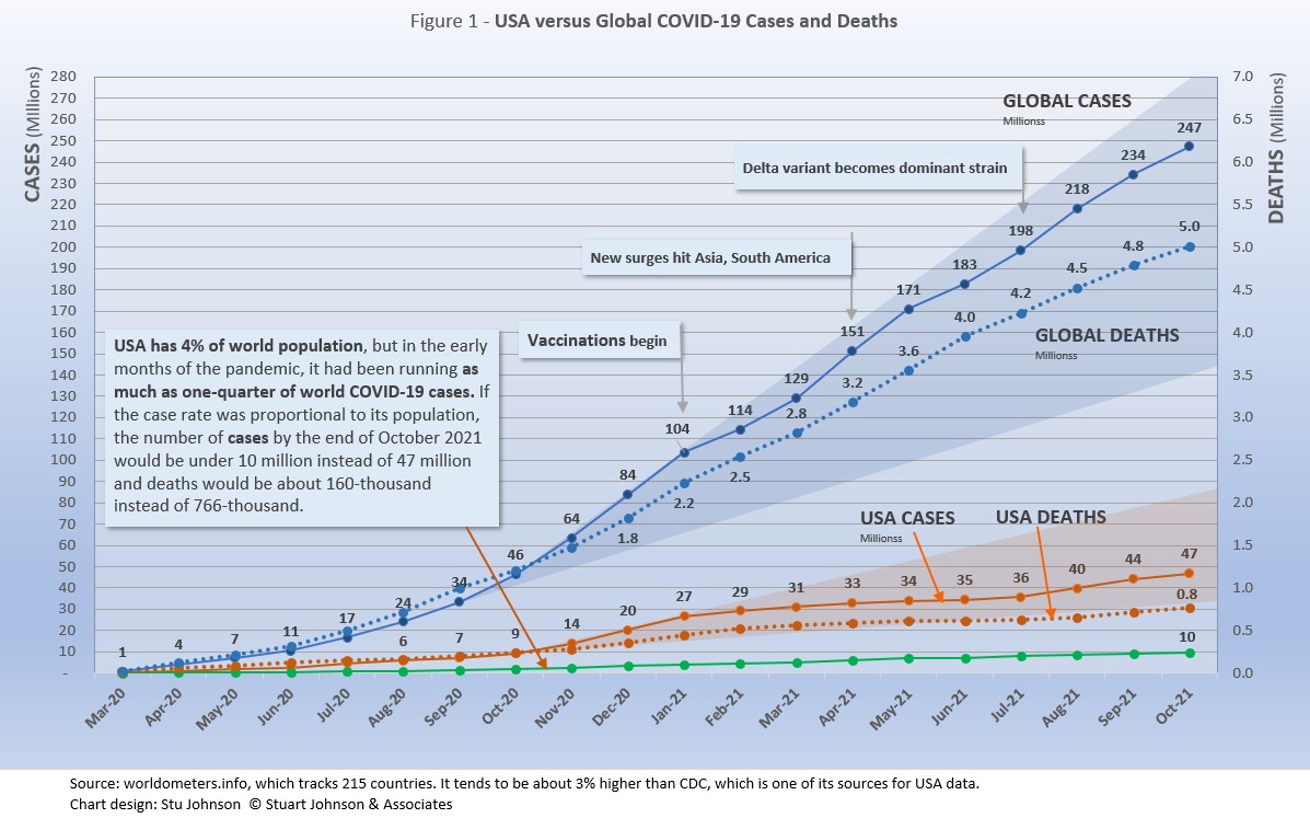
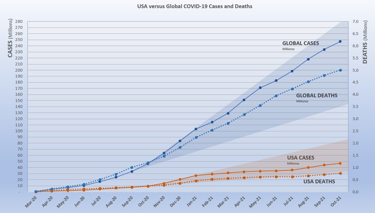
- COVID-19 continued to spread around the world, reaching 247-million cases by the end of October, up 6% from September. Deaths from COVID around the world just crossed the 5-million mark at the end of October.
The level of reported cases represents 3.1% of the global population of 7.9-billion, up from 3.0% at the end of September. The increase over September was 6%, back to the level of May following an apparent delta-related surge, when the monthly increase went up to 10% in August. That means that so far the delta-related surge was not as significant as previous surges (November 2020-January 2021 and April-May 2021), but continues to be problematic. In some areas it is driven by dense populations and/or lack of vaccine, in others (USA being a prime example) by vaccine resistance as evidenced by reports that hospital admissions for COVID are nearly all among those who have not been vaccinated. .
The blue "cone" in Figure 1 shows the possible high and low projection of global cases, with the bottom (roughly 140-million) representing the trajectory of the lower pace in late summer 2020 and the upper (approximately 280-million) representing a continuation of the surge from November 2020 through January 2021. You can see that the curve for global cases has bent down and back up several times since February 2021, but is very slowly moving away from—but still close to—the upper edge of the prediction cone. USA had fared better until August, which I'll get to below. - The pattern for deaths tends to lag behind cases by weeks or months, and the global rate of increase continues to fall below that of cases—dropping from a 23% increase in January to 5% at the end of October, with a modest increase to 7% in July and August. While the curve for deaths is not increasing as much as that for cases, it is still climbing at a noticeable rate (unlike USA where cases and deaths flattened between January and July 2021, before rising again).
- Where South America was clearly going the wrong way through early summer, things have significantly reversed. Headed toward eclipsing Europe in the number of cases and deaths, the curves began to turn down in July and flatten through October.
South America has also taken the lead in vaccination doses, surpassing Europe and North America in August. Ironically, while the continent is improving several South American countries remain as trouble spots. See more in The Continental View.
- USA. continues to lead the world in the number of reported cases and deaths, but also leads the world in the number of COVID tests and is respectable in vaccinations, but hampered by vaccine resistance.
While the 18.9% USA share of global cases at the end of October is down from a high of 25.9% in January, the trend is erratic. The rate was 18.9% in June before dropping to 18.0% in July, then headed back up to 18.9% in September and October.
Similarly, deaths have declined from 20.9% of the world total in September 2020 to 14.5% at the end of August 2021 before heading back up to 15.3% at the end of October. As you will see in details to follow, while USA outpaced everyone through the early months of the pandemic, the vast disparity was slowly shrinking until the delta variant brought a resurgence in cases. T
he projection cone surrounding USA Cases in Figure 1 shows a pronounced flattening of the curve from January to July (vaccinations), with a very noticeable upward bend in August (delta variant among unvaccinated)—though still in the bottom half of the projection cone (which for USA extends from roughly 35 to 85-million). The upward bend for USA cases from August to October is clearly visible in Figure 1, but even more pronounced in Figure 10 below, which "zooms in" on USA.
Figure 1 also shows how much lower cases in the US would be—approaching 9.9-million by now, instead of 46.8-million—if they were proportional to the global population. It would also mean about 160-thousand deaths instead of 766-thousand.
- Countries to watch. For this report, I moved Romania into the list of monitored countries, increasing that list from 28 to 29 countries (a profile of this list can be found at the bottom of this page). In addition, the weekly comparison report on worldometers gives a sense of hot spots to watch. Based on activity in the last week or two, this includes Bulgaria, Serbia, Czechia, Thailand, Vietnam, Guatemala and Egypt. While some of these have population too small to make much of an impact on this report, they generally confirm (along with countries recently added to my monitored list) the shift of growth in COVID to eastern Europe, southeast Asia and the Middle East.
- With vaccinations, USA continues to move ahead. After a noticeable slowdown in June and July, total doses distributed climbed to nearly 520-million by October. The curve for doses administered ("shots in the arm") picked up, but not as fast as doses distributed. Meanwhile, the curve for those fully vaccinated is rising at a slower but steady pace, with those fully vaccinated rising 2.3% over September. (See Figure 11).
Where you get information on COVID is important. In an atmosphere wary of misinformation, "news-by-anecdote" from otherwise trusted sources can itself be a form of misinformation. As I go through the statistics each month, I am reminded often that the numbers do not always line up with the impressions from the news. With that caveat, let's dig into the numbers for October 2021.
The Continental View
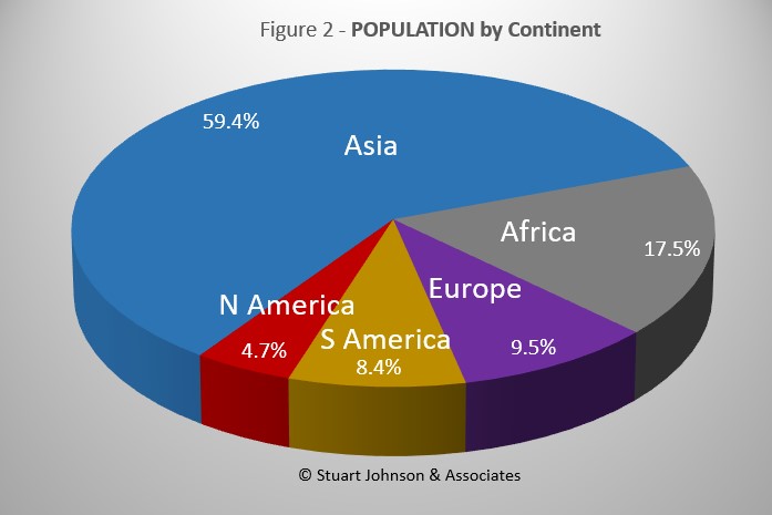
Since starting to report on COVID in April of 2020, global population has grown from just over 7.8-billlion to 7.9-billion, so this month I have updated population numbers. The Americas show no change in proportion, Europe is down one-tenth of a percent, Asia is up that much, and Africa gained four-tenths. Oceana is not included because of its small size, about one-half a percent of world population. (The apparent discrepancy of a net gain of four-tenths is explained by rounding).
While COVID-19 has been classified as a global pandemic, it is not distributed evenly around the world.
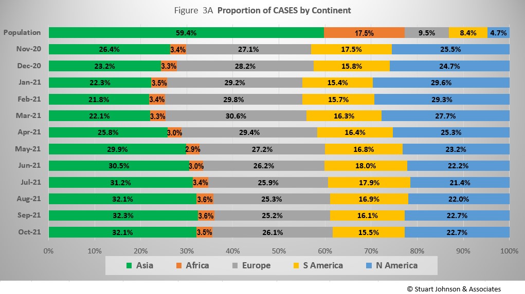
Asia accounts for 59.4% of the world's population (Figure 2), but had only 32.1% of COVID cases at the end of October (Figure 3A)—affecting a mere 1.7% of its population (COVID cases have been reported for 3.1% of world population).
The biggest trends in the proportion of cases among continents are most noticeable since March:
Asia - rising, then leveling off near 32% the last three months
Europe - falling through September, with a bump up to 26% in October
North America - falling through July, then back up slightly, below 23% in September and October
South America - after peaking at 18% in June, steadily descending to just over 15% in October, returning to the level last seen in January
Africa - hovering around 3.5%
Where Asia and Africa combined represent about three-quarters (76.9%) of the world's 7.9-billion people, Europe, South America and North America still account for nearly two-thirds of COVID cases (65.1% - Figure 3A) and about 7 in 10 of COVID deaths (72.2% - Figure 4A). The shares for Europe and the Americas combined are slowly coming down from their highs (74.7% for cases and 80.8% for deaths in February).
While news reports have given the impression of widespread delta-variant surges, growth in the number of cases since July has not been uniform across continents. North America showed the sharpest and steadiest climb. Asia and Africa bent upward in August then started to slow a bit in September and October. Europe began to bend upward in July, but at a rate slower then Asia and North America until October when it accelerated slightly to match the rate of increase shown by North America. South America became the outlier here, actually bending down starting in August.
Africa, second by population, remains a loner, with an almost flat curve compared to the other four large continents. It did bend up slightly from May through August, when delta became dominant, but then leveled off again in September and October.
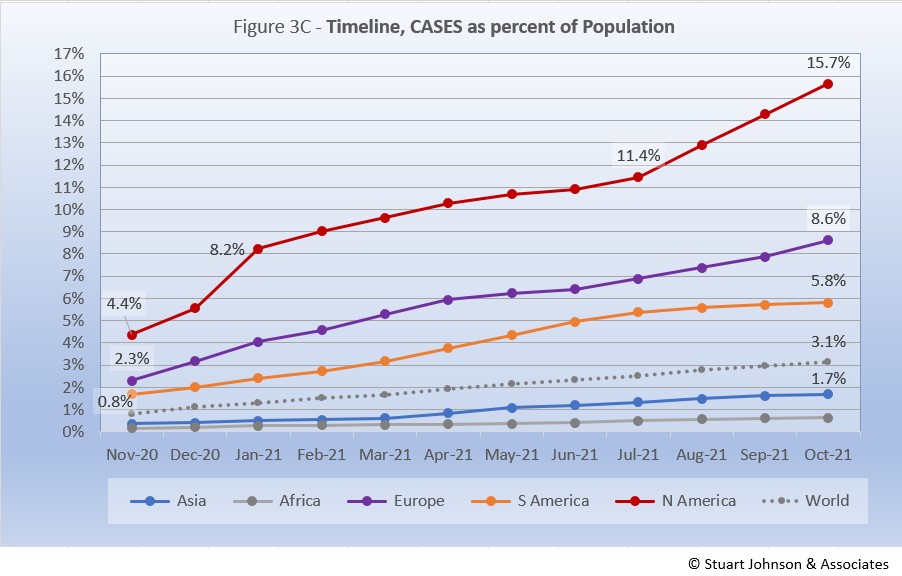
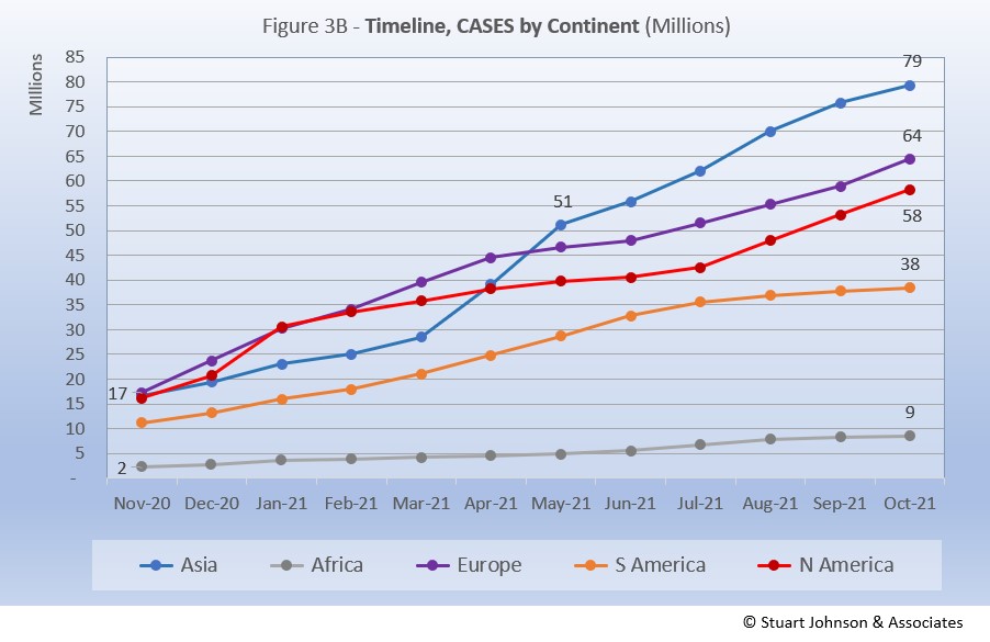
The raw numbers of Figure 3B can be deceptive. Figure 3C gives a more realistic picture of impact by translating raw case numbers to percentage of population.
After a sharp increase in January, North America slowed down for six months, before jumping 1.5 points to 13.0% in August and continuing that pace to reach 15.7% at the end of October—far ahead of the other continents in proportion of population reported with COVID and the most dramatic change for any of them since the delta variant became a factor.
Europe remains well below North America, though it did show a steady upward movement over the last four months, after a short downturn in May and June. South America was rising steadily through July, before bending downward from August through October, widening its gap with Europe. Asia and Africa have not changed dramatically in rate over the past five months and both continue to inch away from the global rate, which stood at 3.1% at the end of October. However, as pointed out last month, individual countries in Asia have dominated my watch list in the past few months.
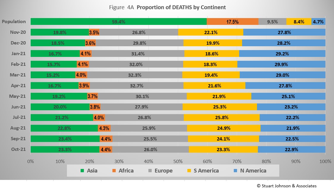
The proportion of deaths between continents is even more distorted than that of cases. In the early months of COVID, Europe and the Americas were growing in deaths, causing Asia to bottom out in its proportion of global deaths at 15.2% in March. The trends since then shadow those of cases, but lag behind by a month of two.
Europe retains the highest proportion of COVID deaths at 26%, but that is down from a high of nearly 33% in April.
Asia and South America both ended October at just over 23%. Asia rose from a low of 15% in March, while South America bottomed out at 18% in February before rising to nearly 26% in June and then starting to drop again.
North America ended October at nearly 23%, down from a high aproaching 30% in February.
Asia has stayed centered on 4% in COVID deaths, while its population represents 17%.
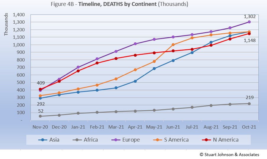
Deaths through October shows that while the trajectory lags behind cases and has progressed at a steadier rate, it does reflect the overall changes in Cases by continent. The 1-million milestone is now history for the top four continents by COVID deaths. Europe crossed that threshold in April, followed by South America in June, Asia in August and North America in September.
Europe remains at the top in number of deaths, at 1.3-million. Asia slowed slightly in September, but kept increasing to barely pass South America to claim second place in October. The growth rate for South America, which climbed dramatically in June and seemed poised to pass Europe, slowed down significantly, enough to allow Asia to pass it by a mere 37 deaths. North America had been slowing in late spring and summer, on a path to distance itself from the top three, but bent upward in September and October to nearly catch Asia and South America, but remain in fourth place. If South America continues to flatten, if could end up in fourth place in another month or two.
Africa continues at a slow and steady pace, with a slight drift upward since May, but remains well below the other continents despite being second in size, with 1.3-billion people.
Vaccinations
Last month I started to compare vaccination at the continental level using data from ourworldindata.org.
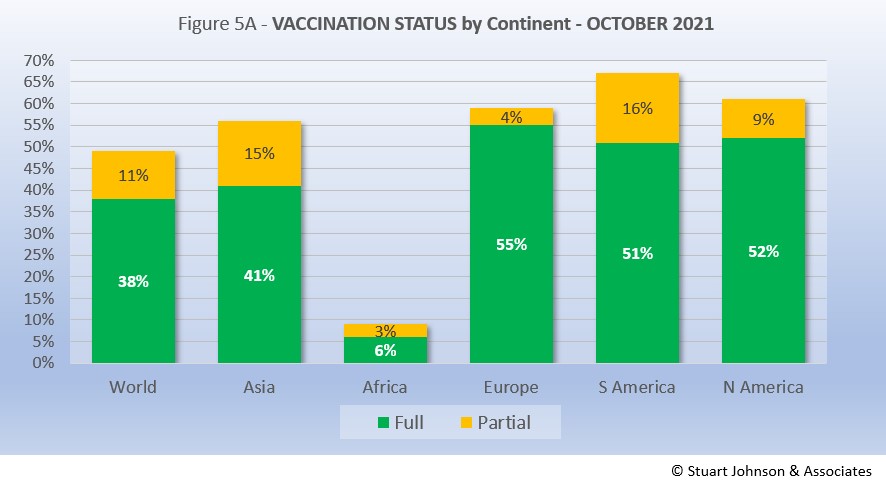
As Figure 5A shows, more than one-third of the global population has been reported as fully vaccinated (roughly 3-billion people), with another 11% having received the first of two doses or in the waiting period to be considered fully vaccinated. Given continuing gloomy reports in the news, those numbers may be surprisingly high given the monumental task of vaccinating multiple billions of people.
Europe is ahead of the pack, with 55% of its population fully vaccinated, followed by North America at 52%. Interestingly, South America, which struggled with surges over recent months, has attacked the vaccination front, putting the continent in the lead for total doses administered at 67% and close on the heels of North America in fully vaccinated. Asia is further behind, but gaining, with 56% having received at least one dose. Clearly, Africa remains the loner—and the loser—on the vaccination front, which highlights arguments over vaccine availability and inequities in distribution.
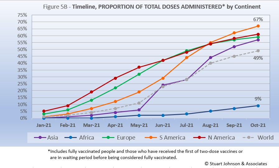
While South America got into vaccinations later and slower than North America and Europe, Figure 5B shows how it pushed its way to the top of the total vaccination doses administered by October—and this by proportion of population, not raw numbers, so it's a fair comparison. Where North America started aggressively, it slowed in June as Europe caught up, then both have tracked very close the last three months, reaching 61% and 59% respectively in October.
The world trajectory was clearly influenced by Asia, which showed serious vaccination administration starting in June, moving upward to nearly match Europe in October. Africa remains far behind the others, though there is an encouraging upward movement beginning in July.
Because a majority of vaccines require two doses, we will likely see total doses expand more quickly in coming months, with full vaccination catching up at a rate dependent on supply, strategy and willingness of populations to cooperate.
Comparison of U.S. with other Countries
Cases
Raw numbers are virtually meaningless without relating them to the size of a given country, so looking at cases as a proportion of population helps get a sense of the relative impact.
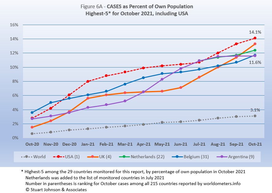
France drops from the top-5, replaced by Belgium. The other four return, but shuffle their order from September.
USA moved back into #1 in August after being edged out by a very slim margin by Argentina in July. In September USA pushed well past the others, but UK, hard hit with a steady increase since July is now on a path that could surpass USA in a month or two. Netherlands, introduced to the list of monitored countries in July, has risen steadily, but with UK rising faster, it drops to third place. Belgium continues a fairly steady upward pace which, combined with Argentina's slowing pace put Belgium at number 4 and Argentina at number 5.
The top-5 by proportion of population with COVID cases, have progressed at a rate higher than the Global level, with only Argentina slowing to a lower pace. Last month, it appeared that USA was racing ahead of the others in proportion of cases for its population, but the upward turns of UK, Netherlands and Belgium made the distribution between them more even.
Another way to look at population proportion is the measure "1 in." The global figure of 3.1% means that 1 in 32 people in the world have been reported with COVID (and that only by official record keeping, not including any unreported and likely asymptomatic cases). For USA it is 1 in
7. For UK and Netherlands it is 1 in 8 and for Belgium and Argentina 1 in 9.
All five countries return from September, but their order is shuffled. All five have been at or below the global level since August.
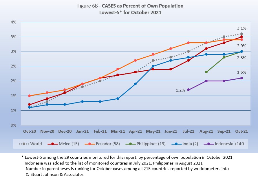
Mexico continued an accelerated path started last month to put it on the top of the bottom five. Ecuador had flattened considerably in development of new cases, bringing it first below the global level last month and then into second place this month. Philippines rose sharply in September after being added to the list of monitored countries in August, then slowed in October. India had a major surge in April and May, then slowed before a bump up in October put it in a virtual ties for third place with Philippines. Indonesia, added to the list of monitored countries in July, remains the lowest of the 29 monitored for proportion of cases for its population and the only one below 2%.
These countries represent a considerable spread in size, from India, the second largest country, to Ecuador, ranked number 67 of the 215 countries tracked by worldometers. For Ecuador, its 2.9% of population means that 1 in 34 have been reported as having had the COVID virus, for India it is 1 in 40, and for Indonesia 1 in 64.
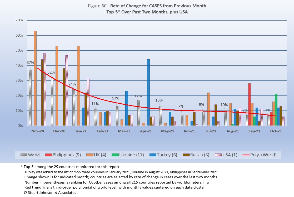
Because the size of countries makes the use of raw case numbers illusory, another measure I find helpful is the rate of change from month to month (Figure 6C). The focus of the selection is on recent changes, but the chart goes back to November to keep the surges of late 2020 in perspective.
For this chart, countries are selected based on the change over two-months (end of August to end of October for this report). Iran and Mexico have been replaced by Philippines and Ukraine. USA, which appears in every report, dropped from the top-5, replaced by Russia.
The overall trend (red line, reflecting global level) flattens as it drops, then heads down even more in October. (A polynomial trend line flexes as adjacent data points go up and down, so the leading edge of newest dates can change the shape of the curve as new months are added).
Overall, global levels were much higher from November 2020 through January 2021 (the highest period of surging cases as pointed out in Figure 1), as was the absolute variation between countries. Global levels remained over 10% through May. Over the past five months, the global level ranged from 10% in August down to 7% in June, September and October,
Philippines was added to the list of monitored countries in August and showed a 28% rise in cases for September over August. It dropped to 9% in October, but that remained above the global change of 7%. UK has been above the global rate of change since July and had even higher levels from November 2020 through January 2021 during the highest levels of surge since the pandemic started. Ukraine, added to the list in July, hit a 21% change for October over September. Turkey, on the monitored list since January, saw increases of 11 and 12% for the past three months and 44% back in April. Russia increased 13% in October after only 3% in September, but was above 10% in July and August. .
USA started well above the Global level from November 2020 (48%) through January 2021 (31%), then dropped to 9% in February after vaccinations had begun and the surge seemed to have ended (in USA anyway). From there it is fell further below the global level each month until reaching a low of 1% in June. This has reversed, with a small bump in July that was still well below the global level. Then August went above the global rate (10%) to hit a 12% increase, followed by 11% in September—not as bad as the early surge, but enough to show the impact of delta on the still-too-large number of unvaccinated individuals. October slowed, with a 6% change over September. (This is visible in Figure 1, which compares Global and USA curves, but even more evident in Figure 10, which focuses on USA),
Deaths
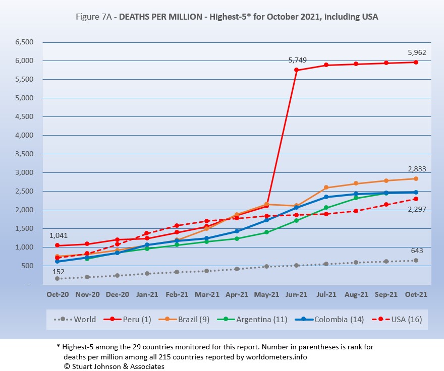
Because deaths as a percentage of population is such a small number, the "Deaths-per-Million" metric shown in Figure 7A provides a comparable measure.
The top four countries return, in the same order, but USA replaces Belgium in fifth place.
As Figure 7A shows, Peru still soars over the others following a correction to its death data in June. October remains more than double #2 Brazil and more than 9 times the Global level of 643.
While the worst deaths-per-million is still dominated by South American countries, as suggested in other parts of the report there has been a slowing and even some flattening evident in the last three months. Peru, Brazil, and Argentina have all slowed in growth of deaths-per-million (the number cannot go down, but growth can flatten). Columbia pretty much flattened in September, putting it on top of Argentina's curve for October.
USA rose steadily until evidence of the effectiveness of vaccination began to become evident with a slow down from March through July, before turning back upward in August, coinciding with the delta variant and vaccine resistance.
Since this analysis focuses on 29 countries that have been in the top-20 of cases and deaths, there are 7 other countries not monitored with Deaths-per-Million between Peru, with a population of 33.5M, and Brazil, with 214.5M. The largest are Bulgaria (6.9M, 3,534 Deaths-per-Million), Hungary (9.6M, 3,208), and Czechia (10.7M, 2,869).
All of the countries on the chart, including USA, are all well above the Global level, and (except for Peru) fairly close to each other for the past four months after nearly converging in June.
While the delta variant was causing cases to rise, particularly in July and August, death rates in general remained unaffected or low in comparison—even South America, which had been the exception, is slowing down.
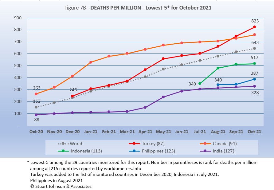
The same five countries return, in the same order as September.
Turkey moved into first place last month and continued on a steeper upward pace, putting more distance between it and second place Canada, which has been fairly steady since January. Both Turkey and Canada remain above the Global level. Indonesia, added to the monitored list in July, rose steeply in August, then leveled off. Netherlands, added in August, was flat into September, then rose at a rate greater than the Global level in October, but remains the second lowest Deaths-per-Million of the 29 monitored countries. Holding onto the lowest level (which is good in this case) is India, which rose sharply from April to June before leveling off, growing at a slower pace than the Global curve.
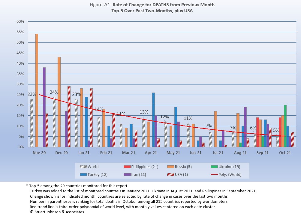
As with the comparable chart for Rate of Change for Cases (Figure 6C), countries for Rate of Change for Deaths (Figure 7C) are selected based on the change over two-months (end of August to end of October) in reported COVID deaths. The focus of the selection is on recent changes, but the chart goes back to November to keep the surges of late 2020 in perspective.
Philippines and Ukraine replace Indonesia and South Africa. USA appears every month for comparison.
The trend
in the rate of change in deaths (red line in Figure 7C) shows the delayed connection with cases and appears smoother than the month-to-month changes in the Global level. Monthly Global changes for deaths trended down through March, bumped up in April and has moved down from there, ending October at 5%, the lowest point. (As mentioned with Rate of Change for Cases, the trend line is a polynomial that can change shape as new values are added at the most-recent end.)
Philippines, added to the list in September, saw a 14% increase in both September and October, well above the Global level of 5%. Russia was nearly the same, increasing 13% in September and 15% in October. Ukraine was below the Global level in September, but increased 20% in October, the most among the top five (over two months). Turkey was double the Global level in both months, while Iran was double in September (11%) and even in October (5%).
USA was higher than the Global level in December 2020 through February 2021, then has been significantly lower since then, falling to a 1% change in July (over the number of deaths in June), but that bumped up in August to 4% over July, still well below the Global level of 7%. In September, however, USA showed a 9% increase in deaths over August, reversing the steady decline from December 2020 to August 2021. October was down to 7% but still above the Global level. All of this confirms the early success of vaccination, which kept driving death rates down, followed by the resurgence related to the delta variant and vaccine resistance. November will tell us whether the October dip was a trend or an anomaly.
Mortality Rate
Mortality Rates (percentage of deaths against reported cases) have generally been slowly declining. This is not surprising as several factors came into play:
- In the early days of the pandemic, there was a high proportion of "outbreak" cases (nursing homes, retirement communities, other settings with a concentration of more vulnerable people). As the pandemic continued the ratio of "community spread" (with lower death rates) to "outbreaks" increased and the overall Mortality Rate went down.
- As knowledge about treatment increased, mortality went down.
- Since the death count is more certain (though not without inaccuracies), the side of the equation that can change the most is cases. As testing revealed more cases, the Motrality Rate would naturally go down because it would only affect cases and not deaths. In addition, the official numbers do not take into account a potentially higher number of people with the virus who are unreported and asymptomatic, so the real mortality rate could be even lower.
- Vaccinations started in January (though that should impact both cases and deaths).
In recent months, the delta variant produced surges in cases, particularly among those who are unvaccinated, though the death rate stayed lower than early on, which results in a lower mortality rate (remember, however, that deaths from the delta variant may become more evident in coming months).
The Global mortality rate has dropped from 2.6% in October 2020 to 2.1% by April, where it has stayed except for a bump back to 2.2% in June, before dropping again, to 2.0% in September and October. The median for the countries monitored for this report has dropped from 4.8% in October 2020 to 2.8% the past seven months.
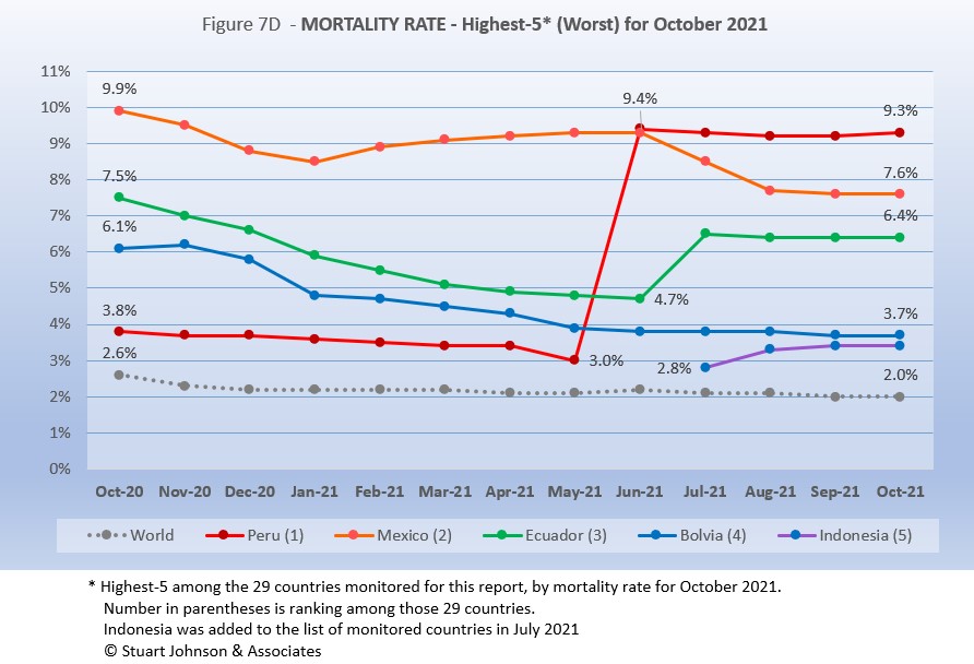
All five of the top-5 in mortality rate (among the 29 countries monitored) return in October, in the same order—for the fourth straight month. Despite a generally improving picture for South America, three of the five with the worst mortality rates are located there and Mexico is geographically close.
Peru was in fourth place and declining until June when its corrected death numbers drove Mortality to 9.4%, just ahead of Mexico at 9.3%. Since then Peru has shown a very slight decline for three months and a slight rise in October. Mexico started with the highest mortality rate, 9.9%, went down then back up before making a more concerted decline in July, though it has leveled off the last two months. Ecuador was on a steady path of dropping mortality rate through June, then has gone up more than Mexico went down, with the two looking like they would cross paths in August. However, both Mexico and Ecuador leveled off and were running on parallel tracks the last two months.
Bolivia is the one South American country among the five with the worst mortality to show a steady decline (which is good), though the pace of the decline has slowed since May. Indonesia was added to the list of monitored countries in July, coming in at #5, rising some in August, then leveling off to maintain a small separation with Bolivia since September. All five have been significantly above the Global rate since at least October 2020 when this chart begins.
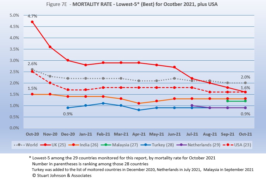
Since these represent the best mortality rates, where low is good, the "rank" order is actually in reverse. Malaysia, added to the monitored list in September replaces Philippines, and UK joins the best five since USA missed being in the group for the first time (primarily due to rising deaths related to the delta variant).
In spite of the delta variant and its impact on a few countries including USA, mortality rates overall continue to drop. Turkey and Netherlands were both at 0.9% mortality for September and October, the best of the 29 monitored countries and well below the Global level of 2.0%. India has been at 1.3% since June. Malaysia, new to the list of monitored countries last month stayed steady at 1.2%, just below (better than) India. UK started out well above the Global level in October 2020—at 4.7%—fell rapidly through the first major global surge, leveled off until going into a steady decline, ending October at 1.6%. USA followed a similar trajectory, but remained below the Global level the entire time, also ending at 1.6%.
How real is the threat of death from COVID? That's where successful mitigation comes in. Worldwide, by the end of September, 1 in 32 people have been reported as having contracted COVID and 1 in 1,577 people have died. In USA, while the mortality rate is low, because the number of cases is so high, 1 in 432 have died through October 2021—close to Mexico (1 in 446) with a third of the population and a mortality rate of 9.3% in October. Of the 28 countries monitored, India has the lowest impact from death, with 1 death for every 3,002 people. Peru is the worst, at 1 in 165.
With low mortality, USA should have been able to keep deaths much lower, but the extraordinarily high number of cases means more deaths. Without a better-than-global mortality rate, the USA death rate would be far higher. Compared to the mortality rate during the 1918 pandemic, it could be ten times worse than it is. Even at the Global mortality rate of 2.0%, USA would have had 940-thousand deaths (for 47-million cases) by the end of October, instead of 766-thousand with a mortality rate of 1.6%. The response of the health care system and availability of vaccines are part of keeping mortality down, but it's far too early to detail the cause for that positive piece of the COVID picture for USA.
Tests
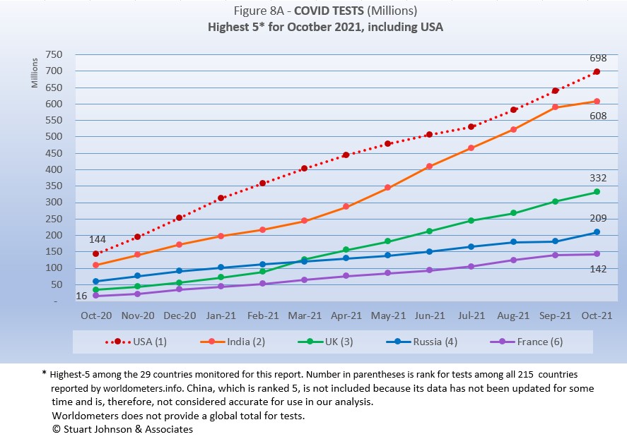
The same five countries remain on top in COVID testings, having been in the same order since March 2021.
USA remains ahead of other countries in reported COVID tests administered, at 698-million, 14% ahead of India, a wider spread than last month but well below the 56% gap in April. UK continues at the pace it set in February (causing it to move into third place back in March). Russia and France remain on paths of slower growth in raw numbers.
Since these are raw numbers, it is important to recognize the size of the country. It is also the case that COVID tests can be administered multiple times to the same person, so it cannot be assumed that USA has tested almost all of its population of some 331-million. Some schools and organizations with in-person gatherings are testing as frequently as once a week or more for those who are not yet fully vaccinated. That's a lot of testing!
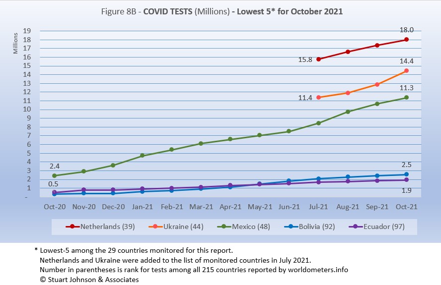
The same countries return in the same order as September.
Netherlands, Ukraine and Mexico all show upward movement in tests while Bolivia and Ecuador remain at the bottom, both at lower rates of growth..
As questions arise about equity of testing between countries, check the number of tests for countries of similar size (within the 29 monitored countries):
- Mexico: 11.5M tests for 128.9M population, compared to Philippines: 23.0M tests for 109.6M population (2X the tests)
- Ukraine: 14.4M tests for 43.7M population, compared to Argentina: 25.1M tests for 45.7M population (1.7X)
- Peru: 19.0M tests for 33.0M population, compared to Malaysia: 34.2M tests for 32.4M population (1.8X)
- Ecuador: 1.9M tests for 17.6M population, compared to Netherlands: 18.0M tests for 17.1M population (9.5X)
- Bolivia: 2.5M tests for 11.7M population, compared to Belgium: 21.7M tests for 11.6M population (8.3X)
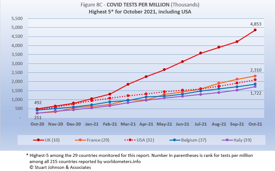
Tests per million adds another perspective. Fig. 8C shows the five countries with the highest tests per million. All five return from September, in the same order (though they appear tied, France was slightly ahead of USA in July).
UK, already the most aggressive in testing, increased its numerical lead each month since February, with a reported 4.8-million tests-per-million population in October, nearly 5 tests per person. France maintained its lead over USA, ending at 2.3-million tests-per-million, more than two tests per person. USA continues on a straight line trajectory, with a very slight dip in June and July, followed by a slight increase for August through Octoberr, reaching 1.9-million tests-per-million. Belgium and Italy are not far behind, tracking closely with France and USA. Italy is up to 1.7-million tests-per-million, moving toward 2 tests per person.
Anything over 1,000 (or "x-million tests-per-million") represents more tests than people (1,000 on the chart actually means 1,000,000), but as mentioned above, that does not mean that everyone had been tested. Some people have been tested more than once, and some are being tested regularly or with increased frequency.
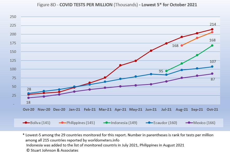
The same five countries in the same order return from September.
While still in the bottom five of the 29 countries monitored for this report, Bolivia has made the most substantial progress. Bolivia has been steadily moving up, hitting 214-thousand tests-per-million. .Philippines is not far behind at 206-thouand tests-per-million. Indonesia is increasing at a faster rate than seen in Bolivia and Philippines, ending at 168-thousand-tests-per-million and continuing to put more distance between itself and Ecuador and Mexico. Ecuador and Mexico are running in parallel tracks, well below the rate of increase for the other three.
While improvement is evident in all five, the equivalent proportion of tests to population remains very low, from roughly 9% to 21% (and that would be reduced in some individuals receive more than one test). This illustrates the arguments over inequity in resources among countries.
Vaccinations
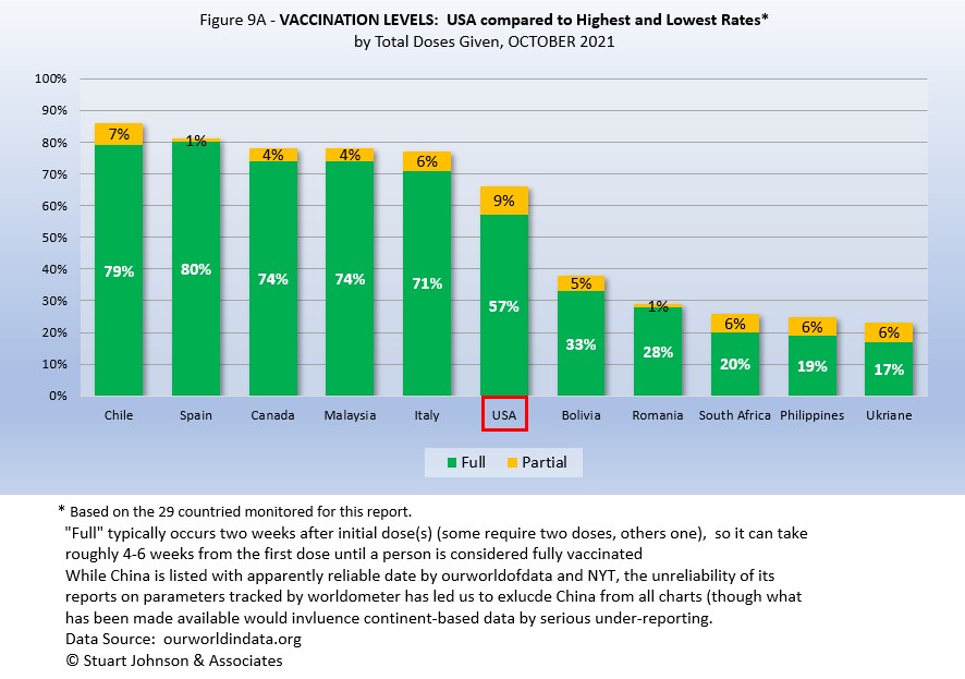
Figure 9A compares USA with the top-5 and bottom-5 of monitored countries by total doses administered. As you can see USA leans toward the upper countries, but is clearly behind Spain, with the highest proportion of fully vaccinated, at 80%. Including partial vaccination, USA comes up to 66%, but that does not even reach the proportion of fully vaccinated in Italy. On the other hand, USA is well ahead of the bottom five of the 29 monitored countries for either total doses or fully vaccinated.
As pointed out in other parts of this analysis, Figure 9A does not tell the whole story. It's a bit of an apples and oranges comparison, with one major factor being the population of each country.
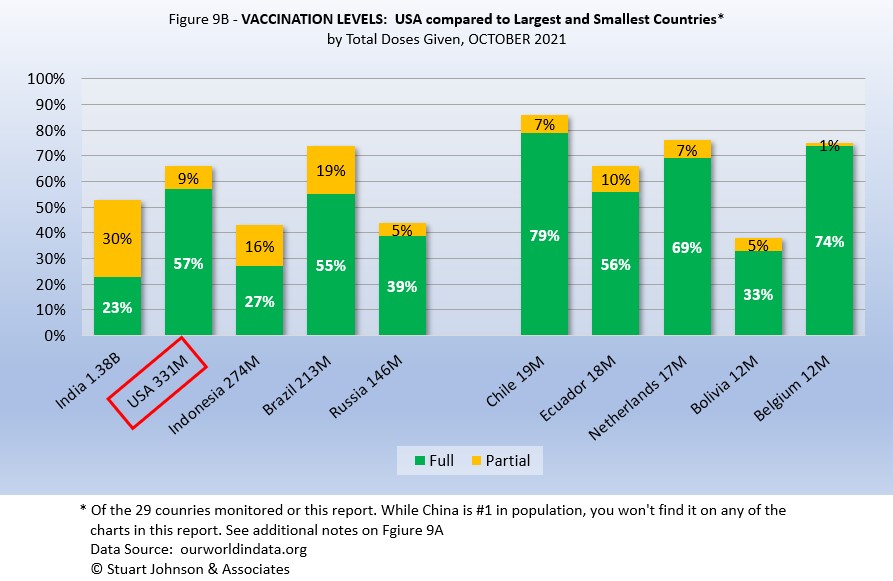
Taking population into account paints a different picture for USA compared to other monitored countries. In Figure 9B you see the five most populous countries on the left and the five smallest on the right. (China is not included because of unreliability of its data).
Here, USA is ahead of the four other largest countries in fully vaccinated, but Brazil is ahead when including those partially vaccinated (first of two doses, or in the waiting period following the final shot). Compared to last month, however, the USA lead in fully vaccinated was cut dramatically as Brazil increased its fully vaccinated from 42% to 55% (while total vaccinated increased much less, from 71% to 74%).
On the side of smallest countries, all except Bolivia are near or ahead of USA in fully vaccinated, Three of the five are ahead of Brazil in total doses.
As a point of interest, the smallest countries are roughly comparable in size to the state of Illinois, where I live, (about 14-million), state-wide vaccination would be similar to Netherlands (Illinois reported 71% fully vaccinated and 77% total vaccinations at the end of October). Thus, individual regions, provinces or states of the largest countries may be doing as well as some smaller countries, while the entire country lags behind the smaller ones.
Causes of Death in U.S.
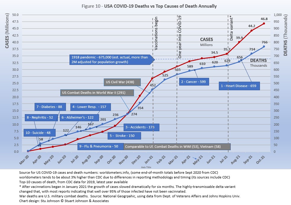
Early in the reporting on COVID, as the death rate climbed in the U.S., a great deal of attention was given to benchmarks, most notably as it approached 58,000, matching the number of American military deaths in the Vietnam War. At that time, I wrote the first article in this series, "About Those Numbers," in which I looked at ways of viewing the data, which at the time of that writing in May 2020 was still focused on worst-case models and familiar benchmarks, like Vietnam.
Figure 10 shows the number of USA COVID cases and deaths against the top-10 causes of death as reported by CDC. Last month, that data was updated to show 2019 figures, the latest year available. Except for Flu & Pneumonia and Nephritis, which swapped the #8 and 9 positions, the others stayed in the same order and changed by small increments, if at all, but did mean that some of the benchmarks in the chart moved slightly.
Notice that for nearly nine months, the curve for deaths was increasing at a faster rate than cases. Then, starting in October 2020 the curve for cases took a decided turn upward, while deaths increased at a more moderate pace (the two curves use different scales, but reflects the relative rate of growth between them).
Media reporting tended to focus on easily grasped benchmarks—deaths in Vietnam or World War II, or major
milestones like 500,000 (crossed in February 2021).
In August we passed the 2018 level for heart disease (655-thousand), then passed it again in September when the 2019 data "moved the goal post" to 259-thousand. Another significant benchmark, pointed out in some news reports, was the 675-thousand estimate for deaths in USA during the 1918 pandemic. Adjusted for population growth, however, that number would now be around 2-mllion.
The latest "Ensemble Forecast" from CDC suggests that by our next report we should see:
...the number of newly reported COVID-19 deaths will likely decrease over the next 4 weeks, with 3,200 to 11,300 new deaths likely reported in the week ending November 27, 2021. The national ensemble predicts that a total of 765,000 to 789,000 COVID-19 deaths will be reported by this date....
Note: As I've referenced in the notes for several charts, the data from worldometers.info tends to be ahead of CDC and Johns Hopkins by about 3%, because of reporting methodology and timing. I use it as a primary source because its main table is very easy to sort and provides the relevant data for these reports. Such differences are also found in the vaccine data from ourworldindata. Over time, however, trends track with reasonable consistency between sources.
Perspective
The 1918-19 Spanish Flu pandemic is estimated to have struck 500 million people, 26.3% of the world population of 1.9-billion at that time. By contrast, we're now at 3.1% of the global population. Deaths a century ago have been widely estimated at between 50- and 100-million worldwide, putting the global mortality rate somewhere between 10 and 20-percent. It has been estimated that 675,000 died in the U.S.
IF COVID-19 hit at the same rate as 1918, we would see about 2-billion cases worldwide by the time COVID-19 is over, with the global population now at 7.9-billion—four times what it was in 1918. There would be 200- to 400-million deaths. The U.S. is estimated to have had 27-million cases (one-quarter of the population of 108-million) and 675,000 deaths. Today, with a population of 331-million (a three-fold increase from 1918) this would mean more than 80-million cases, and 2- to 4-million deaths.
However, at the present rate of confirmed cases and mortality while the total number of global cases could approach 500 million or more—comparable to 1918 in number, that would be one-quarter of 1918 when taking population growth into account . .. and assuming the pandemic persists as long as the Spanish Flu, which went on in three waves over a two year period. At the present rate of increase (close to 13-million cases per month) it would take another 19 months to reach 500-million, roughly June of 2023.
If the total number of cases globally did approach 500-million, using the global mortality rate of 2.0% in October, there would be roughly 10-million deaths worldwide. Tragic but far below the number reported for 1918 (50-million) with an even wider gap (200 million) when taking population growth into account.
Earlier in the summer, I indicated that with vaccination in progress and expected to be completed in the U.S. by the end of summer, the end of COVID-19 could come sooner. Like 1918, however, there are now complicating factors, such as the combination of the delta variant with a high number of unvaccianted (some by choice, as in USA and Europe, and many more in underdeveloped countries by inequitable access to vaccine). While we may have thought the end of the pandemic was in sight, it is still too early to make predictions on the duration and severity of the COVID-19 pandemic globally. Indeed, the slope of the global growth of cases and deaths still looks like the trajectory of an airplane climbing toward cruising altitude.
Despite the darkening forecast in the past four months, the vast difference in scale between the Spanish Flu pandemic a century ago and COVID-19 even more than a year-and-a-half in, cannot be denied.. Key differences are the mitigation efforts, treatments available today (though still leaving the health care system overwhelmed in some areas during surges), and the availability of vaccines. In addition, in 1918 much of the world was focused on a brutal war among nations (World War I) rather than waging a war against the pandemic, which ran its course and was undoubtedly made much worse by the war, with trans-national troop movements, the close quarters of trench warfare, and large public gatherings supporting or protesting the war.
Vaccinations in the U.S.
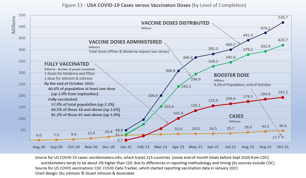
With remarkable speed (it usually takes years to develop vaccines), two COVID vaccines were granted emergency approval for use in the U.S. starting in January 2021—the one by Pfizer requires super-cold storage, which limits its deployment. The other, by Moderna, requires cold storage similar to other vaccines. Both of these require two doses, which means that vaccine dosages available must be divided in two to determine the number of people covered. By March 2021 Johnson & Johnson had been granted approval for a single-dose vaccine. The numbers in Figure 11 represent the status of all three vaccines as of October 31 (as reported by CDC, which will be slightly different than ourworldofdata data used in earlier vaccination charts). .
A person is considered "fully vaccinated" two weeks after the final (or only) vaccine dose; roughly five to six weeks total for Pfizer and Moderna and two weeks for Johnson & Johnson.
Figure 11 shows an upturn in Doses Distributed and Administered in August, a sign that perhaps the delta variant provided the impetus for increased vaccinations. The rate of increased distribution continued into October. However, doses administered dipped slightly in September then recovered in October, while fully vaccinated stayed on the steady, slow rise of the past four months. Added to the chart this month is a figure for the number of booster doses administered (my wife and I got ours yesterday). In addition, as I write this, the CDC just approved vaccinations for children 5-11, so we will see next month whether that expands the number of doses administered.
Early on (still somewhat evident in March 2021) there was much anxiety about vaccine availability and scheduling appointments. That is behind us and vaccinations are readily available to most of the population (there will always be some disparities and trouble spots, but in general most people who want the vaccine can get it). Now, the biggest concern is convincing the dubious, the deniers, and the resisters to get vaccinated and help the country reach herd immunity (about 70% of the population fully vaccinated). Earlier in the summer, as vaccination rates started to stall, some areas began providing incentive, from free beer to lotteries for the fully vaccinated, and celebrity testimonials urging vaccination. The seriousness of the delta variant has scared others into taking action, yet the number of unvaccinated remains troubling, so we now face the use of or threats of using mandates in both the public and private sectors. Some (United Airlines) have been met with strong compliance, others (school systems, health care, cities and states) have been met with limited success and even more strident resistance, including law suits. As of this writing, President Biden, through the Department of Labor, has announced rules requiring vaccination compliance by January 4 for all private businesses with 100 or more employees. The political opposition will be intense as the battle continues between public health and perceptions of governemtn overreach.
The CDC (Centers for Disease Control and Prevention) revised its mask guidelines as the delta variant intensified. Some resistors claim this proves the science cannot be trusted—but that position misunderstands the nature and role of science, which is to observe and constantly assess assumptions and recommendations based on a growing (and developing) body of data.
Debates over masking policy provides evidence that the real battle now is vaccination. A year ago we were debating lock-downs. Today the debate is how to be open but remain safe. Will the rise of infections and the call for more masking be enough to spur more vaccinations? For some, perhaps, but whether low levels of vaccinations have prolonged the pandemic (around the world) will be the subject of discussion and debate for years to come.
Vaccinating over 300 million people in the United States (much less a majority of the billions around the world) is a daunting task. It is a huge logistical challenge, from manufacture to distribution to administration. Yet, it remains amazing that any of this is possible this soon after the identification of the virus just over a year and a half ago.
There is a delicate balance between maintaining hope with the reality that this is a huge and complicated logistical operation that will take time, with the prospect that COVID will be with us for some time, partly because getting shots into the arms of the unvaccinated is proving to be a far bigger challenge that most officials assumed a few months ago.
As the richer countries with access to more resources make progress, the global situation is raising issues of equity and fairness within and between countries. Even as the U.S. and other countries launch large scale vaccine distribution to a needy world community, the immensity of the need is so great that a common refrain heard now is whether this aid is too little, too late. As COVID fades into a bad memory in countries able to provide help, will the sense of urgency remain high enough to produce the results needed to end this global pandemic?
Maintaining Perspective
The following section has appeared several months and I repeat it here because there is an even greater need now to evaluate what is happening: to understand the science and its dynamic nature, to put politics in perspective and to show empathy, to truly demonstrate that we are in this together and want to get out of it as soon as possible.
In the tendency to turn everything into a binary right-wrong or agree-disagree with science or government, we ignore the need to recognize the nature of science and the fact that we are dealing with very complicated issues. So, in addition to recommending excellent sources like the Centers for Disease Control and Prevention (CDC), it is also wise to consider multiple qualified sources.
While there has been much focus placed in trusting "the science," it is important to recognize that science itself changes over time based on research and available data. In the highly volatile political atmosphere we find ourselves in (not just in the U.S., but around the world), there is a danger of not allowing the experts to change their views as their own understanding expands, or of trying to silence voices of experts whose views are out of sync with "the science" as reported by the majority of media outlets.
In an earlier report, I mentioned the Greater Barrington Declaration, currently signed by nearly 58-thousand medical & public health scientists and medical practitioners, which states "As infectious disease epidemiologists and public health scientists we have grave concerns about the damaging physical and mental health impacts of the prevailing COVID-19 policies, and recommend an approach we call Focused Protection."
For a personal perspective from a scholar and practitioner who espouses an approach similar to the Focused Protection of the Greater Harrington Declaration, see comments by Scott W. Atlas, Robert Wesson Senior Fellow at the Hoover Institution at Stanford University, in an article "Science, Politics, and COVID: Will Truth Prevail?"
Several months ago on SeniorLifestyle I posted an article by Mallory Pickett of The New Yorker, "Sweden's Pandemic Experiment," which provides a fair evaluation of the very loose protocols adopted by Sweden, essentially a variation of the "Focused Protection" approach. The "jury is still out" on this one, so judge for yourself whether Sweden hit the mark any better than the area in which you live.
UPDATE ON SWEDEN: Very little change from July. At the end of October Sweden reported just over 1.2-million cases of COVID, or 13.5% of its population of 10.2-million. There have been 15,007 deaths, for a mortality rate of 1.3%. Ranked 89 by population, Sweden was number 34 in cases and number 45 in deaths (the same for cases and 44 for deaths in September). That would put Sweden below USA and the same as UK in cases as proportion of population, but the mortality rate would be the same as India, near the bottom (best) among the 29 counties monitored for this report and well below the global rate of 2.0%.
UPDATE (November 6): After posting this month's Perspectives, I posted on SeniorLifesytle an article by Sarah Zhang from The Atlantic, "America Has Lost the Plot on COVID." In it, she suggests that America (and the world) is headed not toward the eradication of COVID-19, but its transofmration from pandemic to endemic, joining the seasonal flu as something we will deal with for some time. Getting there, she contends, is more a matter of mixed policy strategies than "following the science," but coming to grips with its inevitability could help lead to more effective strategies.
Zhang mentions Denmark as a counterpoint to what is happening in America, saying
One country that has excelled at vaccinating its elderly population is Denmark. Ninety-five percent of those over 50 have taken a COVID-19 vaccine, on top of a 90 percent overall vaccination rate in those eligible. (Children under 12 are still not eligible.) On September 10, Denmark lifted all restrictions. No face masks. No restrictions on bars or nightclubs. Life feels completely back to normal, says Lone Simonsen, an epidemiologist at Roskilde University, who was among the scientists advising the Danish government. In deciding when the country would be ready to reopen, she told me, “I was looking at, simply, vaccination coverage in people over 50.” COVID-19 cases in Denmark have since risen—under CDC mask guidelines, the country would even qualify as an area of “high” transmission where vaccinated people should still mask indoors. But hospitalizations are at a fraction of their January peak, relatively few people are in intensive care, and deaths in particular have remained low.
Crucially, Simonsen said, decisions about COVID measures are made on a short-term basis. If the situation changes, these restrictions can come back—and indeed, the health minister is now talking about that possibility. Simonsen continues to scrutinize new hospitalizations everyday. Depending on how the country’s transition to endemicity goes, it could be a model for the rest of the world.
UPDATE ON DENMARK: As of November 4, Denmark reported nearly 396-thousand cases of COVID, or 6.8% of its population of 5.8-million. There have been 2.722 deaths, for a mortality rate of 0.7%. Ranked 113 in population, Denmark was number 70 in cases and number 95 in deaths. That puts Denmark at half the proportion of cases as Sweden, even better compared to USA, and about the same as Ukraine and Peru (ranked 17 and 18 among the 29 monitored countires). While double the global case to population proportion of 3.1%, mortality rate is most striking, and the point of Zhang's observation about focusing on the prevention of hospitalization. The mortality rate (0.7%) is below Turkey and Netherlands (0.9%), which are the lowest among the 29 monitored countries, and well below the global rate of 2.0%.
How we evaluate the many approaches used to deal with COVID will determine how we prepare for and approach the next global event—including what now appears to be a transition from pandemic to endemic for COVID-19.
My purpose in mentioning these sources is to recognize that there are multiple, sometimes dissenting, voices that should be part of the conversation. The purpose of these monthly reports remains first and foremost to present the numbers about COVID-19 in a manner that helps you understand how the pandemic is progressing and how the U.S. compares to the world—and how to gain more perspective than might be gathered from the news alone.
Profile of Monitored Continents & Countries
(Data from worldometers.info).
| Rank | Country | Population | Share of World Population |
Density People per square km |
Urban Population |
Median Age |
| WORLD | 7.82B | 100% | -- | -- | -- | |
| Top 10 Countries by Population, plus Five Major Continents See lists of countries by continent |
||||||
| - | ASIA | 4.64B | 59.3% | 150 | 51 countries | 32 |
| 1 | China | 1.44B | 18.4% | 153 | 61% | 38 |
| 2 | India | 1.38B | 17.7% | 454 | 35% | 28 |
| - | AFRICA | 1.34BM | 17.1% | 45 | 59 countries | 20 |
| - | EUROPE | 747.7M | 9.6% | 34 | 44 countries | 43 |
| - | S AMERICA | 653.8M | 8.4% | 32 | 50 countries | 31 |
| - | N AMERICA | 368.9M | 4.7% | 29 | 5 countries | 39 |
| 3 | USA | 331.5M | 4.3% | 36 | 83% | 38 |
| 4 | Indonesia** | 274.5M | 3.5% | 151 | 56% | 30 |
| 5 | Pakistan* | 220.9M | 2.8% | 287 | 35% | 23 |
| 6 | Brazil | 212.9M | 2.7% | 25 | 88% | 33 |
| 7 | Nigeria* | 206.1M | 2.6% | 226 | 52% | 18 |
| 8 | Bangladesh* | 165.2M | 2.1% | 1,265 | 39% | 28 |
| 9 | Russia | 145.9M | 1.9% | 9 | 74% | 40 |
| 10 | Mexico | 129.3M | 1.7% | 66 | 84% | 29 |
| *these countries do not appear in the details because they have not yet reached a high enough threshold to be included **Indonesia was added to the monitored list in July 2021 Other Countries included in Analysis most have been in top 20 of cases or deaths |
||||||
| Rank | Country | Population | Share of World Population |
Density People per square km |
Urban Population |
Median Age |
| 13 | Philippines (2) | 109.6M | 1.4% | 368 | 47% | 26 |
| 17 | Turkey | 84.3M | 1.1% | 110 | 76% | 32 |
| 18 | Iran | 83.9M | 1.1% | 52 | 76% | 32 |
| 19 | Germany | 83.8M | 1.1% | 240 | 76% | 46 |
| 21 | United Kingdom | 67.9M | 0.9% | 281 | 83% | 40 |
| 22 | France | 65.3M | 0.8% | 119 | 82% | 42 |
| 23 | Italy | 60.4M | 0.8% | 206 | 69% | 47 |
| 25 | South Africa (1) | 59.3M | 0.8% | 94 | 67% | 28 |
| 29 | Colombia | 50.9M | 0.7% | 46 | 80% | 31 |
| 30 | Spain | 46.8M | 0.6% | 94 | 80% | 45 |
| 32 | Argentina | 45.2M | 0.6% | 17 | 93% | 32 |
| 35 | Ukraine (1) | 43.7M | 0.6% | 75 | 69% | 41 |
| 39 | Poland (1) | 37.8M | 0.5% | 124 | 60% | 42 |
| 39 | Canada | 37.7M | 0.5% | 4 | 81% | 41 |
| 43 | Peru | 32.9M | 0.4% | 26 | 79% | 31 |
| 45 | Malaysia (3) | 32.4M | 0.4% | 99 | 78% | 30 |
| 61 | Romania (4) | 19.1M | 0.2% | 84 | 55% | 43 |
| 63 | Chile | 19.1M | 0.2% | 26 | 85% | 35 |
| 67 | Ecuador | 17.6M | 0.2% | 71 | 63% | 28 |
| 69 | Netherlands (1) | 17.1M | 0.2% | 508 | 92% | 43 |
| 80 | Bolivia | 11.7M | 0.1% | 11 | 69% | 26 |
| 81 | Belgium | 11.6M | 0.1% | 383 | 98% | 42 |
(1) Added to the monitored list in July 2021 |
||||||
Scope of This Report
What I track
From the worldometers.info website I track the following Categories:
- Total Cases • Cases per Million
- Total Deaths • Deaths per Million
- Total Tests • Tests per Million (not reported at a Continental level)
- From Cases and Deaths, I calculate the Mortality Rate
Instead of reporting Cases per Million directly, I try to put raw numbers in the perspective of several key measures. These are a different way of expressing "per Million" statistics, but it seems easier to grasp.
- Country population as a proportion of global population
- Country cases and deaths as a proportion of global cases and deaths
- Country cases as a proportion of its own population
- Cases and deaths expressed as "1 in X" number of people
Who I monitor
My analysis covers countries that have appeared in the top-10 of the worldometers categories since September 2020. This includes most of the world's largest countries as well as some that are much smaller (see the chart in the previous section).
This article was also posted on SeniorLifestyle, which I edit
Search all articles by Stu Johnson
Building article list (this could take a few moments) ...Stu Johnson is owner of Stuart Johnson & Associates, a communications consultancy in Wheaton, Illinois focused on "making information make sense."
• E-mail the author (moc.setaicossajs@uts*)* For web-based email, you may need to copy and paste the address yourself.
Posted: November 308, 2021 Accessed 7,954 times
![]() Go to the list of most recent InfoMatters Blogs
Go to the list of most recent InfoMatters Blogs
![]() Search InfoMatters (You can expand the search to the entire site)
Search InfoMatters (You can expand the search to the entire site)
Loading requested view (this could take a few moments)...Where is the Life we have lost in living? Where is the wisdom we have lost in knowledge? Where is the knowledge we have lost in information?

InfoMatters
Category: Information / Topics: History • Information • Statistics • Trends
COVID-19 Perspectives for October 2021
by Stu Johnson
Building article list (this could take a few moments)...Posted: November 308, 2021
South America shows improvement while USA and most of the world show little sign of flattening the COVID curve…
Putting the COVID-19 pandemic in perspective (Number 16)
This monthly report was spawned by my interest in making sense of numbers that are often misinterpreted in the media or overwhelming in detail (some would say that these reports are too detailed, but I am trying to give you a picture of how the COVID pandemic in the United States compares with the rest of the world, to give you a sense of perspective).
New this month:
- Population statistics have been updated because global population has increased from 7.8-billion to 7.9-billion since I began reporting on COVID in April 2020.
- The rising number of cases and deaths in Romania reached the threshold to add it to the list of monitored countries, bringing that number to 29 (when these reports began I was monitoring 21 countries).
These reports will continue as long as the pandemic persists around the world.
Report Sections:
• September at-a-glance
• The Continental View • USA Compared with Other Countries
• COVID Deaths Compared to the Leading Causes of Death in the U.S.
• U.S. COVID Cases versus Vaccinations
• Profile of Monitored Continents & Countries • Scope of This Report
September-at-a-glance
- COVID-19 continued to spread around the world, reaching 247-million cases by the end of October, up 6% from September. Deaths from COVID around the world just crossed the 5-million mark at the end of October.
The level of reported cases represents 3.1% of the global population of 7.9-billion, up from 3.0% at the end of September. The increase over September was 6%, back to the level of May following an apparent delta-related surge, when the monthly increase went up to 10% in August. That means that so far the delta-related surge was not as significant as previous surges (November 2020-January 2021 and April-May 2021), but continues to be problematic. In some areas it is driven by dense populations and/or lack of vaccine, in others (USA being a prime example) by vaccine resistance as evidenced by reports that hospital admissions for COVID are nearly all among those who have not been vaccinated. .
The blue "cone" in Figure 1 shows the possible high and low projection of global cases, with the bottom (roughly 140-million) representing the trajectory of the lower pace in late summer 2020 and the upper (approximately 280-million) representing a continuation of the surge from November 2020 through January 2021. You can see that the curve for global cases has bent down and back up several times since February 2021, but is very slowly moving away from—but still close to—the upper edge of the prediction cone. USA had fared better until August, which I'll get to below. - The pattern for deaths tends to lag behind cases by weeks or months, and the global rate of increase continues to fall below that of cases—dropping from a 23% increase in January to 5% at the end of October, with a modest increase to 7% in July and August. While the curve for deaths is not increasing as much as that for cases, it is still climbing at a noticeable rate (unlike USA where cases and deaths flattened between January and July 2021, before rising again).
- Where South America was clearly going the wrong way through early summer, things have significantly reversed. Headed toward eclipsing Europe in the number of cases and deaths, the curves began to turn down in July and flatten through October.
South America has also taken the lead in vaccination doses, surpassing Europe and North America in August. Ironically, while the continent is improving several South American countries remain as trouble spots. See more in The Continental View.
- USA. continues to lead the world in the number of reported cases and deaths, but also leads the world in the number of COVID tests and is respectable in vaccinations, but hampered by vaccine resistance.
While the 18.9% USA share of global cases at the end of October is down from a high of 25.9% in January, the trend is erratic. The rate was 18.9% in June before dropping to 18.0% in July, then headed back up to 18.9% in September and October.
Similarly, deaths have declined from 20.9% of the world total in September 2020 to 14.5% at the end of August 2021 before heading back up to 15.3% at the end of October. As you will see in details to follow, while USA outpaced everyone through the early months of the pandemic, the vast disparity was slowly shrinking until the delta variant brought a resurgence in cases. T
he projection cone surrounding USA Cases in Figure 1 shows a pronounced flattening of the curve from January to July (vaccinations), with a very noticeable upward bend in August (delta variant among unvaccinated)—though still in the bottom half of the projection cone (which for USA extends from roughly 35 to 85-million). The upward bend for USA cases from August to October is clearly visible in Figure 1, but even more pronounced in Figure 10 below, which "zooms in" on USA.
Figure 1 also shows how much lower cases in the US would be—approaching 9.9-million by now, instead of 46.8-million—if they were proportional to the global population. It would also mean about 160-thousand deaths instead of 766-thousand.
- Countries to watch. For this report, I moved Romania into the list of monitored countries, increasing that list from 28 to 29 countries (a profile of this list can be found at the bottom of this page). In addition, the weekly comparison report on worldometers gives a sense of hot spots to watch. Based on activity in the last week or two, this includes Bulgaria, Serbia, Czechia, Thailand, Vietnam, Guatemala and Egypt. While some of these have population too small to make much of an impact on this report, they generally confirm (along with countries recently added to my monitored list) the shift of growth in COVID to eastern Europe, southeast Asia and the Middle East.
- With vaccinations, USA continues to move ahead. After a noticeable slowdown in June and July, total doses distributed climbed to nearly 520-million by October. The curve for doses administered ("shots in the arm") picked up, but not as fast as doses distributed. Meanwhile, the curve for those fully vaccinated is rising at a slower but steady pace, with those fully vaccinated rising 2.3% over September. (See Figure 11).
Where you get information on COVID is important. In an atmosphere wary of misinformation, "news-by-anecdote" from otherwise trusted sources can itself be a form of misinformation. As I go through the statistics each month, I am reminded often that the numbers do not always line up with the impressions from the news. With that caveat, let's dig into the numbers for October 2021.
The Continental View
Since starting to report on COVID in April of 2020, global population has grown from just over 7.8-billlion to 7.9-billion, so this month I have updated population numbers. The Americas show no change in proportion, Europe is down one-tenth of a percent, Asia is up that much, and Africa gained four-tenths. Oceana is not included because of its small size, about one-half a percent of world population. (The apparent discrepancy of a net gain of four-tenths is explained by rounding).
While COVID-19 has been classified as a global pandemic, it is not distributed evenly around the world.
Asia accounts for 59.4% of the world's population (Figure 2), but had only 32.1% of COVID cases at the end of October (Figure 3A)—affecting a mere 1.7% of its population (COVID cases have been reported for 3.1% of world population).
The biggest trends in the proportion of cases among continents are most noticeable since March:
Asia - rising, then leveling off near 32% the last three months
Europe - falling through September, with a bump up to 26% in October
North America - falling through July, then back up slightly, below 23% in September and October
South America - after peaking at 18% in June, steadily descending to just over 15% in October, returning to the level last seen in January
Africa - hovering around 3.5%
Where Asia and Africa combined represent about three-quarters (76.9%) of the world's 7.9-billion people, Europe, South America and North America still account for nearly two-thirds of COVID cases (65.1% - Figure 3A) and about 7 in 10 of COVID deaths (72.2% - Figure 4A). The shares for Europe and the Americas combined are slowly coming down from their highs (74.7% for cases and 80.8% for deaths in February).
While news reports have given the impression of widespread delta-variant surges, growth in the number of cases since July has not been uniform across continents. North America showed the sharpest and steadiest climb. Asia and Africa bent upward in August then started to slow a bit in September and October. Europe began to bend upward in July, but at a rate slower then Asia and North America until October when it accelerated slightly to match the rate of increase shown by North America. South America became the outlier here, actually bending down starting in August.
Africa, second by population, remains a loner, with an almost flat curve compared to the other four large continents. It did bend up slightly from May through August, when delta became dominant, but then leveled off again in September and October.
The raw numbers of Figure 3B can be deceptive. Figure 3C gives a more realistic picture of impact by translating raw case numbers to percentage of population.
After a sharp increase in January, North America slowed down for six months, before jumping 1.5 points to 13.0% in August and continuing that pace to reach 15.7% at the end of October—far ahead of the other continents in proportion of population reported with COVID and the most dramatic change for any of them since the delta variant became a factor.
Europe remains well below North America, though it did show a steady upward movement over the last four months, after a short downturn in May and June. South America was rising steadily through July, before bending downward from August through October, widening its gap with Europe. Asia and Africa have not changed dramatically in rate over the past five months and both continue to inch away from the global rate, which stood at 3.1% at the end of October. However, as pointed out last month, individual countries in Asia have dominated my watch list in the past few months.
The proportion of deaths between continents is even more distorted than that of cases. In the early months of COVID, Europe and the Americas were growing in deaths, causing Asia to bottom out in its proportion of global deaths at 15.2% in March. The trends since then shadow those of cases, but lag behind by a month of two.
Europe retains the highest proportion of COVID deaths at 26%, but that is down from a high of nearly 33% in April.
Asia and South America both ended October at just over 23%. Asia rose from a low of 15% in March, while South America bottomed out at 18% in February before rising to nearly 26% in June and then starting to drop again.
North America ended October at nearly 23%, down from a high aproaching 30% in February.
Asia has stayed centered on 4% in COVID deaths, while its population represents 17%.
Deaths through October shows that while the trajectory lags behind cases and has progressed at a steadier rate, it does reflect the overall changes in Cases by continent. The 1-million milestone is now history for the top four continents by COVID deaths. Europe crossed that threshold in April, followed by South America in June, Asia in August and North America in September.
Europe remains at the top in number of deaths, at 1.3-million. Asia slowed slightly in September, but kept increasing to barely pass South America to claim second place in October. The growth rate for South America, which climbed dramatically in June and seemed poised to pass Europe, slowed down significantly, enough to allow Asia to pass it by a mere 37 deaths. North America had been slowing in late spring and summer, on a path to distance itself from the top three, but bent upward in September and October to nearly catch Asia and South America, but remain in fourth place. If South America continues to flatten, if could end up in fourth place in another month or two.
Africa continues at a slow and steady pace, with a slight drift upward since May, but remains well below the other continents despite being second in size, with 1.3-billion people.
Vaccinations
Last month I started to compare vaccination at the continental level using data from ourworldindata.org.
As Figure 5A shows, more than one-third of the global population has been reported as fully vaccinated (roughly 3-billion people), with another 11% having received the first of two doses or in the waiting period to be considered fully vaccinated. Given continuing gloomy reports in the news, those numbers may be surprisingly high given the monumental task of vaccinating multiple billions of people.
Europe is ahead of the pack, with 55% of its population fully vaccinated, followed by North America at 52%. Interestingly, South America, which struggled with surges over recent months, has attacked the vaccination front, putting the continent in the lead for total doses administered at 67% and close on the heels of North America in fully vaccinated. Asia is further behind, but gaining, with 56% having received at least one dose. Clearly, Africa remains the loner—and the loser—on the vaccination front, which highlights arguments over vaccine availability and inequities in distribution.
While South America got into vaccinations later and slower than North America and Europe, Figure 5B shows how it pushed its way to the top of the total vaccination doses administered by October—and this by proportion of population, not raw numbers, so it's a fair comparison. Where North America started aggressively, it slowed in June as Europe caught up, then both have tracked very close the last three months, reaching 61% and 59% respectively in October.
The world trajectory was clearly influenced by Asia, which showed serious vaccination administration starting in June, moving upward to nearly match Europe in October. Africa remains far behind the others, though there is an encouraging upward movement beginning in July.
Because a majority of vaccines require two doses, we will likely see total doses expand more quickly in coming months, with full vaccination catching up at a rate dependent on supply, strategy and willingness of populations to cooperate.
Comparison of U.S. with other Countries
Cases
Raw numbers are virtually meaningless without relating them to the size of a given country, so looking at cases as a proportion of population helps get a sense of the relative impact.
France drops from the top-5, replaced by Belgium. The other four return, but shuffle their order from September.
USA moved back into #1 in August after being edged out by a very slim margin by Argentina in July. In September USA pushed well past the others, but UK, hard hit with a steady increase since July is now on a path that could surpass USA in a month or two. Netherlands, introduced to the list of monitored countries in July, has risen steadily, but with UK rising faster, it drops to third place. Belgium continues a fairly steady upward pace which, combined with Argentina's slowing pace put Belgium at number 4 and Argentina at number 5.
The top-5 by proportion of population with COVID cases, have progressed at a rate higher than the Global level, with only Argentina slowing to a lower pace. Last month, it appeared that USA was racing ahead of the others in proportion of cases for its population, but the upward turns of UK, Netherlands and Belgium made the distribution between them more even.
Another way to look at population proportion is the measure "1 in." The global figure of 3.1% means that 1 in 32 people in the world have been reported with COVID (and that only by official record keeping, not including any unreported and likely asymptomatic cases). For USA it is 1 in
7. For UK and Netherlands it is 1 in 8 and for Belgium and Argentina 1 in 9.
All five countries return from September, but their order is shuffled. All five have been at or below the global level since August.
Mexico continued an accelerated path started last month to put it on the top of the bottom five. Ecuador had flattened considerably in development of new cases, bringing it first below the global level last month and then into second place this month. Philippines rose sharply in September after being added to the list of monitored countries in August, then slowed in October. India had a major surge in April and May, then slowed before a bump up in October put it in a virtual ties for third place with Philippines. Indonesia, added to the list of monitored countries in July, remains the lowest of the 29 monitored for proportion of cases for its population and the only one below 2%.
These countries represent a considerable spread in size, from India, the second largest country, to Ecuador, ranked number 67 of the 215 countries tracked by worldometers. For Ecuador, its 2.9% of population means that 1 in 34 have been reported as having had the COVID virus, for India it is 1 in 40, and for Indonesia 1 in 64.
Because the size of countries makes the use of raw case numbers illusory, another measure I find helpful is the rate of change from month to month (Figure 6C). The focus of the selection is on recent changes, but the chart goes back to November to keep the surges of late 2020 in perspective.
For this chart, countries are selected based on the change over two-months (end of August to end of October for this report). Iran and Mexico have been replaced by Philippines and Ukraine. USA, which appears in every report, dropped from the top-5, replaced by Russia.
The overall trend (red line, reflecting global level) flattens as it drops, then heads down even more in October. (A polynomial trend line flexes as adjacent data points go up and down, so the leading edge of newest dates can change the shape of the curve as new months are added).
Overall, global levels were much higher from November 2020 through January 2021 (the highest period of surging cases as pointed out in Figure 1), as was the absolute variation between countries. Global levels remained over 10% through May. Over the past five months, the global level ranged from 10% in August down to 7% in June, September and October,
Philippines was added to the list of monitored countries in August and showed a 28% rise in cases for September over August. It dropped to 9% in October, but that remained above the global change of 7%. UK has been above the global rate of change since July and had even higher levels from November 2020 through January 2021 during the highest levels of surge since the pandemic started. Ukraine, added to the list in July, hit a 21% change for October over September. Turkey, on the monitored list since January, saw increases of 11 and 12% for the past three months and 44% back in April. Russia increased 13% in October after only 3% in September, but was above 10% in July and August. .
USA started well above the Global level from November 2020 (48%) through January 2021 (31%), then dropped to 9% in February after vaccinations had begun and the surge seemed to have ended (in USA anyway). From there it is fell further below the global level each month until reaching a low of 1% in June. This has reversed, with a small bump in July that was still well below the global level. Then August went above the global rate (10%) to hit a 12% increase, followed by 11% in September—not as bad as the early surge, but enough to show the impact of delta on the still-too-large number of unvaccinated individuals. October slowed, with a 6% change over September. (This is visible in Figure 1, which compares Global and USA curves, but even more evident in Figure 10, which focuses on USA),
Deaths
Because deaths as a percentage of population is such a small number, the "Deaths-per-Million" metric shown in Figure 7A provides a comparable measure.
The top four countries return, in the same order, but USA replaces Belgium in fifth place.
As Figure 7A shows, Peru still soars over the others following a correction to its death data in June. October remains more than double #2 Brazil and more than 9 times the Global level of 643.
While the worst deaths-per-million is still dominated by South American countries, as suggested in other parts of the report there has been a slowing and even some flattening evident in the last three months. Peru, Brazil, and Argentina have all slowed in growth of deaths-per-million (the number cannot go down, but growth can flatten). Columbia pretty much flattened in September, putting it on top of Argentina's curve for October.
USA rose steadily until evidence of the effectiveness of vaccination began to become evident with a slow down from March through July, before turning back upward in August, coinciding with the delta variant and vaccine resistance.
Since this analysis focuses on 29 countries that have been in the top-20 of cases and deaths, there are 7 other countries not monitored with Deaths-per-Million between Peru, with a population of 33.5M, and Brazil, with 214.5M. The largest are Bulgaria (6.9M, 3,534 Deaths-per-Million), Hungary (9.6M, 3,208), and Czechia (10.7M, 2,869).
All of the countries on the chart, including USA, are all well above the Global level, and (except for Peru) fairly close to each other for the past four months after nearly converging in June.
While the delta variant was causing cases to rise, particularly in July and August, death rates in general remained unaffected or low in comparison—even South America, which had been the exception, is slowing down.
The same five countries return, in the same order as September.
Turkey moved into first place last month and continued on a steeper upward pace, putting more distance between it and second place Canada, which has been fairly steady since January. Both Turkey and Canada remain above the Global level. Indonesia, added to the monitored list in July, rose steeply in August, then leveled off. Netherlands, added in August, was flat into September, then rose at a rate greater than the Global level in October, but remains the second lowest Deaths-per-Million of the 29 monitored countries. Holding onto the lowest level (which is good in this case) is India, which rose sharply from April to June before leveling off, growing at a slower pace than the Global curve.
As with the comparable chart for Rate of Change for Cases (Figure 6C), countries for Rate of Change for Deaths (Figure 7C) are selected based on the change over two-months (end of August to end of October) in reported COVID deaths. The focus of the selection is on recent changes, but the chart goes back to November to keep the surges of late 2020 in perspective.
Philippines and Ukraine replace Indonesia and South Africa. USA appears every month for comparison.
The trend
in the rate of change in deaths (red line in Figure 7C) shows the delayed connection with cases and appears smoother than the month-to-month changes in the Global level. Monthly Global changes for deaths trended down through March, bumped up in April and has moved down from there, ending October at 5%, the lowest point. (As mentioned with Rate of Change for Cases, the trend line is a polynomial that can change shape as new values are added at the most-recent end.)
Philippines, added to the list in September, saw a 14% increase in both September and October, well above the Global level of 5%. Russia was nearly the same, increasing 13% in September and 15% in October. Ukraine was below the Global level in September, but increased 20% in October, the most among the top five (over two months). Turkey was double the Global level in both months, while Iran was double in September (11%) and even in October (5%).
USA was higher than the Global level in December 2020 through February 2021, then has been significantly lower since then, falling to a 1% change in July (over the number of deaths in June), but that bumped up in August to 4% over July, still well below the Global level of 7%. In September, however, USA showed a 9% increase in deaths over August, reversing the steady decline from December 2020 to August 2021. October was down to 7% but still above the Global level. All of this confirms the early success of vaccination, which kept driving death rates down, followed by the resurgence related to the delta variant and vaccine resistance. November will tell us whether the October dip was a trend or an anomaly.
Mortality Rate
Mortality Rates (percentage of deaths against reported cases) have generally been slowly declining. This is not surprising as several factors came into play:
- In the early days of the pandemic, there was a high proportion of "outbreak" cases (nursing homes, retirement communities, other settings with a concentration of more vulnerable people). As the pandemic continued the ratio of "community spread" (with lower death rates) to "outbreaks" increased and the overall Mortality Rate went down.
- As knowledge about treatment increased, mortality went down.
- Since the death count is more certain (though not without inaccuracies), the side of the equation that can change the most is cases. As testing revealed more cases, the Motrality Rate would naturally go down because it would only affect cases and not deaths. In addition, the official numbers do not take into account a potentially higher number of people with the virus who are unreported and asymptomatic, so the real mortality rate could be even lower.
- Vaccinations started in January (though that should impact both cases and deaths).
In recent months, the delta variant produced surges in cases, particularly among those who are unvaccinated, though the death rate stayed lower than early on, which results in a lower mortality rate (remember, however, that deaths from the delta variant may become more evident in coming months).
The Global mortality rate has dropped from 2.6% in October 2020 to 2.1% by April, where it has stayed except for a bump back to 2.2% in June, before dropping again, to 2.0% in September and October. The median for the countries monitored for this report has dropped from 4.8% in October 2020 to 2.8% the past seven months.
All five of the top-5 in mortality rate (among the 29 countries monitored) return in October, in the same order—for the fourth straight month. Despite a generally improving picture for South America, three of the five with the worst mortality rates are located there and Mexico is geographically close.
Peru was in fourth place and declining until June when its corrected death numbers drove Mortality to 9.4%, just ahead of Mexico at 9.3%. Since then Peru has shown a very slight decline for three months and a slight rise in October. Mexico started with the highest mortality rate, 9.9%, went down then back up before making a more concerted decline in July, though it has leveled off the last two months. Ecuador was on a steady path of dropping mortality rate through June, then has gone up more than Mexico went down, with the two looking like they would cross paths in August. However, both Mexico and Ecuador leveled off and were running on parallel tracks the last two months.
Bolivia is the one South American country among the five with the worst mortality to show a steady decline (which is good), though the pace of the decline has slowed since May. Indonesia was added to the list of monitored countries in July, coming in at #5, rising some in August, then leveling off to maintain a small separation with Bolivia since September. All five have been significantly above the Global rate since at least October 2020 when this chart begins.
Since these represent the best mortality rates, where low is good, the "rank" order is actually in reverse. Malaysia, added to the monitored list in September replaces Philippines, and UK joins the best five since USA missed being in the group for the first time (primarily due to rising deaths related to the delta variant).
In spite of the delta variant and its impact on a few countries including USA, mortality rates overall continue to drop. Turkey and Netherlands were both at 0.9% mortality for September and October, the best of the 29 monitored countries and well below the Global level of 2.0%. India has been at 1.3% since June. Malaysia, new to the list of monitored countries last month stayed steady at 1.2%, just below (better than) India. UK started out well above the Global level in October 2020—at 4.7%—fell rapidly through the first major global surge, leveled off until going into a steady decline, ending October at 1.6%. USA followed a similar trajectory, but remained below the Global level the entire time, also ending at 1.6%.
How real is the threat of death from COVID? That's where successful mitigation comes in. Worldwide, by the end of September, 1 in 32 people have been reported as having contracted COVID and 1 in 1,577 people have died. In USA, while the mortality rate is low, because the number of cases is so high, 1 in 432 have died through October 2021—close to Mexico (1 in 446) with a third of the population and a mortality rate of 9.3% in October. Of the 28 countries monitored, India has the lowest impact from death, with 1 death for every 3,002 people. Peru is the worst, at 1 in 165.
With low mortality, USA should have been able to keep deaths much lower, but the extraordinarily high number of cases means more deaths. Without a better-than-global mortality rate, the USA death rate would be far higher. Compared to the mortality rate during the 1918 pandemic, it could be ten times worse than it is. Even at the Global mortality rate of 2.0%, USA would have had 940-thousand deaths (for 47-million cases) by the end of October, instead of 766-thousand with a mortality rate of 1.6%. The response of the health care system and availability of vaccines are part of keeping mortality down, but it's far too early to detail the cause for that positive piece of the COVID picture for USA.
Tests
The same five countries remain on top in COVID testings, having been in the same order since March 2021.
USA remains ahead of other countries in reported COVID tests administered, at 698-million, 14% ahead of India, a wider spread than last month but well below the 56% gap in April. UK continues at the pace it set in February (causing it to move into third place back in March). Russia and France remain on paths of slower growth in raw numbers.
Since these are raw numbers, it is important to recognize the size of the country. It is also the case that COVID tests can be administered multiple times to the same person, so it cannot be assumed that USA has tested almost all of its population of some 331-million. Some schools and organizations with in-person gatherings are testing as frequently as once a week or more for those who are not yet fully vaccinated. That's a lot of testing!
The same countries return in the same order as September.
Netherlands, Ukraine and Mexico all show upward movement in tests while Bolivia and Ecuador remain at the bottom, both at lower rates of growth..
As questions arise about equity of testing between countries, check the number of tests for countries of similar size (within the 29 monitored countries):
- Mexico: 11.5M tests for 128.9M population, compared to Philippines: 23.0M tests for 109.6M population (2X the tests)
- Ukraine: 14.4M tests for 43.7M population, compared to Argentina: 25.1M tests for 45.7M population (1.7X)
- Peru: 19.0M tests for 33.0M population, compared to Malaysia: 34.2M tests for 32.4M population (1.8X)
- Ecuador: 1.9M tests for 17.6M population, compared to Netherlands: 18.0M tests for 17.1M population (9.5X)
- Bolivia: 2.5M tests for 11.7M population, compared to Belgium: 21.7M tests for 11.6M population (8.3X)
Tests per million adds another perspective. Fig. 8C shows the five countries with the highest tests per million. All five return from September, in the same order (though they appear tied, France was slightly ahead of USA in July).
UK, already the most aggressive in testing, increased its numerical lead each month since February, with a reported 4.8-million tests-per-million population in October, nearly 5 tests per person. France maintained its lead over USA, ending at 2.3-million tests-per-million, more than two tests per person. USA continues on a straight line trajectory, with a very slight dip in June and July, followed by a slight increase for August through Octoberr, reaching 1.9-million tests-per-million. Belgium and Italy are not far behind, tracking closely with France and USA. Italy is up to 1.7-million tests-per-million, moving toward 2 tests per person.
Anything over 1,000 (or "x-million tests-per-million") represents more tests than people (1,000 on the chart actually means 1,000,000), but as mentioned above, that does not mean that everyone had been tested. Some people have been tested more than once, and some are being tested regularly or with increased frequency.
The same five countries in the same order return from September.
While still in the bottom five of the 29 countries monitored for this report, Bolivia has made the most substantial progress. Bolivia has been steadily moving up, hitting 214-thousand tests-per-million. .Philippines is not far behind at 206-thouand tests-per-million. Indonesia is increasing at a faster rate than seen in Bolivia and Philippines, ending at 168-thousand-tests-per-million and continuing to put more distance between itself and Ecuador and Mexico. Ecuador and Mexico are running in parallel tracks, well below the rate of increase for the other three.
While improvement is evident in all five, the equivalent proportion of tests to population remains very low, from roughly 9% to 21% (and that would be reduced in some individuals receive more than one test). This illustrates the arguments over inequity in resources among countries.
Vaccinations
Figure 9A compares USA with the top-5 and bottom-5 of monitored countries by total doses administered. As you can see USA leans toward the upper countries, but is clearly behind Spain, with the highest proportion of fully vaccinated, at 80%. Including partial vaccination, USA comes up to 66%, but that does not even reach the proportion of fully vaccinated in Italy. On the other hand, USA is well ahead of the bottom five of the 29 monitored countries for either total doses or fully vaccinated.
As pointed out in other parts of this analysis, Figure 9A does not tell the whole story. It's a bit of an apples and oranges comparison, with one major factor being the population of each country.
Taking population into account paints a different picture for USA compared to other monitored countries. In Figure 9B you see the five most populous countries on the left and the five smallest on the right. (China is not included because of unreliability of its data).
Here, USA is ahead of the four other largest countries in fully vaccinated, but Brazil is ahead when including those partially vaccinated (first of two doses, or in the waiting period following the final shot). Compared to last month, however, the USA lead in fully vaccinated was cut dramatically as Brazil increased its fully vaccinated from 42% to 55% (while total vaccinated increased much less, from 71% to 74%).
On the side of smallest countries, all except Bolivia are near or ahead of USA in fully vaccinated, Three of the five are ahead of Brazil in total doses.
As a point of interest, the smallest countries are roughly comparable in size to the state of Illinois, where I live, (about 14-million), state-wide vaccination would be similar to Netherlands (Illinois reported 71% fully vaccinated and 77% total vaccinations at the end of October). Thus, individual regions, provinces or states of the largest countries may be doing as well as some smaller countries, while the entire country lags behind the smaller ones.
Causes of Death in U.S.
Early in the reporting on COVID, as the death rate climbed in the U.S., a great deal of attention was given to benchmarks, most notably as it approached 58,000, matching the number of American military deaths in the Vietnam War. At that time, I wrote the first article in this series, "About Those Numbers," in which I looked at ways of viewing the data, which at the time of that writing in May 2020 was still focused on worst-case models and familiar benchmarks, like Vietnam.
Figure 10 shows the number of USA COVID cases and deaths against the top-10 causes of death as reported by CDC. Last month, that data was updated to show 2019 figures, the latest year available. Except for Flu & Pneumonia and Nephritis, which swapped the #8 and 9 positions, the others stayed in the same order and changed by small increments, if at all, but did mean that some of the benchmarks in the chart moved slightly.
Notice that for nearly nine months, the curve for deaths was increasing at a faster rate than cases. Then, starting in October 2020 the curve for cases took a decided turn upward, while deaths increased at a more moderate pace (the two curves use different scales, but reflects the relative rate of growth between them).
Media reporting tended to focus on easily grasped benchmarks—deaths in Vietnam or World War II, or major
milestones like 500,000 (crossed in February 2021).
In August we passed the 2018 level for heart disease (655-thousand), then passed it again in September when the 2019 data "moved the goal post" to 259-thousand. Another significant benchmark, pointed out in some news reports, was the 675-thousand estimate for deaths in USA during the 1918 pandemic. Adjusted for population growth, however, that number would now be around 2-mllion.
The latest "Ensemble Forecast" from CDC suggests that by our next report we should see:
...the number of newly reported COVID-19 deaths will likely decrease over the next 4 weeks, with 3,200 to 11,300 new deaths likely reported in the week ending November 27, 2021. The national ensemble predicts that a total of 765,000 to 789,000 COVID-19 deaths will be reported by this date....
Note: As I've referenced in the notes for several charts, the data from worldometers.info tends to be ahead of CDC and Johns Hopkins by about 3%, because of reporting methodology and timing. I use it as a primary source because its main table is very easy to sort and provides the relevant data for these reports. Such differences are also found in the vaccine data from ourworldindata. Over time, however, trends track with reasonable consistency between sources.
Perspective
The 1918-19 Spanish Flu pandemic is estimated to have struck 500 million people, 26.3% of the world population of 1.9-billion at that time. By contrast, we're now at 3.1% of the global population. Deaths a century ago have been widely estimated at between 50- and 100-million worldwide, putting the global mortality rate somewhere between 10 and 20-percent. It has been estimated that 675,000 died in the U.S.
IF COVID-19 hit at the same rate as 1918, we would see about 2-billion cases worldwide by the time COVID-19 is over, with the global population now at 7.9-billion—four times what it was in 1918. There would be 200- to 400-million deaths. The U.S. is estimated to have had 27-million cases (one-quarter of the population of 108-million) and 675,000 deaths. Today, with a population of 331-million (a three-fold increase from 1918) this would mean more than 80-million cases, and 2- to 4-million deaths.
However, at the present rate of confirmed cases and mortality while the total number of global cases could approach 500 million or more—comparable to 1918 in number, that would be one-quarter of 1918 when taking population growth into account . .. and assuming the pandemic persists as long as the Spanish Flu, which went on in three waves over a two year period. At the present rate of increase (close to 13-million cases per month) it would take another 19 months to reach 500-million, roughly June of 2023.
If the total number of cases globally did approach 500-million, using the global mortality rate of 2.0% in October, there would be roughly 10-million deaths worldwide. Tragic but far below the number reported for 1918 (50-million) with an even wider gap (200 million) when taking population growth into account.
Earlier in the summer, I indicated that with vaccination in progress and expected to be completed in the U.S. by the end of summer, the end of COVID-19 could come sooner. Like 1918, however, there are now complicating factors, such as the combination of the delta variant with a high number of unvaccianted (some by choice, as in USA and Europe, and many more in underdeveloped countries by inequitable access to vaccine). While we may have thought the end of the pandemic was in sight, it is still too early to make predictions on the duration and severity of the COVID-19 pandemic globally. Indeed, the slope of the global growth of cases and deaths still looks like the trajectory of an airplane climbing toward cruising altitude.
Despite the darkening forecast in the past four months, the vast difference in scale between the Spanish Flu pandemic a century ago and COVID-19 even more than a year-and-a-half in, cannot be denied.. Key differences are the mitigation efforts, treatments available today (though still leaving the health care system overwhelmed in some areas during surges), and the availability of vaccines. In addition, in 1918 much of the world was focused on a brutal war among nations (World War I) rather than waging a war against the pandemic, which ran its course and was undoubtedly made much worse by the war, with trans-national troop movements, the close quarters of trench warfare, and large public gatherings supporting or protesting the war.
Vaccinations in the U.S.
With remarkable speed (it usually takes years to develop vaccines), two COVID vaccines were granted emergency approval for use in the U.S. starting in January 2021—the one by Pfizer requires super-cold storage, which limits its deployment. The other, by Moderna, requires cold storage similar to other vaccines. Both of these require two doses, which means that vaccine dosages available must be divided in two to determine the number of people covered. By March 2021 Johnson & Johnson had been granted approval for a single-dose vaccine. The numbers in Figure 11 represent the status of all three vaccines as of October 31 (as reported by CDC, which will be slightly different than ourworldofdata data used in earlier vaccination charts). .
A person is considered "fully vaccinated" two weeks after the final (or only) vaccine dose; roughly five to six weeks total for Pfizer and Moderna and two weeks for Johnson & Johnson.
Figure 11 shows an upturn in Doses Distributed and Administered in August, a sign that perhaps the delta variant provided the impetus for increased vaccinations. The rate of increased distribution continued into October. However, doses administered dipped slightly in September then recovered in October, while fully vaccinated stayed on the steady, slow rise of the past four months. Added to the chart this month is a figure for the number of booster doses administered (my wife and I got ours yesterday). In addition, as I write this, the CDC just approved vaccinations for children 5-11, so we will see next month whether that expands the number of doses administered.
Early on (still somewhat evident in March 2021) there was much anxiety about vaccine availability and scheduling appointments. That is behind us and vaccinations are readily available to most of the population (there will always be some disparities and trouble spots, but in general most people who want the vaccine can get it). Now, the biggest concern is convincing the dubious, the deniers, and the resisters to get vaccinated and help the country reach herd immunity (about 70% of the population fully vaccinated). Earlier in the summer, as vaccination rates started to stall, some areas began providing incentive, from free beer to lotteries for the fully vaccinated, and celebrity testimonials urging vaccination. The seriousness of the delta variant has scared others into taking action, yet the number of unvaccinated remains troubling, so we now face the use of or threats of using mandates in both the public and private sectors. Some (United Airlines) have been met with strong compliance, others (school systems, health care, cities and states) have been met with limited success and even more strident resistance, including law suits. As of this writing, President Biden, through the Department of Labor, has announced rules requiring vaccination compliance by January 4 for all private businesses with 100 or more employees. The political opposition will be intense as the battle continues between public health and perceptions of governemtn overreach.
The CDC (Centers for Disease Control and Prevention) revised its mask guidelines as the delta variant intensified. Some resistors claim this proves the science cannot be trusted—but that position misunderstands the nature and role of science, which is to observe and constantly assess assumptions and recommendations based on a growing (and developing) body of data.
Debates over masking policy provides evidence that the real battle now is vaccination. A year ago we were debating lock-downs. Today the debate is how to be open but remain safe. Will the rise of infections and the call for more masking be enough to spur more vaccinations? For some, perhaps, but whether low levels of vaccinations have prolonged the pandemic (around the world) will be the subject of discussion and debate for years to come.
Vaccinating over 300 million people in the United States (much less a majority of the billions around the world) is a daunting task. It is a huge logistical challenge, from manufacture to distribution to administration. Yet, it remains amazing that any of this is possible this soon after the identification of the virus just over a year and a half ago.
There is a delicate balance between maintaining hope with the reality that this is a huge and complicated logistical operation that will take time, with the prospect that COVID will be with us for some time, partly because getting shots into the arms of the unvaccinated is proving to be a far bigger challenge that most officials assumed a few months ago.
As the richer countries with access to more resources make progress, the global situation is raising issues of equity and fairness within and between countries. Even as the U.S. and other countries launch large scale vaccine distribution to a needy world community, the immensity of the need is so great that a common refrain heard now is whether this aid is too little, too late. As COVID fades into a bad memory in countries able to provide help, will the sense of urgency remain high enough to produce the results needed to end this global pandemic?
Maintaining Perspective
The following section has appeared several months and I repeat it here because there is an even greater need now to evaluate what is happening: to understand the science and its dynamic nature, to put politics in perspective and to show empathy, to truly demonstrate that we are in this together and want to get out of it as soon as possible.
In the tendency to turn everything into a binary right-wrong or agree-disagree with science or government, we ignore the need to recognize the nature of science and the fact that we are dealing with very complicated issues. So, in addition to recommending excellent sources like the Centers for Disease Control and Prevention (CDC), it is also wise to consider multiple qualified sources.
While there has been much focus placed in trusting "the science," it is important to recognize that science itself changes over time based on research and available data. In the highly volatile political atmosphere we find ourselves in (not just in the U.S., but around the world), there is a danger of not allowing the experts to change their views as their own understanding expands, or of trying to silence voices of experts whose views are out of sync with "the science" as reported by the majority of media outlets.
In an earlier report, I mentioned the Greater Barrington Declaration, currently signed by nearly 58-thousand medical & public health scientists and medical practitioners, which states "As infectious disease epidemiologists and public health scientists we have grave concerns about the damaging physical and mental health impacts of the prevailing COVID-19 policies, and recommend an approach we call Focused Protection."
For a personal perspective from a scholar and practitioner who espouses an approach similar to the Focused Protection of the Greater Harrington Declaration, see comments by Scott W. Atlas, Robert Wesson Senior Fellow at the Hoover Institution at Stanford University, in an article "Science, Politics, and COVID: Will Truth Prevail?"
Several months ago on SeniorLifestyle I posted an article by Mallory Pickett of The New Yorker, "Sweden's Pandemic Experiment," which provides a fair evaluation of the very loose protocols adopted by Sweden, essentially a variation of the "Focused Protection" approach. The "jury is still out" on this one, so judge for yourself whether Sweden hit the mark any better than the area in which you live.
UPDATE ON SWEDEN: Very little change from July. At the end of October Sweden reported just over 1.2-million cases of COVID, or 13.5% of its population of 10.2-million. There have been 15,007 deaths, for a mortality rate of 1.3%. Ranked 89 by population, Sweden was number 34 in cases and number 45 in deaths (the same for cases and 44 for deaths in September). That would put Sweden below USA and the same as UK in cases as proportion of population, but the mortality rate would be the same as India, near the bottom (best) among the 29 counties monitored for this report and well below the global rate of 2.0%.
UPDATE (November 6): After posting this month's Perspectives, I posted on SeniorLifesytle an article by Sarah Zhang from The Atlantic, "America Has Lost the Plot on COVID." In it, she suggests that America (and the world) is headed not toward the eradication of COVID-19, but its transofmration from pandemic to endemic, joining the seasonal flu as something we will deal with for some time. Getting there, she contends, is more a matter of mixed policy strategies than "following the science," but coming to grips with its inevitability could help lead to more effective strategies.
Zhang mentions Denmark as a counterpoint to what is happening in America, saying
One country that has excelled at vaccinating its elderly population is Denmark. Ninety-five percent of those over 50 have taken a COVID-19 vaccine, on top of a 90 percent overall vaccination rate in those eligible. (Children under 12 are still not eligible.) On September 10, Denmark lifted all restrictions. No face masks. No restrictions on bars or nightclubs. Life feels completely back to normal, says Lone Simonsen, an epidemiologist at Roskilde University, who was among the scientists advising the Danish government. In deciding when the country would be ready to reopen, she told me, “I was looking at, simply, vaccination coverage in people over 50.” COVID-19 cases in Denmark have since risen—under CDC mask guidelines, the country would even qualify as an area of “high” transmission where vaccinated people should still mask indoors. But hospitalizations are at a fraction of their January peak, relatively few people are in intensive care, and deaths in particular have remained low.
Crucially, Simonsen said, decisions about COVID measures are made on a short-term basis. If the situation changes, these restrictions can come back—and indeed, the health minister is now talking about that possibility. Simonsen continues to scrutinize new hospitalizations everyday. Depending on how the country’s transition to endemicity goes, it could be a model for the rest of the world.
UPDATE ON DENMARK: As of November 4, Denmark reported nearly 396-thousand cases of COVID, or 6.8% of its population of 5.8-million. There have been 2.722 deaths, for a mortality rate of 0.7%. Ranked 113 in population, Denmark was number 70 in cases and number 95 in deaths. That puts Denmark at half the proportion of cases as Sweden, even better compared to USA, and about the same as Ukraine and Peru (ranked 17 and 18 among the 29 monitored countires). While double the global case to population proportion of 3.1%, mortality rate is most striking, and the point of Zhang's observation about focusing on the prevention of hospitalization. The mortality rate (0.7%) is below Turkey and Netherlands (0.9%), which are the lowest among the 29 monitored countries, and well below the global rate of 2.0%.
How we evaluate the many approaches used to deal with COVID will determine how we prepare for and approach the next global event—including what now appears to be a transition from pandemic to endemic for COVID-19.
My purpose in mentioning these sources is to recognize that there are multiple, sometimes dissenting, voices that should be part of the conversation. The purpose of these monthly reports remains first and foremost to present the numbers about COVID-19 in a manner that helps you understand how the pandemic is progressing and how the U.S. compares to the world—and how to gain more perspective than might be gathered from the news alone.
Profile of Monitored Continents & Countries
(Data from worldometers.info).
| Rank | Country | Population | Share of World Population |
Density People per square km |
Urban Population |
Median Age |
| WORLD | 7.82B | 100% | -- | -- | -- | |
| Top 10 Countries by Population, plus Five Major Continents See lists of countries by continent |
||||||
| - | ASIA | 4.64B | 59.3% | 150 | 51 countries | 32 |
| 1 | China | 1.44B | 18.4% | 153 | 61% | 38 |
| 2 | India | 1.38B | 17.7% | 454 | 35% | 28 |
| - | AFRICA | 1.34BM | 17.1% | 45 | 59 countries | 20 |
| - | EUROPE | 747.7M | 9.6% | 34 | 44 countries | 43 |
| - | S AMERICA | 653.8M | 8.4% | 32 | 50 countries | 31 |
| - | N AMERICA | 368.9M | 4.7% | 29 | 5 countries | 39 |
| 3 | USA | 331.5M | 4.3% | 36 | 83% | 38 |
| 4 | Indonesia** | 274.5M | 3.5% | 151 | 56% | 30 |
| 5 | Pakistan* | 220.9M | 2.8% | 287 | 35% | 23 |
| 6 | Brazil | 212.9M | 2.7% | 25 | 88% | 33 |
| 7 | Nigeria* | 206.1M | 2.6% | 226 | 52% | 18 |
| 8 | Bangladesh* | 165.2M | 2.1% | 1,265 | 39% | 28 |
| 9 | Russia | 145.9M | 1.9% | 9 | 74% | 40 |
| 10 | Mexico | 129.3M | 1.7% | 66 | 84% | 29 |
| *these countries do not appear in the details because they have not yet reached a high enough threshold to be included **Indonesia was added to the monitored list in July 2021 Other Countries included in Analysis most have been in top 20 of cases or deaths |
||||||
| Rank | Country | Population | Share of World Population |
Density People per square km |
Urban Population |
Median Age |
| 13 | Philippines (2) | 109.6M | 1.4% | 368 | 47% | 26 |
| 17 | Turkey | 84.3M | 1.1% | 110 | 76% | 32 |
| 18 | Iran | 83.9M | 1.1% | 52 | 76% | 32 |
| 19 | Germany | 83.8M | 1.1% | 240 | 76% | 46 |
| 21 | United Kingdom | 67.9M | 0.9% | 281 | 83% | 40 |
| 22 | France | 65.3M | 0.8% | 119 | 82% | 42 |
| 23 | Italy | 60.4M | 0.8% | 206 | 69% | 47 |
| 25 | South Africa (1) | 59.3M | 0.8% | 94 | 67% | 28 |
| 29 | Colombia | 50.9M | 0.7% | 46 | 80% | 31 |
| 30 | Spain | 46.8M | 0.6% | 94 | 80% | 45 |
| 32 | Argentina | 45.2M | 0.6% | 17 | 93% | 32 |
| 35 | Ukraine (1) | 43.7M | 0.6% | 75 | 69% | 41 |
| 39 | Poland (1) | 37.8M | 0.5% | 124 | 60% | 42 |
| 39 | Canada | 37.7M | 0.5% | 4 | 81% | 41 |
| 43 | Peru | 32.9M | 0.4% | 26 | 79% | 31 |
| 45 | Malaysia (3) | 32.4M | 0.4% | 99 | 78% | 30 |
| 61 | Romania (4) | 19.1M | 0.2% | 84 | 55% | 43 |
| 63 | Chile | 19.1M | 0.2% | 26 | 85% | 35 |
| 67 | Ecuador | 17.6M | 0.2% | 71 | 63% | 28 |
| 69 | Netherlands (1) | 17.1M | 0.2% | 508 | 92% | 43 |
| 80 | Bolivia | 11.7M | 0.1% | 11 | 69% | 26 |
| 81 | Belgium | 11.6M | 0.1% | 383 | 98% | 42 |
(1) Added to the monitored list in July 2021 |
||||||
Scope of This Report
What I track
From the worldometers.info website I track the following Categories:
- Total Cases • Cases per Million
- Total Deaths • Deaths per Million
- Total Tests • Tests per Million (not reported at a Continental level)
- From Cases and Deaths, I calculate the Mortality Rate
Instead of reporting Cases per Million directly, I try to put raw numbers in the perspective of several key measures. These are a different way of expressing "per Million" statistics, but it seems easier to grasp.
- Country population as a proportion of global population
- Country cases and deaths as a proportion of global cases and deaths
- Country cases as a proportion of its own population
- Cases and deaths expressed as "1 in X" number of people
Who I monitor
My analysis covers countries that have appeared in the top-10 of the worldometers categories since September 2020. This includes most of the world's largest countries as well as some that are much smaller (see the chart in the previous section).
This article was also posted on SeniorLifestyle, which I edit
Search all articles by Stu Johnson
Building article list (this could take a few moments) ...Stu Johnson is owner of Stuart Johnson & Associates, a communications consultancy in Wheaton, Illinois focused on "making information make sense."
• E-mail the author (moc.setaicossajs@uts*)* For web-based email, you may need to copy and paste the address yourself.
Posted: November 308, 2021 Accessed 7,955 times
![]() Go to the list of most recent InfoMatters Blogs
Go to the list of most recent InfoMatters Blogs
![]() Search InfoMatters (You can expand the search to the entire site)
Search InfoMatters (You can expand the search to the entire site)
Loading requested view (this could take a few moments)...InfoMatters
Category: Information / Topics: History • Information • Statistics • Trends
COVID-19 Perspectives for October 2021
by Stu Johnson
Building article list (this could take a few moments)...Posted: November 308, 2021
South America shows improvement while USA and most of the world show little sign of flattening the COVID curve…
Putting the COVID-19 pandemic in perspective (Number 16)
This monthly report was spawned by my interest in making sense of numbers that are often misinterpreted in the media or overwhelming in detail (some would say that these reports are too detailed, but I am trying to give you a picture of how the COVID pandemic in the United States compares with the rest of the world, to give you a sense of perspective).
New this month:
- Population statistics have been updated because global population has increased from 7.8-billion to 7.9-billion since I began reporting on COVID in April 2020.
- The rising number of cases and deaths in Romania reached the threshold to add it to the list of monitored countries, bringing that number to 29 (when these reports began I was monitoring 21 countries).
These reports will continue as long as the pandemic persists around the world.
Report Sections:
• September at-a-glance
• The Continental View • USA Compared with Other Countries
• COVID Deaths Compared to the Leading Causes of Death in the U.S.
• U.S. COVID Cases versus Vaccinations
• Profile of Monitored Continents & Countries • Scope of This Report
September-at-a-glance
- COVID-19 continued to spread around the world, reaching 247-million cases by the end of October, up 6% from September. Deaths from COVID around the world just crossed the 5-million mark at the end of October.
The level of reported cases represents 3.1% of the global population of 7.9-billion, up from 3.0% at the end of September. The increase over September was 6%, back to the level of May following an apparent delta-related surge, when the monthly increase went up to 10% in August. That means that so far the delta-related surge was not as significant as previous surges (November 2020-January 2021 and April-May 2021), but continues to be problematic. In some areas it is driven by dense populations and/or lack of vaccine, in others (USA being a prime example) by vaccine resistance as evidenced by reports that hospital admissions for COVID are nearly all among those who have not been vaccinated. .
The blue "cone" in Figure 1 shows the possible high and low projection of global cases, with the bottom (roughly 140-million) representing the trajectory of the lower pace in late summer 2020 and the upper (approximately 280-million) representing a continuation of the surge from November 2020 through January 2021. You can see that the curve for global cases has bent down and back up several times since February 2021, but is very slowly moving away from—but still close to—the upper edge of the prediction cone. USA had fared better until August, which I'll get to below. - The pattern for deaths tends to lag behind cases by weeks or months, and the global rate of increase continues to fall below that of cases—dropping from a 23% increase in January to 5% at the end of October, with a modest increase to 7% in July and August. While the curve for deaths is not increasing as much as that for cases, it is still climbing at a noticeable rate (unlike USA where cases and deaths flattened between January and July 2021, before rising again).
- Where South America was clearly going the wrong way through early summer, things have significantly reversed. Headed toward eclipsing Europe in the number of cases and deaths, the curves began to turn down in July and flatten through October.
South America has also taken the lead in vaccination doses, surpassing Europe and North America in August. Ironically, while the continent is improving several South American countries remain as trouble spots. See more in The Continental View.
- USA. continues to lead the world in the number of reported cases and deaths, but also leads the world in the number of COVID tests and is respectable in vaccinations, but hampered by vaccine resistance.
While the 18.9% USA share of global cases at the end of October is down from a high of 25.9% in January, the trend is erratic. The rate was 18.9% in June before dropping to 18.0% in July, then headed back up to 18.9% in September and October.
Similarly, deaths have declined from 20.9% of the world total in September 2020 to 14.5% at the end of August 2021 before heading back up to 15.3% at the end of October. As you will see in details to follow, while USA outpaced everyone through the early months of the pandemic, the vast disparity was slowly shrinking until the delta variant brought a resurgence in cases. T
he projection cone surrounding USA Cases in Figure 1 shows a pronounced flattening of the curve from January to July (vaccinations), with a very noticeable upward bend in August (delta variant among unvaccinated)—though still in the bottom half of the projection cone (which for USA extends from roughly 35 to 85-million). The upward bend for USA cases from August to October is clearly visible in Figure 1, but even more pronounced in Figure 10 below, which "zooms in" on USA.
Figure 1 also shows how much lower cases in the US would be—approaching 9.9-million by now, instead of 46.8-million—if they were proportional to the global population. It would also mean about 160-thousand deaths instead of 766-thousand.
- Countries to watch. For this report, I moved Romania into the list of monitored countries, increasing that list from 28 to 29 countries (a profile of this list can be found at the bottom of this page). In addition, the weekly comparison report on worldometers gives a sense of hot spots to watch. Based on activity in the last week or two, this includes Bulgaria, Serbia, Czechia, Thailand, Vietnam, Guatemala and Egypt. While some of these have population too small to make much of an impact on this report, they generally confirm (along with countries recently added to my monitored list) the shift of growth in COVID to eastern Europe, southeast Asia and the Middle East.
- With vaccinations, USA continues to move ahead. After a noticeable slowdown in June and July, total doses distributed climbed to nearly 520-million by October. The curve for doses administered ("shots in the arm") picked up, but not as fast as doses distributed. Meanwhile, the curve for those fully vaccinated is rising at a slower but steady pace, with those fully vaccinated rising 2.3% over September. (See Figure 11).
Where you get information on COVID is important. In an atmosphere wary of misinformation, "news-by-anecdote" from otherwise trusted sources can itself be a form of misinformation. As I go through the statistics each month, I am reminded often that the numbers do not always line up with the impressions from the news. With that caveat, let's dig into the numbers for October 2021.
The Continental View
Since starting to report on COVID in April of 2020, global population has grown from just over 7.8-billlion to 7.9-billion, so this month I have updated population numbers. The Americas show no change in proportion, Europe is down one-tenth of a percent, Asia is up that much, and Africa gained four-tenths. Oceana is not included because of its small size, about one-half a percent of world population. (The apparent discrepancy of a net gain of four-tenths is explained by rounding).
While COVID-19 has been classified as a global pandemic, it is not distributed evenly around the world.
Asia accounts for 59.4% of the world's population (Figure 2), but had only 32.1% of COVID cases at the end of October (Figure 3A)—affecting a mere 1.7% of its population (COVID cases have been reported for 3.1% of world population).
The biggest trends in the proportion of cases among continents are most noticeable since March:
Asia - rising, then leveling off near 32% the last three months
Europe - falling through September, with a bump up to 26% in October
North America - falling through July, then back up slightly, below 23% in September and October
South America - after peaking at 18% in June, steadily descending to just over 15% in October, returning to the level last seen in January
Africa - hovering around 3.5%
Where Asia and Africa combined represent about three-quarters (76.9%) of the world's 7.9-billion people, Europe, South America and North America still account for nearly two-thirds of COVID cases (65.1% - Figure 3A) and about 7 in 10 of COVID deaths (72.2% - Figure 4A). The shares for Europe and the Americas combined are slowly coming down from their highs (74.7% for cases and 80.8% for deaths in February).
While news reports have given the impression of widespread delta-variant surges, growth in the number of cases since July has not been uniform across continents. North America showed the sharpest and steadiest climb. Asia and Africa bent upward in August then started to slow a bit in September and October. Europe began to bend upward in July, but at a rate slower then Asia and North America until October when it accelerated slightly to match the rate of increase shown by North America. South America became the outlier here, actually bending down starting in August.
Africa, second by population, remains a loner, with an almost flat curve compared to the other four large continents. It did bend up slightly from May through August, when delta became dominant, but then leveled off again in September and October.
The raw numbers of Figure 3B can be deceptive. Figure 3C gives a more realistic picture of impact by translating raw case numbers to percentage of population.
After a sharp increase in January, North America slowed down for six months, before jumping 1.5 points to 13.0% in August and continuing that pace to reach 15.7% at the end of October—far ahead of the other continents in proportion of population reported with COVID and the most dramatic change for any of them since the delta variant became a factor.
Europe remains well below North America, though it did show a steady upward movement over the last four months, after a short downturn in May and June. South America was rising steadily through July, before bending downward from August through October, widening its gap with Europe. Asia and Africa have not changed dramatically in rate over the past five months and both continue to inch away from the global rate, which stood at 3.1% at the end of October. However, as pointed out last month, individual countries in Asia have dominated my watch list in the past few months.
The proportion of deaths between continents is even more distorted than that of cases. In the early months of COVID, Europe and the Americas were growing in deaths, causing Asia to bottom out in its proportion of global deaths at 15.2% in March. The trends since then shadow those of cases, but lag behind by a month of two.
Europe retains the highest proportion of COVID deaths at 26%, but that is down from a high of nearly 33% in April.
Asia and South America both ended October at just over 23%. Asia rose from a low of 15% in March, while South America bottomed out at 18% in February before rising to nearly 26% in June and then starting to drop again.
North America ended October at nearly 23%, down from a high aproaching 30% in February.
Asia has stayed centered on 4% in COVID deaths, while its population represents 17%.
Deaths through October shows that while the trajectory lags behind cases and has progressed at a steadier rate, it does reflect the overall changes in Cases by continent. The 1-million milestone is now history for the top four continents by COVID deaths. Europe crossed that threshold in April, followed by South America in June, Asia in August and North America in September.
Europe remains at the top in number of deaths, at 1.3-million. Asia slowed slightly in September, but kept increasing to barely pass South America to claim second place in October. The growth rate for South America, which climbed dramatically in June and seemed poised to pass Europe, slowed down significantly, enough to allow Asia to pass it by a mere 37 deaths. North America had been slowing in late spring and summer, on a path to distance itself from the top three, but bent upward in September and October to nearly catch Asia and South America, but remain in fourth place. If South America continues to flatten, if could end up in fourth place in another month or two.
Africa continues at a slow and steady pace, with a slight drift upward since May, but remains well below the other continents despite being second in size, with 1.3-billion people.
Vaccinations
Last month I started to compare vaccination at the continental level using data from ourworldindata.org.
As Figure 5A shows, more than one-third of the global population has been reported as fully vaccinated (roughly 3-billion people), with another 11% having received the first of two doses or in the waiting period to be considered fully vaccinated. Given continuing gloomy reports in the news, those numbers may be surprisingly high given the monumental task of vaccinating multiple billions of people.
Europe is ahead of the pack, with 55% of its population fully vaccinated, followed by North America at 52%. Interestingly, South America, which struggled with surges over recent months, has attacked the vaccination front, putting the continent in the lead for total doses administered at 67% and close on the heels of North America in fully vaccinated. Asia is further behind, but gaining, with 56% having received at least one dose. Clearly, Africa remains the loner—and the loser—on the vaccination front, which highlights arguments over vaccine availability and inequities in distribution.
While South America got into vaccinations later and slower than North America and Europe, Figure 5B shows how it pushed its way to the top of the total vaccination doses administered by October—and this by proportion of population, not raw numbers, so it's a fair comparison. Where North America started aggressively, it slowed in June as Europe caught up, then both have tracked very close the last three months, reaching 61% and 59% respectively in October.
The world trajectory was clearly influenced by Asia, which showed serious vaccination administration starting in June, moving upward to nearly match Europe in October. Africa remains far behind the others, though there is an encouraging upward movement beginning in July.
Because a majority of vaccines require two doses, we will likely see total doses expand more quickly in coming months, with full vaccination catching up at a rate dependent on supply, strategy and willingness of populations to cooperate.
Comparison of U.S. with other Countries
Cases
Raw numbers are virtually meaningless without relating them to the size of a given country, so looking at cases as a proportion of population helps get a sense of the relative impact.
France drops from the top-5, replaced by Belgium. The other four return, but shuffle their order from September.
USA moved back into #1 in August after being edged out by a very slim margin by Argentina in July. In September USA pushed well past the others, but UK, hard hit with a steady increase since July is now on a path that could surpass USA in a month or two. Netherlands, introduced to the list of monitored countries in July, has risen steadily, but with UK rising faster, it drops to third place. Belgium continues a fairly steady upward pace which, combined with Argentina's slowing pace put Belgium at number 4 and Argentina at number 5.
The top-5 by proportion of population with COVID cases, have progressed at a rate higher than the Global level, with only Argentina slowing to a lower pace. Last month, it appeared that USA was racing ahead of the others in proportion of cases for its population, but the upward turns of UK, Netherlands and Belgium made the distribution between them more even.
Another way to look at population proportion is the measure "1 in." The global figure of 3.1% means that 1 in 32 people in the world have been reported with COVID (and that only by official record keeping, not including any unreported and likely asymptomatic cases). For USA it is 1 in
7. For UK and Netherlands it is 1 in 8 and for Belgium and Argentina 1 in 9.
All five countries return from September, but their order is shuffled. All five have been at or below the global level since August.
Mexico continued an accelerated path started last month to put it on the top of the bottom five. Ecuador had flattened considerably in development of new cases, bringing it first below the global level last month and then into second place this month. Philippines rose sharply in September after being added to the list of monitored countries in August, then slowed in October. India had a major surge in April and May, then slowed before a bump up in October put it in a virtual ties for third place with Philippines. Indonesia, added to the list of monitored countries in July, remains the lowest of the 29 monitored for proportion of cases for its population and the only one below 2%.
These countries represent a considerable spread in size, from India, the second largest country, to Ecuador, ranked number 67 of the 215 countries tracked by worldometers. For Ecuador, its 2.9% of population means that 1 in 34 have been reported as having had the COVID virus, for India it is 1 in 40, and for Indonesia 1 in 64.
Because the size of countries makes the use of raw case numbers illusory, another measure I find helpful is the rate of change from month to month (Figure 6C). The focus of the selection is on recent changes, but the chart goes back to November to keep the surges of late 2020 in perspective.
For this chart, countries are selected based on the change over two-months (end of August to end of October for this report). Iran and Mexico have been replaced by Philippines and Ukraine. USA, which appears in every report, dropped from the top-5, replaced by Russia.
The overall trend (red line, reflecting global level) flattens as it drops, then heads down even more in October. (A polynomial trend line flexes as adjacent data points go up and down, so the leading edge of newest dates can change the shape of the curve as new months are added).
Overall, global levels were much higher from November 2020 through January 2021 (the highest period of surging cases as pointed out in Figure 1), as was the absolute variation between countries. Global levels remained over 10% through May. Over the past five months, the global level ranged from 10% in August down to 7% in June, September and October,
Philippines was added to the list of monitored countries in August and showed a 28% rise in cases for September over August. It dropped to 9% in October, but that remained above the global change of 7%. UK has been above the global rate of change since July and had even higher levels from November 2020 through January 2021 during the highest levels of surge since the pandemic started. Ukraine, added to the list in July, hit a 21% change for October over September. Turkey, on the monitored list since January, saw increases of 11 and 12% for the past three months and 44% back in April. Russia increased 13% in October after only 3% in September, but was above 10% in July and August. .
USA started well above the Global level from November 2020 (48%) through January 2021 (31%), then dropped to 9% in February after vaccinations had begun and the surge seemed to have ended (in USA anyway). From there it is fell further below the global level each month until reaching a low of 1% in June. This has reversed, with a small bump in July that was still well below the global level. Then August went above the global rate (10%) to hit a 12% increase, followed by 11% in September—not as bad as the early surge, but enough to show the impact of delta on the still-too-large number of unvaccinated individuals. October slowed, with a 6% change over September. (This is visible in Figure 1, which compares Global and USA curves, but even more evident in Figure 10, which focuses on USA),
Deaths
Because deaths as a percentage of population is such a small number, the "Deaths-per-Million" metric shown in Figure 7A provides a comparable measure.
The top four countries return, in the same order, but USA replaces Belgium in fifth place.
As Figure 7A shows, Peru still soars over the others following a correction to its death data in June. October remains more than double #2 Brazil and more than 9 times the Global level of 643.
While the worst deaths-per-million is still dominated by South American countries, as suggested in other parts of the report there has been a slowing and even some flattening evident in the last three months. Peru, Brazil, and Argentina have all slowed in growth of deaths-per-million (the number cannot go down, but growth can flatten). Columbia pretty much flattened in September, putting it on top of Argentina's curve for October.
USA rose steadily until evidence of the effectiveness of vaccination began to become evident with a slow down from March through July, before turning back upward in August, coinciding with the delta variant and vaccine resistance.
Since this analysis focuses on 29 countries that have been in the top-20 of cases and deaths, there are 7 other countries not monitored with Deaths-per-Million between Peru, with a population of 33.5M, and Brazil, with 214.5M. The largest are Bulgaria (6.9M, 3,534 Deaths-per-Million), Hungary (9.6M, 3,208), and Czechia (10.7M, 2,869).
All of the countries on the chart, including USA, are all well above the Global level, and (except for Peru) fairly close to each other for the past four months after nearly converging in June.
While the delta variant was causing cases to rise, particularly in July and August, death rates in general remained unaffected or low in comparison—even South America, which had been the exception, is slowing down.
The same five countries return, in the same order as September.
Turkey moved into first place last month and continued on a steeper upward pace, putting more distance between it and second place Canada, which has been fairly steady since January. Both Turkey and Canada remain above the Global level. Indonesia, added to the monitored list in July, rose steeply in August, then leveled off. Netherlands, added in August, was flat into September, then rose at a rate greater than the Global level in October, but remains the second lowest Deaths-per-Million of the 29 monitored countries. Holding onto the lowest level (which is good in this case) is India, which rose sharply from April to June before leveling off, growing at a slower pace than the Global curve.
As with the comparable chart for Rate of Change for Cases (Figure 6C), countries for Rate of Change for Deaths (Figure 7C) are selected based on the change over two-months (end of August to end of October) in reported COVID deaths. The focus of the selection is on recent changes, but the chart goes back to November to keep the surges of late 2020 in perspective.
Philippines and Ukraine replace Indonesia and South Africa. USA appears every month for comparison.
The trend
in the rate of change in deaths (red line in Figure 7C) shows the delayed connection with cases and appears smoother than the month-to-month changes in the Global level. Monthly Global changes for deaths trended down through March, bumped up in April and has moved down from there, ending October at 5%, the lowest point. (As mentioned with Rate of Change for Cases, the trend line is a polynomial that can change shape as new values are added at the most-recent end.)
Philippines, added to the list in September, saw a 14% increase in both September and October, well above the Global level of 5%. Russia was nearly the same, increasing 13% in September and 15% in October. Ukraine was below the Global level in September, but increased 20% in October, the most among the top five (over two months). Turkey was double the Global level in both months, while Iran was double in September (11%) and even in October (5%).
USA was higher than the Global level in December 2020 through February 2021, then has been significantly lower since then, falling to a 1% change in July (over the number of deaths in June), but that bumped up in August to 4% over July, still well below the Global level of 7%. In September, however, USA showed a 9% increase in deaths over August, reversing the steady decline from December 2020 to August 2021. October was down to 7% but still above the Global level. All of this confirms the early success of vaccination, which kept driving death rates down, followed by the resurgence related to the delta variant and vaccine resistance. November will tell us whether the October dip was a trend or an anomaly.
Mortality Rate
Mortality Rates (percentage of deaths against reported cases) have generally been slowly declining. This is not surprising as several factors came into play:
- In the early days of the pandemic, there was a high proportion of "outbreak" cases (nursing homes, retirement communities, other settings with a concentration of more vulnerable people). As the pandemic continued the ratio of "community spread" (with lower death rates) to "outbreaks" increased and the overall Mortality Rate went down.
- As knowledge about treatment increased, mortality went down.
- Since the death count is more certain (though not without inaccuracies), the side of the equation that can change the most is cases. As testing revealed more cases, the Motrality Rate would naturally go down because it would only affect cases and not deaths. In addition, the official numbers do not take into account a potentially higher number of people with the virus who are unreported and asymptomatic, so the real mortality rate could be even lower.
- Vaccinations started in January (though that should impact both cases and deaths).
In recent months, the delta variant produced surges in cases, particularly among those who are unvaccinated, though the death rate stayed lower than early on, which results in a lower mortality rate (remember, however, that deaths from the delta variant may become more evident in coming months).
The Global mortality rate has dropped from 2.6% in October 2020 to 2.1% by April, where it has stayed except for a bump back to 2.2% in June, before dropping again, to 2.0% in September and October. The median for the countries monitored for this report has dropped from 4.8% in October 2020 to 2.8% the past seven months.
All five of the top-5 in mortality rate (among the 29 countries monitored) return in October, in the same order—for the fourth straight month. Despite a generally improving picture for South America, three of the five with the worst mortality rates are located there and Mexico is geographically close.
Peru was in fourth place and declining until June when its corrected death numbers drove Mortality to 9.4%, just ahead of Mexico at 9.3%. Since then Peru has shown a very slight decline for three months and a slight rise in October. Mexico started with the highest mortality rate, 9.9%, went down then back up before making a more concerted decline in July, though it has leveled off the last two months. Ecuador was on a steady path of dropping mortality rate through June, then has gone up more than Mexico went down, with the two looking like they would cross paths in August. However, both Mexico and Ecuador leveled off and were running on parallel tracks the last two months.
Bolivia is the one South American country among the five with the worst mortality to show a steady decline (which is good), though the pace of the decline has slowed since May. Indonesia was added to the list of monitored countries in July, coming in at #5, rising some in August, then leveling off to maintain a small separation with Bolivia since September. All five have been significantly above the Global rate since at least October 2020 when this chart begins.
Since these represent the best mortality rates, where low is good, the "rank" order is actually in reverse. Malaysia, added to the monitored list in September replaces Philippines, and UK joins the best five since USA missed being in the group for the first time (primarily due to rising deaths related to the delta variant).
In spite of the delta variant and its impact on a few countries including USA, mortality rates overall continue to drop. Turkey and Netherlands were both at 0.9% mortality for September and October, the best of the 29 monitored countries and well below the Global level of 2.0%. India has been at 1.3% since June. Malaysia, new to the list of monitored countries last month stayed steady at 1.2%, just below (better than) India. UK started out well above the Global level in October 2020—at 4.7%—fell rapidly through the first major global surge, leveled off until going into a steady decline, ending October at 1.6%. USA followed a similar trajectory, but remained below the Global level the entire time, also ending at 1.6%.
How real is the threat of death from COVID? That's where successful mitigation comes in. Worldwide, by the end of September, 1 in 32 people have been reported as having contracted COVID and 1 in 1,577 people have died. In USA, while the mortality rate is low, because the number of cases is so high, 1 in 432 have died through October 2021—close to Mexico (1 in 446) with a third of the population and a mortality rate of 9.3% in October. Of the 28 countries monitored, India has the lowest impact from death, with 1 death for every 3,002 people. Peru is the worst, at 1 in 165.
With low mortality, USA should have been able to keep deaths much lower, but the extraordinarily high number of cases means more deaths. Without a better-than-global mortality rate, the USA death rate would be far higher. Compared to the mortality rate during the 1918 pandemic, it could be ten times worse than it is. Even at the Global mortality rate of 2.0%, USA would have had 940-thousand deaths (for 47-million cases) by the end of October, instead of 766-thousand with a mortality rate of 1.6%. The response of the health care system and availability of vaccines are part of keeping mortality down, but it's far too early to detail the cause for that positive piece of the COVID picture for USA.
Tests
The same five countries remain on top in COVID testings, having been in the same order since March 2021.
USA remains ahead of other countries in reported COVID tests administered, at 698-million, 14% ahead of India, a wider spread than last month but well below the 56% gap in April. UK continues at the pace it set in February (causing it to move into third place back in March). Russia and France remain on paths of slower growth in raw numbers.
Since these are raw numbers, it is important to recognize the size of the country. It is also the case that COVID tests can be administered multiple times to the same person, so it cannot be assumed that USA has tested almost all of its population of some 331-million. Some schools and organizations with in-person gatherings are testing as frequently as once a week or more for those who are not yet fully vaccinated. That's a lot of testing!
The same countries return in the same order as September.
Netherlands, Ukraine and Mexico all show upward movement in tests while Bolivia and Ecuador remain at the bottom, both at lower rates of growth..
As questions arise about equity of testing between countries, check the number of tests for countries of similar size (within the 29 monitored countries):
- Mexico: 11.5M tests for 128.9M population, compared to Philippines: 23.0M tests for 109.6M population (2X the tests)
- Ukraine: 14.4M tests for 43.7M population, compared to Argentina: 25.1M tests for 45.7M population (1.7X)
- Peru: 19.0M tests for 33.0M population, compared to Malaysia: 34.2M tests for 32.4M population (1.8X)
- Ecuador: 1.9M tests for 17.6M population, compared to Netherlands: 18.0M tests for 17.1M population (9.5X)
- Bolivia: 2.5M tests for 11.7M population, compared to Belgium: 21.7M tests for 11.6M population (8.3X)
Tests per million adds another perspective. Fig. 8C shows the five countries with the highest tests per million. All five return from September, in the same order (though they appear tied, France was slightly ahead of USA in July).
UK, already the most aggressive in testing, increased its numerical lead each month since February, with a reported 4.8-million tests-per-million population in October, nearly 5 tests per person. France maintained its lead over USA, ending at 2.3-million tests-per-million, more than two tests per person. USA continues on a straight line trajectory, with a very slight dip in June and July, followed by a slight increase for August through Octoberr, reaching 1.9-million tests-per-million. Belgium and Italy are not far behind, tracking closely with France and USA. Italy is up to 1.7-million tests-per-million, moving toward 2 tests per person.
Anything over 1,000 (or "x-million tests-per-million") represents more tests than people (1,000 on the chart actually means 1,000,000), but as mentioned above, that does not mean that everyone had been tested. Some people have been tested more than once, and some are being tested regularly or with increased frequency.
The same five countries in the same order return from September.
While still in the bottom five of the 29 countries monitored for this report, Bolivia has made the most substantial progress. Bolivia has been steadily moving up, hitting 214-thousand tests-per-million. .Philippines is not far behind at 206-thouand tests-per-million. Indonesia is increasing at a faster rate than seen in Bolivia and Philippines, ending at 168-thousand-tests-per-million and continuing to put more distance between itself and Ecuador and Mexico. Ecuador and Mexico are running in parallel tracks, well below the rate of increase for the other three.
While improvement is evident in all five, the equivalent proportion of tests to population remains very low, from roughly 9% to 21% (and that would be reduced in some individuals receive more than one test). This illustrates the arguments over inequity in resources among countries.
Vaccinations
Figure 9A compares USA with the top-5 and bottom-5 of monitored countries by total doses administered. As you can see USA leans toward the upper countries, but is clearly behind Spain, with the highest proportion of fully vaccinated, at 80%. Including partial vaccination, USA comes up to 66%, but that does not even reach the proportion of fully vaccinated in Italy. On the other hand, USA is well ahead of the bottom five of the 29 monitored countries for either total doses or fully vaccinated.
As pointed out in other parts of this analysis, Figure 9A does not tell the whole story. It's a bit of an apples and oranges comparison, with one major factor being the population of each country.
Taking population into account paints a different picture for USA compared to other monitored countries. In Figure 9B you see the five most populous countries on the left and the five smallest on the right. (China is not included because of unreliability of its data).
Here, USA is ahead of the four other largest countries in fully vaccinated, but Brazil is ahead when including those partially vaccinated (first of two doses, or in the waiting period following the final shot). Compared to last month, however, the USA lead in fully vaccinated was cut dramatically as Brazil increased its fully vaccinated from 42% to 55% (while total vaccinated increased much less, from 71% to 74%).
On the side of smallest countries, all except Bolivia are near or ahead of USA in fully vaccinated, Three of the five are ahead of Brazil in total doses.
As a point of interest, the smallest countries are roughly comparable in size to the state of Illinois, where I live, (about 14-million), state-wide vaccination would be similar to Netherlands (Illinois reported 71% fully vaccinated and 77% total vaccinations at the end of October). Thus, individual regions, provinces or states of the largest countries may be doing as well as some smaller countries, while the entire country lags behind the smaller ones.
Causes of Death in U.S.
Early in the reporting on COVID, as the death rate climbed in the U.S., a great deal of attention was given to benchmarks, most notably as it approached 58,000, matching the number of American military deaths in the Vietnam War. At that time, I wrote the first article in this series, "About Those Numbers," in which I looked at ways of viewing the data, which at the time of that writing in May 2020 was still focused on worst-case models and familiar benchmarks, like Vietnam.
Figure 10 shows the number of USA COVID cases and deaths against the top-10 causes of death as reported by CDC. Last month, that data was updated to show 2019 figures, the latest year available. Except for Flu & Pneumonia and Nephritis, which swapped the #8 and 9 positions, the others stayed in the same order and changed by small increments, if at all, but did mean that some of the benchmarks in the chart moved slightly.
Notice that for nearly nine months, the curve for deaths was increasing at a faster rate than cases. Then, starting in October 2020 the curve for cases took a decided turn upward, while deaths increased at a more moderate pace (the two curves use different scales, but reflects the relative rate of growth between them).
Media reporting tended to focus on easily grasped benchmarks—deaths in Vietnam or World War II, or major
milestones like 500,000 (crossed in February 2021).
In August we passed the 2018 level for heart disease (655-thousand), then passed it again in September when the 2019 data "moved the goal post" to 259-thousand. Another significant benchmark, pointed out in some news reports, was the 675-thousand estimate for deaths in USA during the 1918 pandemic. Adjusted for population growth, however, that number would now be around 2-mllion.
The latest "Ensemble Forecast" from CDC suggests that by our next report we should see:
...the number of newly reported COVID-19 deaths will likely decrease over the next 4 weeks, with 3,200 to 11,300 new deaths likely reported in the week ending November 27, 2021. The national ensemble predicts that a total of 765,000 to 789,000 COVID-19 deaths will be reported by this date....
Note: As I've referenced in the notes for several charts, the data from worldometers.info tends to be ahead of CDC and Johns Hopkins by about 3%, because of reporting methodology and timing. I use it as a primary source because its main table is very easy to sort and provides the relevant data for these reports. Such differences are also found in the vaccine data from ourworldindata. Over time, however, trends track with reasonable consistency between sources.
Perspective
The 1918-19 Spanish Flu pandemic is estimated to have struck 500 million people, 26.3% of the world population of 1.9-billion at that time. By contrast, we're now at 3.1% of the global population. Deaths a century ago have been widely estimated at between 50- and 100-million worldwide, putting the global mortality rate somewhere between 10 and 20-percent. It has been estimated that 675,000 died in the U.S.
IF COVID-19 hit at the same rate as 1918, we would see about 2-billion cases worldwide by the time COVID-19 is over, with the global population now at 7.9-billion—four times what it was in 1918. There would be 200- to 400-million deaths. The U.S. is estimated to have had 27-million cases (one-quarter of the population of 108-million) and 675,000 deaths. Today, with a population of 331-million (a three-fold increase from 1918) this would mean more than 80-million cases, and 2- to 4-million deaths.
However, at the present rate of confirmed cases and mortality while the total number of global cases could approach 500 million or more—comparable to 1918 in number, that would be one-quarter of 1918 when taking population growth into account . .. and assuming the pandemic persists as long as the Spanish Flu, which went on in three waves over a two year period. At the present rate of increase (close to 13-million cases per month) it would take another 19 months to reach 500-million, roughly June of 2023.
If the total number of cases globally did approach 500-million, using the global mortality rate of 2.0% in October, there would be roughly 10-million deaths worldwide. Tragic but far below the number reported for 1918 (50-million) with an even wider gap (200 million) when taking population growth into account.
Earlier in the summer, I indicated that with vaccination in progress and expected to be completed in the U.S. by the end of summer, the end of COVID-19 could come sooner. Like 1918, however, there are now complicating factors, such as the combination of the delta variant with a high number of unvaccianted (some by choice, as in USA and Europe, and many more in underdeveloped countries by inequitable access to vaccine). While we may have thought the end of the pandemic was in sight, it is still too early to make predictions on the duration and severity of the COVID-19 pandemic globally. Indeed, the slope of the global growth of cases and deaths still looks like the trajectory of an airplane climbing toward cruising altitude.
Despite the darkening forecast in the past four months, the vast difference in scale between the Spanish Flu pandemic a century ago and COVID-19 even more than a year-and-a-half in, cannot be denied.. Key differences are the mitigation efforts, treatments available today (though still leaving the health care system overwhelmed in some areas during surges), and the availability of vaccines. In addition, in 1918 much of the world was focused on a brutal war among nations (World War I) rather than waging a war against the pandemic, which ran its course and was undoubtedly made much worse by the war, with trans-national troop movements, the close quarters of trench warfare, and large public gatherings supporting or protesting the war.
Vaccinations in the U.S.
With remarkable speed (it usually takes years to develop vaccines), two COVID vaccines were granted emergency approval for use in the U.S. starting in January 2021—the one by Pfizer requires super-cold storage, which limits its deployment. The other, by Moderna, requires cold storage similar to other vaccines. Both of these require two doses, which means that vaccine dosages available must be divided in two to determine the number of people covered. By March 2021 Johnson & Johnson had been granted approval for a single-dose vaccine. The numbers in Figure 11 represent the status of all three vaccines as of October 31 (as reported by CDC, which will be slightly different than ourworldofdata data used in earlier vaccination charts). .
A person is considered "fully vaccinated" two weeks after the final (or only) vaccine dose; roughly five to six weeks total for Pfizer and Moderna and two weeks for Johnson & Johnson.
Figure 11 shows an upturn in Doses Distributed and Administered in August, a sign that perhaps the delta variant provided the impetus for increased vaccinations. The rate of increased distribution continued into October. However, doses administered dipped slightly in September then recovered in October, while fully vaccinated stayed on the steady, slow rise of the past four months. Added to the chart this month is a figure for the number of booster doses administered (my wife and I got ours yesterday). In addition, as I write this, the CDC just approved vaccinations for children 5-11, so we will see next month whether that expands the number of doses administered.
Early on (still somewhat evident in March 2021) there was much anxiety about vaccine availability and scheduling appointments. That is behind us and vaccinations are readily available to most of the population (there will always be some disparities and trouble spots, but in general most people who want the vaccine can get it). Now, the biggest concern is convincing the dubious, the deniers, and the resisters to get vaccinated and help the country reach herd immunity (about 70% of the population fully vaccinated). Earlier in the summer, as vaccination rates started to stall, some areas began providing incentive, from free beer to lotteries for the fully vaccinated, and celebrity testimonials urging vaccination. The seriousness of the delta variant has scared others into taking action, yet the number of unvaccinated remains troubling, so we now face the use of or threats of using mandates in both the public and private sectors. Some (United Airlines) have been met with strong compliance, others (school systems, health care, cities and states) have been met with limited success and even more strident resistance, including law suits. As of this writing, President Biden, through the Department of Labor, has announced rules requiring vaccination compliance by January 4 for all private businesses with 100 or more employees. The political opposition will be intense as the battle continues between public health and perceptions of governemtn overreach.
The CDC (Centers for Disease Control and Prevention) revised its mask guidelines as the delta variant intensified. Some resistors claim this proves the science cannot be trusted—but that position misunderstands the nature and role of science, which is to observe and constantly assess assumptions and recommendations based on a growing (and developing) body of data.
Debates over masking policy provides evidence that the real battle now is vaccination. A year ago we were debating lock-downs. Today the debate is how to be open but remain safe. Will the rise of infections and the call for more masking be enough to spur more vaccinations? For some, perhaps, but whether low levels of vaccinations have prolonged the pandemic (around the world) will be the subject of discussion and debate for years to come.
Vaccinating over 300 million people in the United States (much less a majority of the billions around the world) is a daunting task. It is a huge logistical challenge, from manufacture to distribution to administration. Yet, it remains amazing that any of this is possible this soon after the identification of the virus just over a year and a half ago.
There is a delicate balance between maintaining hope with the reality that this is a huge and complicated logistical operation that will take time, with the prospect that COVID will be with us for some time, partly because getting shots into the arms of the unvaccinated is proving to be a far bigger challenge that most officials assumed a few months ago.
As the richer countries with access to more resources make progress, the global situation is raising issues of equity and fairness within and between countries. Even as the U.S. and other countries launch large scale vaccine distribution to a needy world community, the immensity of the need is so great that a common refrain heard now is whether this aid is too little, too late. As COVID fades into a bad memory in countries able to provide help, will the sense of urgency remain high enough to produce the results needed to end this global pandemic?
Maintaining Perspective
The following section has appeared several months and I repeat it here because there is an even greater need now to evaluate what is happening: to understand the science and its dynamic nature, to put politics in perspective and to show empathy, to truly demonstrate that we are in this together and want to get out of it as soon as possible.
In the tendency to turn everything into a binary right-wrong or agree-disagree with science or government, we ignore the need to recognize the nature of science and the fact that we are dealing with very complicated issues. So, in addition to recommending excellent sources like the Centers for Disease Control and Prevention (CDC), it is also wise to consider multiple qualified sources.
While there has been much focus placed in trusting "the science," it is important to recognize that science itself changes over time based on research and available data. In the highly volatile political atmosphere we find ourselves in (not just in the U.S., but around the world), there is a danger of not allowing the experts to change their views as their own understanding expands, or of trying to silence voices of experts whose views are out of sync with "the science" as reported by the majority of media outlets.
In an earlier report, I mentioned the Greater Barrington Declaration, currently signed by nearly 58-thousand medical & public health scientists and medical practitioners, which states "As infectious disease epidemiologists and public health scientists we have grave concerns about the damaging physical and mental health impacts of the prevailing COVID-19 policies, and recommend an approach we call Focused Protection."
For a personal perspective from a scholar and practitioner who espouses an approach similar to the Focused Protection of the Greater Harrington Declaration, see comments by Scott W. Atlas, Robert Wesson Senior Fellow at the Hoover Institution at Stanford University, in an article "Science, Politics, and COVID: Will Truth Prevail?"
Several months ago on SeniorLifestyle I posted an article by Mallory Pickett of The New Yorker, "Sweden's Pandemic Experiment," which provides a fair evaluation of the very loose protocols adopted by Sweden, essentially a variation of the "Focused Protection" approach. The "jury is still out" on this one, so judge for yourself whether Sweden hit the mark any better than the area in which you live.
UPDATE ON SWEDEN: Very little change from July. At the end of October Sweden reported just over 1.2-million cases of COVID, or 13.5% of its population of 10.2-million. There have been 15,007 deaths, for a mortality rate of 1.3%. Ranked 89 by population, Sweden was number 34 in cases and number 45 in deaths (the same for cases and 44 for deaths in September). That would put Sweden below USA and the same as UK in cases as proportion of population, but the mortality rate would be the same as India, near the bottom (best) among the 29 counties monitored for this report and well below the global rate of 2.0%.
UPDATE (November 6): After posting this month's Perspectives, I posted on SeniorLifesytle an article by Sarah Zhang from The Atlantic, "America Has Lost the Plot on COVID." In it, she suggests that America (and the world) is headed not toward the eradication of COVID-19, but its transofmration from pandemic to endemic, joining the seasonal flu as something we will deal with for some time. Getting there, she contends, is more a matter of mixed policy strategies than "following the science," but coming to grips with its inevitability could help lead to more effective strategies.
Zhang mentions Denmark as a counterpoint to what is happening in America, saying
One country that has excelled at vaccinating its elderly population is Denmark. Ninety-five percent of those over 50 have taken a COVID-19 vaccine, on top of a 90 percent overall vaccination rate in those eligible. (Children under 12 are still not eligible.) On September 10, Denmark lifted all restrictions. No face masks. No restrictions on bars or nightclubs. Life feels completely back to normal, says Lone Simonsen, an epidemiologist at Roskilde University, who was among the scientists advising the Danish government. In deciding when the country would be ready to reopen, she told me, “I was looking at, simply, vaccination coverage in people over 50.” COVID-19 cases in Denmark have since risen—under CDC mask guidelines, the country would even qualify as an area of “high” transmission where vaccinated people should still mask indoors. But hospitalizations are at a fraction of their January peak, relatively few people are in intensive care, and deaths in particular have remained low.
Crucially, Simonsen said, decisions about COVID measures are made on a short-term basis. If the situation changes, these restrictions can come back—and indeed, the health minister is now talking about that possibility. Simonsen continues to scrutinize new hospitalizations everyday. Depending on how the country’s transition to endemicity goes, it could be a model for the rest of the world.
UPDATE ON DENMARK: As of November 4, Denmark reported nearly 396-thousand cases of COVID, or 6.8% of its population of 5.8-million. There have been 2.722 deaths, for a mortality rate of 0.7%. Ranked 113 in population, Denmark was number 70 in cases and number 95 in deaths. That puts Denmark at half the proportion of cases as Sweden, even better compared to USA, and about the same as Ukraine and Peru (ranked 17 and 18 among the 29 monitored countires). While double the global case to population proportion of 3.1%, mortality rate is most striking, and the point of Zhang's observation about focusing on the prevention of hospitalization. The mortality rate (0.7%) is below Turkey and Netherlands (0.9%), which are the lowest among the 29 monitored countries, and well below the global rate of 2.0%.
How we evaluate the many approaches used to deal with COVID will determine how we prepare for and approach the next global event—including what now appears to be a transition from pandemic to endemic for COVID-19.
My purpose in mentioning these sources is to recognize that there are multiple, sometimes dissenting, voices that should be part of the conversation. The purpose of these monthly reports remains first and foremost to present the numbers about COVID-19 in a manner that helps you understand how the pandemic is progressing and how the U.S. compares to the world—and how to gain more perspective than might be gathered from the news alone.
Profile of Monitored Continents & Countries
(Data from worldometers.info).
| Rank | Country | Population | Share of World Population |
Density People per square km |
Urban Population |
Median Age |
| WORLD | 7.82B | 100% | -- | -- | -- | |
| Top 10 Countries by Population, plus Five Major Continents See lists of countries by continent |
||||||
| - | ASIA | 4.64B | 59.3% | 150 | 51 countries | 32 |
| 1 | China | 1.44B | 18.4% | 153 | 61% | 38 |
| 2 | India | 1.38B | 17.7% | 454 | 35% | 28 |
| - | AFRICA | 1.34BM | 17.1% | 45 | 59 countries | 20 |
| - | EUROPE | 747.7M | 9.6% | 34 | 44 countries | 43 |
| - | S AMERICA | 653.8M | 8.4% | 32 | 50 countries | 31 |
| - | N AMERICA | 368.9M | 4.7% | 29 | 5 countries | 39 |
| 3 | USA | 331.5M | 4.3% | 36 | 83% | 38 |
| 4 | Indonesia** | 274.5M | 3.5% | 151 | 56% | 30 |
| 5 | Pakistan* | 220.9M | 2.8% | 287 | 35% | 23 |
| 6 | Brazil | 212.9M | 2.7% | 25 | 88% | 33 |
| 7 | Nigeria* | 206.1M | 2.6% | 226 | 52% | 18 |
| 8 | Bangladesh* | 165.2M | 2.1% | 1,265 | 39% | 28 |
| 9 | Russia | 145.9M | 1.9% | 9 | 74% | 40 |
| 10 | Mexico | 129.3M | 1.7% | 66 | 84% | 29 |
| *these countries do not appear in the details because they have not yet reached a high enough threshold to be included **Indonesia was added to the monitored list in July 2021 Other Countries included in Analysis most have been in top 20 of cases or deaths |
||||||
| Rank | Country | Population | Share of World Population |
Density People per square km |
Urban Population |
Median Age |
| 13 | Philippines (2) | 109.6M | 1.4% | 368 | 47% | 26 |
| 17 | Turkey | 84.3M | 1.1% | 110 | 76% | 32 |
| 18 | Iran | 83.9M | 1.1% | 52 | 76% | 32 |
| 19 | Germany | 83.8M | 1.1% | 240 | 76% | 46 |
| 21 | United Kingdom | 67.9M | 0.9% | 281 | 83% | 40 |
| 22 | France | 65.3M | 0.8% | 119 | 82% | 42 |
| 23 | Italy | 60.4M | 0.8% | 206 | 69% | 47 |
| 25 | South Africa (1) | 59.3M | 0.8% | 94 | 67% | 28 |
| 29 | Colombia | 50.9M | 0.7% | 46 | 80% | 31 |
| 30 | Spain | 46.8M | 0.6% | 94 | 80% | 45 |
| 32 | Argentina | 45.2M | 0.6% | 17 | 93% | 32 |
| 35 | Ukraine (1) | 43.7M | 0.6% | 75 | 69% | 41 |
| 39 | Poland (1) | 37.8M | 0.5% | 124 | 60% | 42 |
| 39 | Canada | 37.7M | 0.5% | 4 | 81% | 41 |
| 43 | Peru | 32.9M | 0.4% | 26 | 79% | 31 |
| 45 | Malaysia (3) | 32.4M | 0.4% | 99 | 78% | 30 |
| 61 | Romania (4) | 19.1M | 0.2% | 84 | 55% | 43 |
| 63 | Chile | 19.1M | 0.2% | 26 | 85% | 35 |
| 67 | Ecuador | 17.6M | 0.2% | 71 | 63% | 28 |
| 69 | Netherlands (1) | 17.1M | 0.2% | 508 | 92% | 43 |
| 80 | Bolivia | 11.7M | 0.1% | 11 | 69% | 26 |
| 81 | Belgium | 11.6M | 0.1% | 383 | 98% | 42 |
(1) Added to the monitored list in July 2021 |
||||||
Scope of This Report
What I track
From the worldometers.info website I track the following Categories:
- Total Cases • Cases per Million
- Total Deaths • Deaths per Million
- Total Tests • Tests per Million (not reported at a Continental level)
- From Cases and Deaths, I calculate the Mortality Rate
Instead of reporting Cases per Million directly, I try to put raw numbers in the perspective of several key measures. These are a different way of expressing "per Million" statistics, but it seems easier to grasp.
- Country population as a proportion of global population
- Country cases and deaths as a proportion of global cases and deaths
- Country cases as a proportion of its own population
- Cases and deaths expressed as "1 in X" number of people
Who I monitor
My analysis covers countries that have appeared in the top-10 of the worldometers categories since September 2020. This includes most of the world's largest countries as well as some that are much smaller (see the chart in the previous section).
This article was also posted on SeniorLifestyle, which I edit
Search all articles by Stu Johnson
Building article list (this could take a few moments) ...Stu Johnson is owner of Stuart Johnson & Associates, a communications consultancy in Wheaton, Illinois focused on "making information make sense."
• E-mail the author (moc.setaicossajs@uts*)* For web-based email, you may need to copy and paste the address yourself.
Posted: November 308, 2021 Accessed 7,956 times
![]() Go to the list of most recent InfoMatters Blogs
Go to the list of most recent InfoMatters Blogs
![]() Search InfoMatters (You can expand the search to the entire site)
Search InfoMatters (You can expand the search to the entire site)
Loading requested view (this could take a few moments)...